Overview
The following overview briefly introduce the functionalities exposed by this module.
Plotting functions
On top of the usual and limited SymPy plotting functions, many new functions are implemented to deal with 2D or 3D lines, contours, surfaces, vectors, complex functions and control theory. The output of all of them can be viewed by exploring the Modules section.
Backends
This module allows the user to chose between 5 different backends (plotting libraries): Matplotlib, Plotly, Bokeh, K3D-Jupyter.
The 3 most important reasons for supporting multiple backends are:
In the Python ecosystem there is no perfect plotting library. Each one is great at something and terrible at something else. Supporting multiple backends allows the plotting module to have a greater capability of visualizing different kinds of symbolic expressions.
Better interactive experience (explored in the tutorial section), which translates to better data exploration and visualization (especially when working with Jupyter Notebook).
To use the plotting library we are most comfortable with.
More information about the backends can be found at: Backends .
Examples
The following code blocks shows a few examples about the capabilities of this module. Please, try them on a Jupyter Notebook to explore the interactive figures.
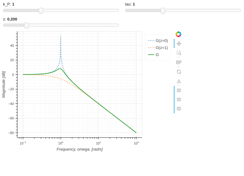
Interactive-Parametric 2D plot of the magnitude of a second order transfer function:
from sympy import symbols, log, sqrt, re, im, I
from spb import plot, BB
from bokeh.models.formatters import PrintfTickFormatter
formatter = PrintfTickFormatter(format="%.3f")
kp, t, z, o = symbols("k_P, tau, zeta, omega")
G = kp / (I**2 * t**2 * o**2 + 2 * z * t * o * I + 1)
mod = lambda x: 20 * log(sqrt(re(x)**2 + im(x)**2), 10)
plot(
    (mod(G.subs(z, 0)), (o, 0.1, 100), "G(z=0)", {"line_dash": "dotted"}),
    (mod(G.subs(z, 1)), (o, 0.1, 100), "G(z=1)", {"line_dash": "dotted"}),
    (mod(G), (o, 0.1, 100), "G"),
    params = {
        kp: (1, 0, 3),
        t: (1, 0, 3),
        z: (0.2, 0, 1, 200, formatter, "z")
    },
    backend = BB,
    n = 2000,
    xscale = "log",
    xlabel = "Frequency, omega, [rad/s]",
    ylabel = "Magnitude [dB]",
    use_latex = False,
    update_event=True
)
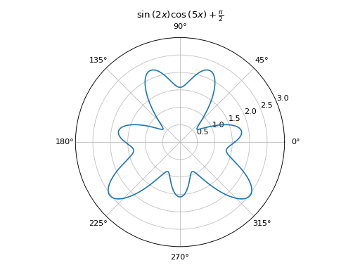
Polar animation with Matplotlib:
from sympy import symbols, sin, cos, pi, latex
from spb import plot_polar, prange
u, x = symbols("u, x")
expr = sin(2 * x) * cos(5 * x) + pi / 2
plot_polar(
    expr, prange(x, 0, u),
    params={u: (1, 2*pi)}, animation={"fps": 10, "time": 4},
    polar_axis=True, ylim=(0, 3), title="$%s$" % latex(expr))

2D parametric plot with Matplotlib, using Numpy and lambda functions:
import numpy as np
from spb import plot_parametric, multiples_of_pi_over_3
plot_parametric(
   lambda t: np.sin(3 * t + np.pi / 4), lambda t: np.sin(4 * t),
   ("t", 0, 2 * np.pi), "t [rad]", xlabel="x", ylabel="y", aspect="equal",
   colorbar_ticks_formatter=multiples_of_pi_over_3())
(Source code, png)
Interactive-Parametric domain coloring plot of a complex function:
from sympy import symbols, latex
from spb import *
import colorcet
u, v, w, z = symbols("u, v, w, z")
expr = (z - 1) / (u * z**2 + v * z + w * 1)
params = {
   u: (1, 1e-5, 2),
   v: (1, 0, 2),
   w: (1, 0, 2),
}
graphics(
   domain_coloring(
      expr, (z, -2-2j, 2+2j), coloring="m", cmap=colorcet.CET_C7,
      n=500, params=params),
   use_latex=False, title="$%s$" % latex(expr), grid=False,
   update_event=True
)

Animation of a 3D surface using K3D-Jupyter. Here we create an
Animation object, which can later be used to save the animation
to a file.
from sympy import *
from spb import *
import numpy as np
r, theta, t, a = symbols("r, theta, t, a")
expr = cos(r**2 - a) * exp(-r / 3)
plot3d_revolution(
   expr, (r, 0, 5), (theta, 0, t),
   params={t: (1e-03, 2*pi), a: (0, 2*pi)},
   use_cm=True, color_func=lambda x, y, z: np.sqrt(x**2 + y**2),
   is_polar=True,
   wireframe=True, wf_n1=30, wf_n2=30,
   wf_rendering_kw={"width": 0.005},
   animation=True,
   title=(r"theta={:.4f}; \, a={:.4f}", t, a),
   backend=KB, grid=False
)
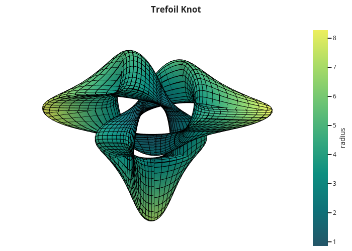
3D plot with Plotly of a parametric surface, colored according to the radius, with wireframe lines (also known as grid lines) highlighting the parameterization:
from sympy import symbols, cos, sin, pi
from spb import plot3d_parametric_surface, PB
import numpy as np
u, v = symbols("u, v")
def trefoil(u, v, r):
    x = r * sin(3 * u) / (2 + cos(v))
    y = r * (sin(u) + 2 * sin(2 * u)) / (2 + cos(v + pi * 2 / 3))
    z = r / 2 * (cos(u) - 2 * cos(2 * u)) * (2 + cos(v)) * (2 + cos(v + pi * 2 / 3)) / 4
    return x, y, z
plot3d_parametric_surface(
   trefoil(u, v, 3), (u, -pi, 3*pi), (v, -pi, 3*pi), "radius",
   grid=False, title="Trefoil Knot", backend=PB, use_cm=True,
   color_func=lambda x, y, z: np.sqrt(x**2 + y**2 + z**2),
   wireframe=True, wf_n1=100, wf_n2=30, n1=250)
(Source code, png)
Riemann surface of Log(z), colored by its argument, using Plotly:
from sympy import *
from spb import *
r, theta = symbols("r theta")
graphics(
   surface_parametric(
      r * cos(theta), r * sin(theta), theta,
      (r, 0, 2), (theta, -4*pi, 4*pi),
      n1 = 10, n2=1000,
      wireframe=True, wf_n1=6, wf_n2=40,
      use_cm=True,
      rendering_kw={"colorscale": "mygbm", "cmin": 0, "cmax": 2*np.pi},
      color_func=lambda x, y, z, r, theta: theta % (2 * np.pi),
      label="theta [rad]",
      colorbar_ticks_formatter=multiples_of_pi_over_4(label="π")
   ),
   backend=PB,
   aspect=dict(x=1, y=1, z=1.15),
   xlabel="Real", ylabel="Imag", zlabel="Im(Log(z))"
)
(Source code, png)
Visualizing a 2D vector field:
from sympy import *
from spb import *
x, y = symbols("x, y")
expr = Tuple(1, sin(x**2 + y**2))
l = 2
plot_vector(
   expr, (x, -l, l), (y, -l, l),
   backend=PB, streamlines=True, scalar=False,
   stream_kw={"line_color": "black", "density": 1.5},
   xlim=(-l, l), ylim=(-l, l),
   title=r"$\vec{F} = " + latex(expr) + "$")
(Source code, png)
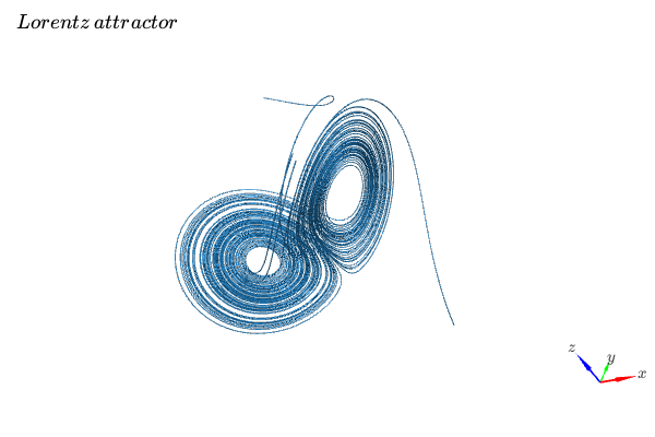
Visualizing a 3D vector field with a random number of streamtubes:
from sympy import *
from spb import *
var("x:z")

l = 30
u = 10 * (y - x)
v = 28 * x - y - x * z
w = -8 * z / 3 + x * y

plot_vector(
   [u, v, w], (x, -l, l), (y, -l, l), (z, 0, 50),
   backend=KB, n=50, grid=False, use_cm=False, streamlines=True,
   stream_kw={"starts": True, "npoints": 15},
   title="Lorentz \, attractor"
)

Visualizing the surface of a cone with outward pointing normal vectors.
from sympy import tan, cos, sin, pi, symbols
from spb import *
from sympy.vector import CoordSys3D, gradient

u, v = symbols("u, v")
N = CoordSys3D("N")
i, j, k = N.base_vectors()
xn, yn, zn = N.base_scalars()

t = 0.35    # half-cone angle in radians
expr = -xn**2 * tan(t)**2 + yn**2 + zn**2    # cone surface equation
g = gradient(expr)
n = g / g.magnitude()    # unit normal vector
n1, n2 = 10, 20 # number of discretization points for the vector field

# cone surface to discretize vector field (low numb of discret points)
cone_discr = surface_parametric(
   u / tan(t), u * cos(v), u * sin(v), (u, 0, 1), (v, 0 , 2*pi),
   n1=n1, n2=n2)[0]
graphics(
   surface_parametric(
      u / tan(t), u * cos(v), u * sin(v), (u, 0, 1), (v, 0 , 2*pi),
      rendering_kw={"opacity": 1}, wireframe=True,
      wf_n1=n1, wf_n2=n2, wf_rendering_kw={"width": 0.004}),
   vector_field_3d(
      n, range1=(xn, -5, 5), range2=(yn, -5, 5), range3=(zn, -5, 5),
      use_cm=False, slice=cone_discr,
      quiver_kw={"scale": 0.5, "pivot": "tail"}
   ),
   backend=KB, grid=False
)

Differences with sympy.plotting
While the backends implemented in this module might resemble the ones from the sympy.plotting module, they are not interchangeable.
The
plot_implicitfunction uses a mesh grid algorithm and contour plots by default (in contrast to the adaptive algorithm used by sympy.plotting). It is going to automatically switch to an adaptive algorithm if Boolean expressions are found. This ensures a better visualization for non-Boolean implicit expressions.sympy.plotting is unable to visualize summations containing infinity in their lower/upper bounds. This module introduces the
sum_boundkeyword argument into theplotfunction: it substitutes infinity with a large integer number. As such, it is possible to visualize summations.sympy.plotting provides an adaptive algorithm for line plots. This module does not.
sympy.plotting exposed the
nb_of_points_*keyword arguments. These have been replaced withnorn1, n2.sympy.plotting exposed the
TextBackendclass to create very basic plots on a terminal window. This module removed it.The following example compares how to customize a plot created with sympy.plotting and one created with this module.
This is pretty much all we can do with sympy.plotting:
from sympy.plotting import plot
from sympy import symbols, sin, cos
x = symbols("x")
p = plot(sin(x), cos(x), show=False)
p[0].label = "a"
p[0].line_color = "red"
p[1].label = "b"
p.show()
The above command works perfectly fine also with this new module. However, we can customize the plot even further. In particular:
it is possible to set a custom label directly from any plot function.
the full potential of each backend can be accessed by providing dictionaries containing backend-specific keyword arguments.
from spb import plot
from sympy import symbols, sin, cos
x = symbols("x")
# pass customization options directly to matplotlib (or other backends)
plot(
    (sin(x), "a", dict(color="k", linestyle=":")),
    (cos(x), "b"),
    backend=MB)
# alternatively, set the label and rendering_kw keyword arguments
# to lists: each element target an expression
# plot(sin(x), cos(x), label=["a", "b"], rendering_kw=[dict(color="k", linestyle=":"), None])
Read the documentation to learn how to further customize the appearance of figures.
Take a look at Modules for more examples about the output of this module.