1 - Differences between 2D backends
In this tutorial we are going to compare the same plot produced with 3 different backends. In particular, we will focus on usability and interactivity.
First, let’s initialize the tutorial by running:
%matplotlib widget
from sympy import *
from spb import *
x = symbols("x")
In the above code cell we first imported every plot function
from this plotting module. Remember: while some plot functions are identical
to the ones from sympy.plotting, they are not compatible when using a
different backend!
We also imported the following backends:
Backend |
Alias |
|---|---|
BokehBackend |
BB |
MatplotlibBackend |
MB |
PlotlyBackend |
PB |
K3DBackend |
KB |
Only MatplotlibBackend, BokehBackend and PlotlyBackend support
2D plots. We will use their aliases in order to type less.
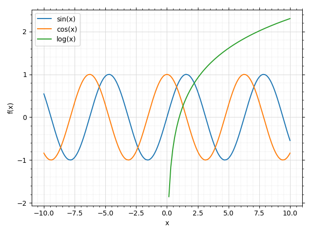
Now, let’s visualize a plot created with Matplotlib:
p = plot(sin(x), cos(x), log(x), backend=MB)
In the previous command we specified the optional keyword argument
backend=. If not provided, the default backend will be used. Refer to
Tutorial 3 to learn how to customize the
module and set a different default backend.
We can see a RuntimeWarning in the output cell: it was generated by the evaluation algorithm while processing log(x), which is only defined for x > 0, whereas we asked the plot function to evaluate it over the interval -10 < x < 10.
Once we plot multiple expression simultaneously, the legend will automatically
show up. We can disable it by setting legend=False.
Note that:
In order to interact with the plot we have to use the buttons on the toolbar.
If we move the cursor over the figure, we can see its coordinates. By moving it over a line we only get approximate coordinates.
With the previous command, we plotted 3 different expressions. Therefore, the
plot object p contains 3 data series. We can easily access the data
series by using the index notation: this is useful in order to extract
numerical data as we will see in Tutorial 4.
print(p)
print("\nInformation about the first series:")
print(p[0])
Plot object containing:
[0]: cartesian line: sin(x) for x over (-10.0, 10.0)
[1]: cartesian line: cos(x) for x over (-10.0, 10.0)
[2]: cartesian line: log(x) for x over (-10.0, 10.0)

Information about the first series:
cartesian line: sin(x) for x over (-10.0, 10.0)
Let’s now do the same with Plotly:
plot(sin(x), cos(x), log(x), backend=PB)
The top toolbar can be used to interact with the plot. However, there are more natural ways:
Click and drag to zoom into a rectangular selection.
Move the cursor in the middle of the horizontal axis, click and drag to pan horizontally.
Move the cursor in the middle of the vertical axis, click and drag to pan vertically.
Move the cursor near the ends of the horizontal/vertical axis: click and drag to resize.
Move the cursor over a line: a tooltip will show the coordinate of that point in the data series. Note that there is no interpolation between two consecutive points.
Click over a label in the legend to hide/show that data series.
Finally, let’s use Bokeh:
plot(sin(x), cos(x), log(x), backend=BB)
Here, we can:
Click and drag to pan the plot around. Once we are done panning, the plot automatically updates all the data series according to the new range. This is a wonderful feature of Bokeh, which allows us to type less and explore more. We can disable this behaviour by setting
update_event=Falsein the function call.Click and drag the axis to pan the plot only on one direction.
Click the legend entries to hide/show the data series.
Move the cursor over a line: a tooltip will show the coordinate of that point in the data series.
Use the toolbar to change the tool, for example we can select the Box Zoom to zoom into a rectangular region.