1 - Combining plots
1.1 - With the Graphics module
Combining multiple visualizations is a core feature of the graphics module.
Hence, it is really easy to do that. All we need to do is call graphics(),
providing the necessary data series as arguments, which are create with
appropriate functions:
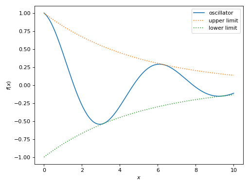
>>> from sympy import *
>>> from spb import *
>>> x = symbols("x")
>>> c = S(2) / 10
>>> p = graphics(
...     line(cos(x) * exp(-c * x), (x, 0, 10), label="oscillator"),
...     line(exp(-c * x), (x, 0, 10), label="upper limit",
...         rendering_kw={"linestyle": ":"}),
...     line(-exp(-c * x), (x, 0, 10), label="lower limit",
...         rendering_kw={"linestyle": ":"}),
...     grid=False
... )
(Source code, png)

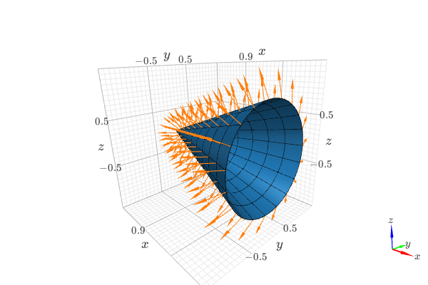
Another example, illustrating how to combine a surface with a vector field:
from sympy import tan, cos, sin, pi, symbols
from spb import *
from sympy.vector import CoordSys3D, gradient

u, v = symbols("u, v")
N = CoordSys3D("N")
i, j, k = N.base_vectors()
xn, yn, zn = N.base_scalars()

t = 0.35    # half-cone angle in radians
expr = -xn**2 * tan(t)**2 + yn**2 + zn**2    # cone surface equation
g = gradient(expr)
n = g / g.magnitude()    # unit normal vector
n1, n2 = 10, 20 # number of discretization points for the vector field

# cone surface to discretize vector field (low numb of discret points)
cone_discr = surface_parametric(
   u / tan(t), u * cos(v), u * sin(v), (u, 0, 1), (v, 0 , 2*pi),
   n1=n1, n2=n2)[0]
graphics(
   surface_parametric(
      u / tan(t), u * cos(v), u * sin(v), (u, 0, 1), (v, 0 , 2*pi),
      rendering_kw={"opacity": 1}, wireframe=True,
      wf_n1=n1, wf_n2=n2, wf_rendering_kw={"width": 0.004}),
   vector_field_3d(
      n, range1=(xn, -5, 5), range2=(yn, -5, 5), range3=(zn, -5, 5),
      use_cm=False, slice=cone_discr,
      quiver_kw={"scale": 0.5, "pivot": "tail"}
   ),
   backend=KB)
1.2 - With usual plotting functions
Usual plotting functions (whose name’s start with plot) are the oldest
features of the plotting module, and suffer from the limitations explained
in The Graphics Module. Hence, combining multiple plots together using old
plotting functions is not intuitive.
Let’s understand what happens when a plot command is executed:
>>> from sympy import *
>>> from spb import *
>>> x = symbols("x")
>>> p = plot(sin(x), cos(x), log(x), backend=MB)
(Source code, png)
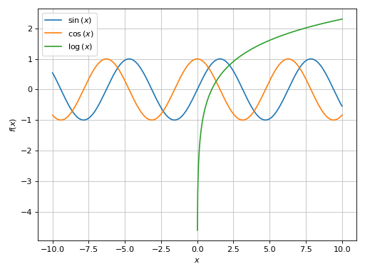

The plot function is going to loop over the provided arguments: it will create
and store one data series for each expression. So, in the previous example
p contains 3 data series. Once the data series are created, they will be
used by the backend (the wrapper to the plotting library) to generate
numerical data.
Effectively, p is a container of data series. We can quickly visualize
them by printing the plot object:
>>> print(p)
Plot object containing:
[0]: cartesian line: sin(x) for x over (-10, 10)
[1]: cartesian line: cos(x) for x over (-10, 10)
[2]: cartesian line: log(x) for x over (-10, 10)
We can retrieve a list containing all data series from a plot object by
calling the series attribute:
>>> p.series
Alternatively, we can retrieve a single data series by indexing the plot object:
>>> print(p[0])
cartesian line: sin(x) for x over (-10, 10)
We can combine multiple plots together in three ways:
summing them up: this will create a new plot containing all data series from all initial plots. For example:
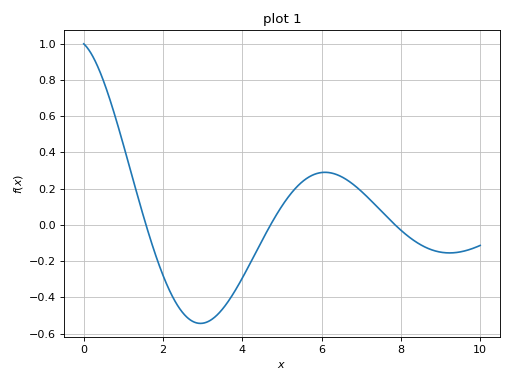
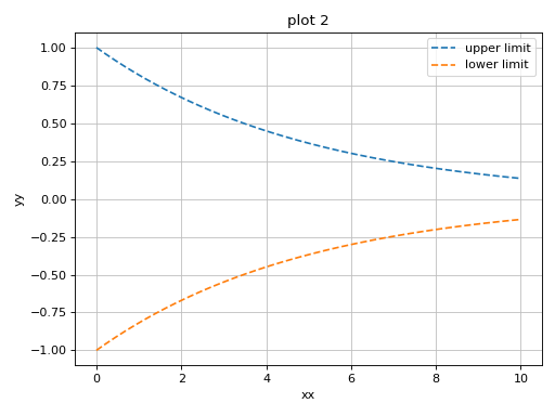
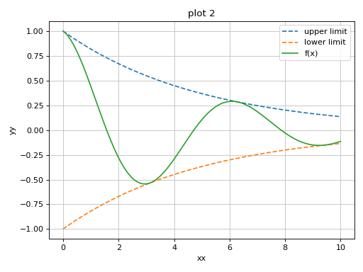
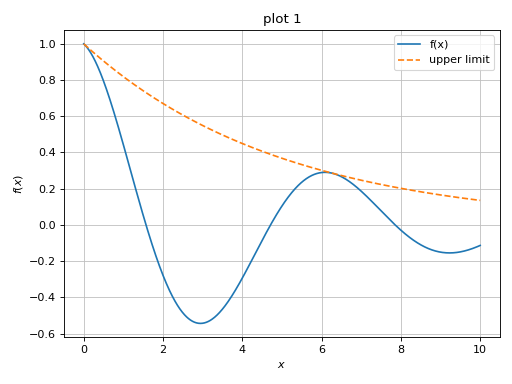
>>> c = S(2) / 10
>>> p1 = plot(cos(x) * exp(-c * x), (x, 0, 10), "f(x)", title="plot 1")
>>> p2 = plot(
...     (exp(-c * x), "upper limit"),
...     (-exp(-c * x), "lower limit"), (x, 0, 10), {"linestyle": "--"},
...     title="plot 2", xlabel="xx", ylabel="yy")


And then:
>>> p3 = p1 + p2
>>> p3.show()
>>> # or more quickly: (p1 + p2).show()
(
Source code,png)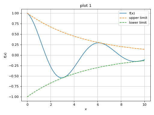
Note that the final plot uses the keyword arguments of the left-most plot in the summation. In the previous example, the resulting plot has the title of
p1. Now, let’s sum them up in a different order:>>> (p2 + p1).show()
(
Source code,png)
Here, the resulting plot is using the title and axis labels of
p2.We can use the
extendmethod to achieve the same goal as before:>>> p1.extend(p2) >>> p1.show()
(
Source code,png)
using the
appendmethod to append one specific data series from one plot object to another. For example:>>> p1 = plot(cos(x) * exp(-c * x), (x, 0, 10), "f(x)", ... title="plot 1", show=False) >>> p2 = plot( ... (exp(-c * x), "upper limit"), ... (-exp(-c * x), "lower limit"), (x, 0, 10), {"linestyle": "--"}, ... title="plot 2", xlabel="xx", ylabel="yy", show=False) >>> p1.append(p2[0]) >>> print(p1) Plot object containing: [0]: cartesian line: exp(-x/5)*cos(x) for x over (0, 10) [1]: cartesian line: exp(-x/5) for x over (0, 10) >>> p1.show()
(
Source code,png)