The Graphics Module
The graphics module’s goal is to solve the following limitations of the
usual plotting functions (whose names start with plot_):
Some functions perform too many tasks, making them difficult and confusing to use.
The documentation is difficult to maintain because many keywords arguments are repeated on all plotting functions.
The procedures to combine multiple plots together is not ideal. Namely,
extend()orappend()or adding multiple plots. All of them requires the plots to be shown on the screen or to be explicitely hidden by settingshow=Falsein the function call.
The graphics module implements new functions into appropriate submodules.
Each function solves a very specific task and is able to plot only one
symbolic expression. Each function returns a list containing one or
more data series, depending on the required visualization. Function names’
were chosen to allow TAB completion. For example,
typing line and pressing TAB, a list of function names related to plotting
lines will appear.
In order to render the data series on the screen, they must be passed into
the graphics() function. We can think of it as
the overall figure: thanks to its keyword arguments, we can set axis labels,
axis limits, title, aspect ratio, etc. This function provides a clear
separation between the resulting figure and the data series we are trying
to plot.
A few examples will illustrate the differences between the usual plotting
functions and graphics(). There are times were usual plotting functions
are perfectly good, other times were graphics() is decisively better.
Ultimately, this decision is left to the user.
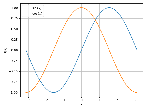
In this example, plot() is good enough to visualize
multiple expressions over the same range.
>>> from sympy import *
>>> from sympy.abc import x, y
>>> from spb import *
>>> plot(sin(x), cos(x), (x, -pi, pi))
Plot object containing:
[0]: cartesian line: sin(x) for x over (-pi, pi)
[1]: cartesian line: cos(x) for x over (-pi, pi)
(Source code, png)

More typing is required to achieve the same results with graphics():
>>> graphics(
...     line(sin(x), (x, -pi, pi)),
...     line(cos(x), (x, -pi, pi)))
Plot object containing:
[0]: cartesian line: sin(x) for x over (-pi, pi)
[1]: cartesian line: cos(x) for x over (-pi, pi)
(Source code, png)
Note that both approaches returned an instance of
Plot, containing two data series.
Let’s visualize multiple expressions over different ranges, with custom rendering options:
>>> plot(
...     (sin(x), (x, 0, pi), "a"),
...     (cos(x), (x, -pi, pi), "b", {"linestyle": "--"}),
...     n=500)
Plot object containing:
[0]: cartesian line: sin(x) for x over (0, pi)
[1]: cartesian line: cos(x) for x over (-pi, pi)
(Source code, png)
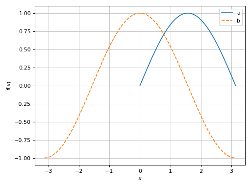
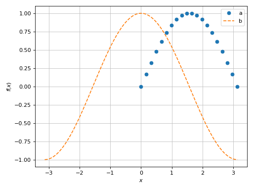
Both expressions were evaluated over 500 points. The graphics module allows a much finer level of control. In the following code block, the first expression is evaluated over 20 points and will be rendered with a scatter, the second expression is evaluated over a 1000 points.
>>> graphics(
...     line(sin(x), (x, 0, pi), label="a", n=20, scatter=True),
...     line(cos(x), (x, -pi, pi), label="b", rendering_kw={"linestyle": "--"}))
Plot object containing:
[0]: cartesian line: sin(x) for x over (0, pi)
[1]: cartesian line: cos(x) for x over (-pi, pi)
(Source code, png)
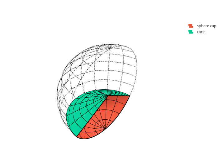
Things gets even better for graphics() when we combine different kinds
of visualization. The usual approach with plotting functions is kind of a mess:
from sympy import *
from spb import *
var("t u v theta phi")
r_sphere = 1
t = pi / 3 # half-cone angle
r_cone = r_sphere * sin(t)
p1 = plot3d_spherical(
    r_sphere, (theta, 0, pi), (phi, pi, 2*pi),
    "", rendering_kw={"opacity": 0},
    wireframe=True, wf_n1=13, wf_rendering_kw={"line_dash": "dot"},
    backend=PB, show=False, grid=False)
p2 = plot3d_spherical(
    r_sphere, (theta, pi - t, pi), (phi, pi, 2*pi),
    "sphere cap", wireframe=True, wf_n1=5,
    backend=PB, show=False)
p3 = plot3d_parametric_surface(
    u * cos(v), u * sin(v), -u / tan(t), (u, 0, r_cone), (v, pi , 2*pi),
    "cone", wireframe=True, wf_n1=7,
    backend=PB, show=False)
final = p1 + p2 + p3
# in real world, uncomment this line and remove the following two
# final.show()
fig = final.fig
fig
(Source code, png)
Note that show=False and backend=PB were set on all plots. Now, let’s
achieve a similar result with the graphics module:
from sympy import *
from spb import *
var("t u v theta phi")
r_sphere = 1
sphere = surface_spherical(r_sphere, (theta, 0, pi), (phi, pi, 2*pi))[0]
t = pi / 3 # half-cone angle
r_cone = r_sphere * sin(t)
graphics(
    wireframe(sphere, n1=13, rendering_kw={"line_dash": "dot"}),
    surface_spherical(r_sphere, (theta, pi - t, pi), (phi, pi, 2*pi),
        label="sphere cap", wireframe=True, wf_n1=5),
    surface_parametric(u * cos(v), u * sin(v), -u / tan(t), (u, 0, r_cone), (v, pi , 2*pi),
        label="cone", wireframe=True, wf_n1=7),
    backend=PB, grid=False)
(Source code, png)
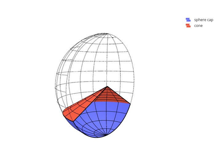
In the above code block:
backend=PBandgrid=Falsewere set only once asgraphics()keyword arguments, which illustrates the separation between figure-level and data-level.no surface of a half-sphere of unit radius was added to the plot, only wireframe lines. Previously, there were 3 surface, one of which was hidden by setting
opacity=0. In the above code block there are only two surfaces. This explains the difference of the surface colors between the two approaches.code is much cleaner and easy to read.
Without further ado, let’s explore the graphics module.