graphics
NOTE:
For technical reasons, all interactive-widgets plots in this documentation
are created using Holoviz’s Panel. Often, they will ran just fine with
ipywidgets too. However, if a specific example uses the param library,
or widgets from the panel module, then users will have to modify the
params dictionary in order to make it work with ipywidgets.
Refer to Interactive module for more information.
- spb.graphics.graphics.graphics(*, aspect, ax, axis, axis_center, camera, colorloop, colormaps, cyclic_colormaps, fig, grid, hooks, legend, minor_grid, polar_axis, size, theme, title, update_event, use_latex, x_ticks_formatter, xlabel, xlim, xscale, y_ticks_formatter, ylabel, ylim, yscale, zlabel, zlim, zscale, app, imodule, layout, ncols, use_latex_on_widgets, name)[source]
Plots a collection of data series.
- Parameters:
- args
Instances of
BaseSeriesor lists of instances ofBaseSeries.- appbool
If True, shows interactive widgets useful to customize the numerical data computation for each series. Related parameters:
imodule,ncols,layout. Default value: False.- aspectstr, tuple, list, dict
Set the aspect ratio.
Possible values for Matplotlib (only works for a 2D plot):
"auto": Matplotlib will fit the plot in the vibile area."equal": sets equal spacing.tuple containing 2 float numbers, from which the aspect ratio is computed. This only works for 2D plots.
Possible values for Plotly:
"equal": sets equal spacing on the axis of a 2D plot.For 3D plots:
"cube": fix the ratio to be a cube"data": draw axes in proportion of their ranges"auto": automatically produce something that is well proportioned using ‘data’ as the default.manually set the aspect ratio by providing a dictionary. For example:
dict(x=1, y=1, z=2)forces the z-axis to appear twice as big as the other two.
Possible values for Bokeh:
"equal": sets equal spacing.
- ax
An existing Matplotlib’s Axes over which the symbolic expressions will be plotted.
- axisbool
Show the axis in the figure. Default value: True.
- axis_centerstr, tuple
Set the location of the intersection between the horizontal and vertical axis in a 2D plot. It only works with Matplotlib and it can receive the following values:
None: traditional layout, with the horizontal axis fixed on the bottom and the vertical axis fixed on the left. This is the default value.a tuple
(x, y)specifying the exact intersection point.'center': center of the current plot area.'auto': the intersection point is automatically computed.
- camera
Set the camera position for 3D plots.
For Matplotlib, it can be a dictionary of keyword arguments that will be passed to the
Axes3D.view_initmethod. Refer to the following link for more information: https://matplotlib.org/stable/api/_as_gen/mpl_toolkits.mplot3d.axes3d.Axes3D.html#mpl_toolkits.mplot3d.axes3d.Axes3D.view_initFor Plotly, it can be a dictionary of keyword arguments that will be passed to the layout’s
scene_camera. Refer to the following link for more information: https://plotly.com/python/3d-camera-controls/For K3D-Jupyter, it is list of 9 numbers, namely:
x_cam, y_cam, z_cam: the position of the camera in the scenex_tar, y_tar, z_tar: the position of the target of the camerax_up, y_up, z_up: components of the up vector
- colorlooplist, tuple
List of colors to be used in line plots or solid color surfaces.
- colormapslist, tuple
List of color maps to render surfaces.
- cyclic_colormapslist, tuple
List of cyclic color maps to render complex series (the phase/argument ranges over [-pi, pi]).
- fig
Get or set the figure where to plot into.
- gridbool, dict
Toggle the visibility of major grid lines. A dictionary of keyword arguments can be passed to customized the appearance of the grid lines:
- hookslist
List of functions expecting one argument, the current plot object, which allows users to further customize the appearance of the plot before it is shown on the screen. The hooks are executed:
after the figure has been initialized and populated with numerical data.
after the existing renderers update the visualization because the user interacted with some widget.
Note: let
pbe the plot object. Then, the user can access the figure withp.fig. In case ofspb.backends.matplotlib.MatplotlibBackend, the user can also retrieve the axes in which data was added withp.ax.- imodulestr
Chose the interactive module to be used with parametric widgets plots. Related parameters:
app,ncols,layout. Possible options: [‘panel’, ‘ipywidgets’] Default value: ‘ipywidgets’.- layoutstr
Select the location of the widgets in relation to the plotting area of the interactive application. Related parameters:
app,ncols,imodule. Possible options:‘tb’: Widgets on the top bar
‘bb’: Widgets on the bottom bar
‘sbl’: Widgets on the left side bar
‘sbr’: Widgets on the right side bar
Default value: ‘tb’.
- legendbool
Toggle the visibility of the legend. If None, the backend will automatically determine if it is appropriate to show it. Default value: None.
- minor_gridbool, dict
Toggle the visibility of minor grid lines. A dictionary of keyword arguments can be passed to customized the appearance of the grid lines:
- ncolsint
Number of columns used by the interactive widgets. Related parameters:
app,imodule,layout. It must be: 1 ≤ ncols < ∞. Default value: 2.- polar_axisbool
If True, the backend will attempt to use polar axis, otherwise it uses cartesian axis. This is only supported for 2D plots. Default value: False.
- size
Set the size of the plot, (width, height). For Matplotlib, the size is measured in inches. For Bokeh, Plotly and K3D-Jupyter, the size is in pixel.
- themestr
Theme to be used to style the figure. Depending on the backend being used, several themes may be available.
- title
Title of the plot. It can be:
a string.
a callable receiving a single argument, use_latex, which must return a string.
a tuple of the form (format_str, symbol 1, symbol 2, etc.), which creates an output string when parameters symbol 1, symbol 2, etc. receive numerical values from the widgets. This operation mode only works when creating interactive data series (ie, specifying the
paramsdictionary).
- update_eventbool
If True and the backend supports such functionality, events like drag and zoom will trigger a recompute of the data series within the new axis limits. Default value: False.
- use_latexbool
Turn on/off the rendering of latex labels. If the backend doesn’t support latex, it will render the string representations instead. Default value: True.
- use_latex_on_widgetsbool
Use latex on the labels of the widgets. Default value: True.
- x_ticks_formattertick_formatter_multiples_of
An object of type
tick_formatter_multiples_ofwhich will be used to place tick values at each multiple of a specified quantity, along the x-axis.- xlabel
Label of the x-axis. It can be:
a string.
a callable receiving a single argument, use_latex, which must return a string.
a tuple of the form (format_str, symbol 1, symbol 2, etc.), which creates an output string when parameters symbol 1, symbol 2, etc. receive numerical values from the widgets. This operation mode only works when creating interactive data series (ie, specifying the
paramsdictionary).
- xlim
Limit the figure’s x-axis to the specified range. The tuple must be in the form (min_val, max_val).
- xscaleNoneType, str
If the backend supports it, the x-direction will use the specified scale. Note that none of the backends support logarithmic scale for 3D plots. Possible options: [‘linear’, ‘log’, None] Default value: ‘linear’.
- y_ticks_formattertick_formatter_multiples_of
An object of type
tick_formatter_multiples_ofwhich will be used to place tick values at each multiple of a specified quantity, along the y-axis.- ylabel
Label of the y-axis. It can be:
a string.
a callable receiving a single argument, use_latex, which must return a string.
a tuple of the form (format_str, symbol 1, symbol 2, etc.), which creates an output string when parameters symbol 1, symbol 2, etc. receive numerical values from the widgets. This operation mode only works when creating interactive data series (ie, specifying the
paramsdictionary).
- ylim
Limit the figure’s y-axis to the specified range. The tuple must be in the form (min_val, max_val).
- yscaleNoneType, str
If the backend supports it, the y-direction will use the specified scale. Note that none of the backends support logarithmic scale for 3D plots. Possible options: [‘linear’, ‘log’, None] Default value: ‘linear’.
- zlabel
Label of the z-axis. It can be:
a string.
a callable receiving a single argument, use_latex, which must return a string.
a tuple of the form (format_str, symbol 1, symbol 2, etc.), which creates an output string when parameters symbol 1, symbol 2, etc. receive numerical values from the widgets. This operation mode only works when creating interactive data series (ie, specifying the
paramsdictionary).
- zlim
Limit the figure’s z-axis to the specified range. The tuple must be in the form (min_val, max_val).
- zscaleNoneType, str
If the backend supports it, the z-direction will use the specified scale. Note that none of the backends support logarithmic scale for 3D plots. Possible options: [‘linear’, ‘log’, None] Default value: ‘linear’.
- Returns:
- pPlot or InteractivePlot
This function returns:
an instance of
InteractivePlotif any of the data series is interactive (paramshas been set), or ifapp=True.an instance of
Plototherwise.
See also
plotgrid
Examples
Combining together multiple data series of the same type, enabling auto-update on pan:
>>> from sympy import *
>>> from spb import *
>>> x = symbols("x")
>>> graphics(
...     line(cos(x), label="a"),
...     line(sin(x), (x, -pi, pi), label="b"),
...     line(log(x), rendering_kw={"linestyle": "--"}),
...     title="My title", ylabel="y", update_event=True
... )
Plot object containing:
[0]: cartesian line: cos(x) for x over (-10.0, 10.0)
[1]: cartesian line: sin(x) for x over (-3.141592653589793, 3.141592653589793)
[2]: cartesian line: log(x) for x over (-10.0, 10.0)
(
Source code,png)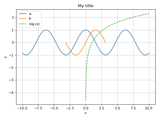
Combining together multiple data series of the different types:
>>> from sympy import *
>>> from spb import *
>>> x = symbols("x")
>>> graphics(
...     line((cos(x)+1)/2, (x, -pi, pi), label="a"),
...     line(-(cos(x)+1)/2, (x, -pi, pi), label="b"),
...     line_parametric_2d(cos(x), sin(x), (x, 0, 2*pi), label="c", use_cm=False),
...     title="My title", ylabel="y", aspect="equal"
... )
Plot object containing:
[0]: cartesian line: cos(x)/2 + 1/2 for x over (-3.141592653589793, 3.141592653589793)
[1]: cartesian line: -cos(x)/2 - 1/2 for x over (-3.141592653589793, 3.141592653589793)
[2]: parametric cartesian line: (cos(x), sin(x)) for x over (0.0, 6.283185307179586)
(
Source code,png)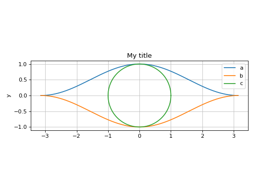
Set tick labels to be some multiple of pi:
>>> x, y = symbols("x, y")
>>> expr = 5 * (cos(x) - 0.2 * sin(y))**2 + 5 * (-0.2 * cos(x) + sin(y))**2
>>> graphics(
...     contour(expr, (x, 0, 2 * pi), (y, 0, 2 * pi), fill=False),
...     x_ticks_formatter=multiples_of_pi_over_4(),
...     y_ticks_formatter=multiples_of_pi_over_3()
... )
Plot object containing:
[0]: contour: 5*(-0.2*sin(y) + cos(x))**2 + 5*(sin(y) - 0.2*cos(x))**2 for x over (0, 2*pi) and y over (0, 2*pi)
(
Source code,png)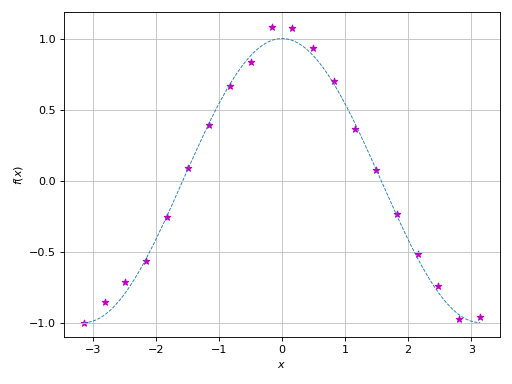
Use
hooksto further customize the figure before it is shown on the screen, for example applying custom tick labels to a colorbar:>>> def colorbar_ticks_formatter(plot_object): ... fig, ax = plot_object.fig, plot_object.ax ... cax = fig.axes[1] ... formatter = multiples_of_pi() ... cax.yaxis.set_major_locator(formatter.MB_major_locator()) ... cax.yaxis.set_major_formatter(formatter.MB_func_formatter())
>>> u = symbols("u")
>>> graphics(
...     line_parametric_2d(
...         2 * cos(u) + 5 * cos(2 * u / 3),
...         2 * sin(u) - 5 * sin(2 * u / 3),
...         (u, 0, 6 * pi)
...     ),
...     hooks=[colorbar_ticks_formatter]
... )
Plot object containing:
[0]: parametric cartesian line: (5*cos(2*u/3) + 2*cos(u), -5*sin(2*u/3) + 2*sin(u)) for u over (0, 6*pi)
(
Source code,png)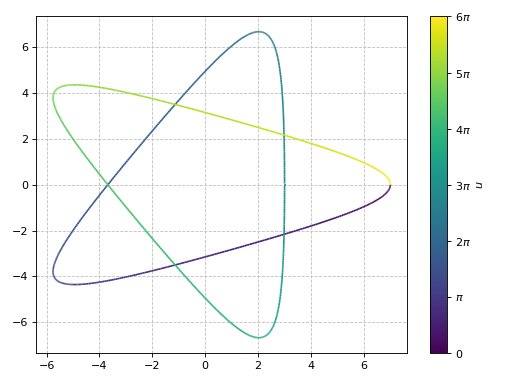
Plot over an existing figure. Note that:
If an existing Matplotlib’s figure is available, users can specify one of the following keyword arguments:
fig=to provide the existing figure. The module will then plot the symbolic expressions over the first Matplotlib’s axes.ax=to provide the Matplotlib’s axes over which symbolic expressions will be plotted. This is useful if users have a figure with multiple subplots.
If an existing Bokeh/Plotly/K3D’s figure is available, user should pass the following keyword arguments:
fig=for the existing figure andbackend=to specify which backend should be used.This module will override axis labels, title, and grid.
>>> from sympy import symbols, cos, pi
>>> from spb import *
>>> import numpy as np
>>> import matplotlib.pyplot as plt
>>> # plot some numerical data
>>> fig, ax = plt.subplots()
>>> xx = np.linspace(-np.pi, np.pi, 20)
>>> yy = np.cos(xx)
>>> noise = (np.random.random_sample(len(xx)) - 0.5) / 5
>>> yy = yy * (1+noise)
>>> ax.scatter(xx, yy, marker="*", color="m")
>>> # plot a symbolic expression
>>> x = symbols("x")
>>> graphics(
...     line(cos(x), (x, -pi, pi), rendering_kw={"ls": "--", "lw": 0.8}),
...     ax=ax, update_event=True)
Plot object containing:
[0]: cartesian line: cos(x) for x over (-3.141592653589793, 3.141592653589793)
(
Source code,png)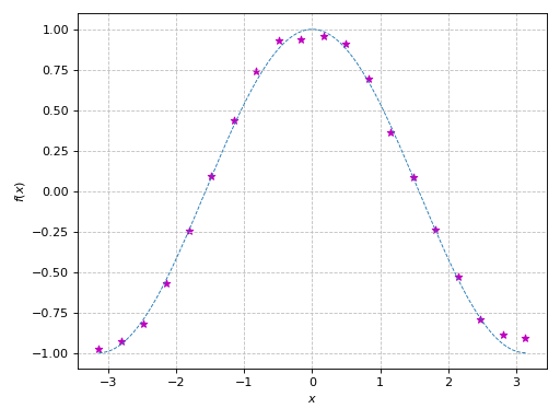
Interactive-widget plot combining together data series of different types:
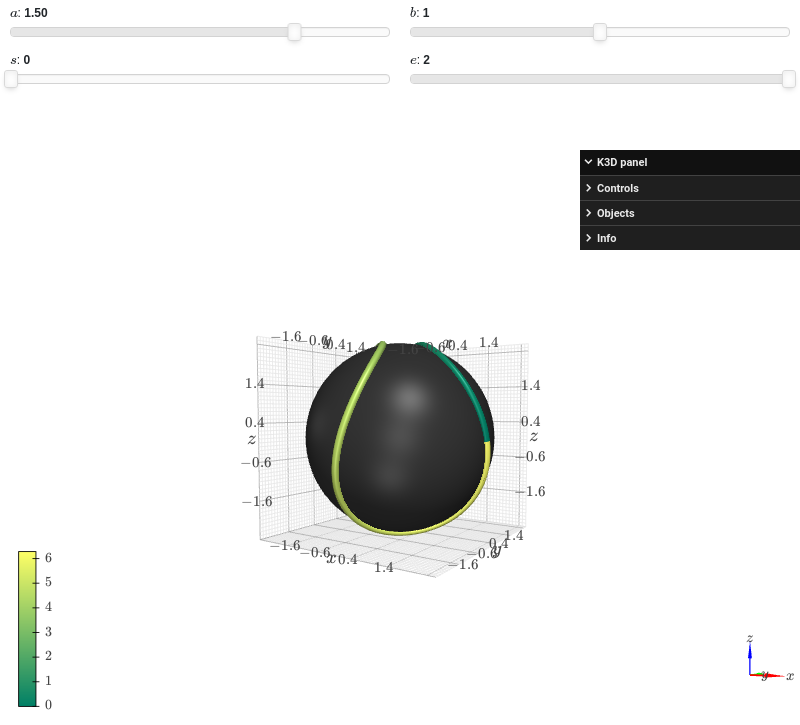
from sympy import *
from spb import *
import k3d
a, b, s, e, t = symbols("a, b, s, e, t")
c = 2 * sqrt(a * b)
r = a + b
params = {
    a: (1.5, 0, 2),
    b: (1, 0, 2),
    s: (0, 0, 2),
    e: (2, 0, 2)
}
graphics(
    surface_revolution(
        (r * cos(t), r * sin(t)), (t, 0, pi),
        params=params, n=50, parallel_axis="x", show_curve=False,
        rendering_kw={"color":0x353535},
        force_real_eval=True
    ),
    line_parametric_3d(
        a * cos(t) + b * cos(3 * t),
        a * sin(t) - b * sin(3 * t),
        c * sin(2 * t), prange(t, s*pi, e*pi),
        rendering_kw={"color_map": k3d.matplotlib_color_maps.Summer},
        params=params
    ),
    backend=KB
)
Interactive widget plot, showing widgets related to data series that allows to easily customize the data generation process:
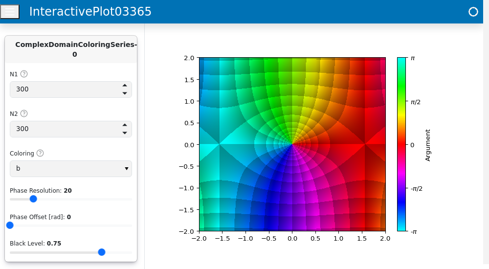
from sympy import *
from spb import *
z = symbols("z")

graphics(
    domain_coloring(sin(z), (z, -2-2j, 2+2j), coloring="b"),
    backend=MB,
    grid=False,
    layout="sbl",
    ncols=1,
    template={"sidebar_width": "30%"},
    app=True
)