2D general plotting
NOTE:
For technical reasons, all interactive-widgets plots in this documentation
are created using Holoviz’s Panel. Often, they will ran just fine with
ipywidgets too. However, if a specific example uses the param library,
or widgets from the panel module, then users will have to modify the
params dictionary in order to make it work with ipywidgets.
Refer to Interactive module for more information.
- spb.plot_functions.functions_2d.plot(*args, **kwargs)[source]
Plots a function of a single variable as a curve.
Typical usage examples are in the followings:
Plotting a single expression with the default range:
plot(expr, **kwargs)
Plotting a single expression with a custom range, custom label and rendering options.
plot(expr, range, label [opt], rendering_kw [opt], **kwargs)
Plotting multiple expressions with a single range.
plot(expr1, expr2, ..., range, **kwargs)
Plotting multiple expressions with different ranges, custom labels and rendering options.
plot(
   (expr1, range1, label1 [opt], rendering_kw1 [opt]),
   (expr2, range2, label2 [opt], rendering_kw2 [opt]),
   ..., **kwargs)
Refer to
line()for a full list of keyword arguments to customize the appearances of lines.Refer to
graphics()for a full list of keyword arguments to customize the appearances of the figure (title, axis labels, …).- Parameters:
- expr
It can either be a symbolic expression representing the function of one variable to be plotted, or a numerical function of one variable, supporting vectorization. In the latter case the following keyword arguments are not supported:
params,sum_bound.- range_xtuple, Tuple
A 3-tuple (symb, min, max) denoting the range of the x variable. Default values: min=-10 and max=10.
- labelstr
Set the label associated to this series, which will be eventually shown on the legend or colorbar.
- aspectstr, tuple, list, dict
Set the aspect ratio.
Possible values for Matplotlib (only works for a 2D plot):
"auto": Matplotlib will fit the plot in the vibile area."equal": sets equal spacing.tuple containing 2 float numbers, from which the aspect ratio is computed. This only works for 2D plots.
Possible values for Plotly:
"equal": sets equal spacing on the axis of a 2D plot.For 3D plots:
"cube": fix the ratio to be a cube"data": draw axes in proportion of their ranges"auto": automatically produce something that is well proportioned using ‘data’ as the default.manually set the aspect ratio by providing a dictionary. For example:
dict(x=1, y=1, z=2)forces the z-axis to appear twice as big as the other two.
Possible values for Bokeh:
"equal": sets equal spacing.
- ax
An existing Matplotlib’s Axes over which the symbolic expressions will be plotted.
- axisbool
Show the axis in the figure. Default value: True.
- axis_centerstr, tuple
Set the location of the intersection between the horizontal and vertical axis in a 2D plot. It only works with Matplotlib and it can receive the following values:
None: traditional layout, with the horizontal axis fixed on the bottom and the vertical axis fixed on the left. This is the default value.a tuple
(x, y)specifying the exact intersection point.'center': center of the current plot area.'auto': the intersection point is automatically computed.
- camera
Set the camera position for 3D plots.
For Matplotlib, it can be a dictionary of keyword arguments that will be passed to the
Axes3D.view_initmethod. Refer to the following link for more information: https://matplotlib.org/stable/api/_as_gen/mpl_toolkits.mplot3d.axes3d.Axes3D.html#mpl_toolkits.mplot3d.axes3d.Axes3D.view_initFor Plotly, it can be a dictionary of keyword arguments that will be passed to the layout’s
scene_camera. Refer to the following link for more information: https://plotly.com/python/3d-camera-controls/For K3D-Jupyter, it is list of 9 numbers, namely:
x_cam, y_cam, z_cam: the position of the camera in the scenex_tar, y_tar, z_tar: the position of the target of the camerax_up, y_up, z_up: components of the up vector
- color_func
A color function to be applied to the numerical data. It can be:
A numerical function of 2 variables, x, y (the points computed by the internal algorithm) supporting vectorization.
A symbolic expression having at most as many free symbols as
expr.None: the default value (no color mapping).
- colorbarbool
Toggle the visibility of the colorbar associated to the current data series. Note that a colorbar is only visible if
use_cm=Trueandcolor_funcis not None. Default value: True.- colorbar_ticks_formattertick_formatter_multiples_of
An object of type
tick_formatter_multiples_ofwhich will be used to place tick values on the colorbar at each multiple of a specified quantity. This only works when use_cm=True.- colorlooplist, tuple
List of colors to be used in line plots or solid color surfaces.
- colormapslist, tuple
List of color maps to render surfaces.
- cyclic_colormapslist, tuple
List of cyclic color maps to render complex series (the phase/argument ranges over [-pi, pi]).
- detect_polesbool, str
Chose whether to detect and correctly plot the roots of the denominator. There are two algorithms at work:
based on the gradient of the numerical data, it introduces NaN values at locations where the steepness is greater than some threshold. This splits the line into multiple segments. To improve detection, increase the number of discretization points
nand/or change the value ofeps. This algorithm can be used to visualize jump discontinuities as well as essential discontinuities.a symbolic approach based on the
continuous_domainfunction from thesympy.calculus.utilmodule, which computes the locations of essential discontinuities. If any are found, vertical lines will be shown.
Possible options:
False: No poles detection
True: Poles detection with the numerical algorithm
‘symbolic’: Poles detection with numerical and symbolic algorithms
Default value: False.
- epsfloat
An arbitrary small value used by the
detect_polesnumerical algorithm. Before changing this value, it is recommended to increase the number of discretization points. Related parameters:detect_poles. It must be: 0 ≤ eps < ∞. Default value: 0.01.- excludelist
List of x-coordinates to be excluded from evaluation. In practice, it introduces discontinuities in the resulting line.
- fig
Get or set the figure where to plot into.
- force_real_evalbool
By default, numerical evaluation is performed over complex numbers, which is slower but produces correct results. However, when the symbolic expression is converted to a numerical function with lambdify, the resulting function may not like to be evaluated over complex numbers. In such cases, forcing the evaluation to be performed over real numbers might be a good choice. The plotting module should be able to detect such occurences and automatically activate this option. If that is not the case, or evaluation performance is of paramount importance, set this parameter to True, but be aware that it might produce wrong results. Default value: False.
- gridbool, dict
Toggle the visibility of major grid lines. A dictionary of keyword arguments can be passed to customized the appearance of the grid lines:
- hookslist
List of functions expecting one argument, the current plot object, which allows users to further customize the appearance of the plot before it is shown on the screen. The hooks are executed:
after the figure has been initialized and populated with numerical data.
after the existing renderers update the visualization because the user interacted with some widget.
Note: let
pbe the plot object. Then, the user can access the figure withp.fig. In case ofspb.backends.matplotlib.MatplotlibBackend, the user can also retrieve the axes in which data was added withp.ax.- is_filledbool
Whether scatter’s markers are filled or void. Default value: True.
- is_scatterbool
If True it represent a scatter plot, otherwise a continuous line. Default value: False.
- legendbool
Toggle the visibility of the legend. If None, the backend will automatically determine if it is appropriate to show it. Default value: None.
- line_color
For back-compatibility with old sympy.plotting. Use
rendering_kwin order to fully customize the appearance of the line/scatter.- minor_gridbool, dict
Toggle the visibility of minor grid lines. A dictionary of keyword arguments can be passed to customized the appearance of the grid lines:
- modules
Specify the evaluation modules to be used by lambdify. If not specified, the evaluation will be done with NumPy/SciPy.
- n1int
Number of discretization points along the parameter to be used in the numerical evaluation. An alias of this parameter is
n. Related parameters:xscale. It must be: 2 ≤ n1 < ∞. Default value: 1000.- only_integersbool
Discretize the domain using only integer numbers. When this parameter is True, the number of discretization points is choosen by the algorithm. Default value: False.
- paramsdict, optional
A dictionary mapping symbols to parameters. If provided, this dictionary enables the interactive-widgets plot.
When calling a plotting function, the parameter can be specified with:
a widget from the
ipywidgetsmodule.a widget from the
panelmodule.- a tuple of the form:
(default, min, max, N, tick_format, label, spacing), which will instantiate a
ipywidgets.widgets.widget_float.FloatSlideror aipywidgets.widgets.widget_float.FloatLogSlider, depending on the spacing strategy. In particular:- default, min, maxfloat
Default value, minimum value and maximum value of the slider, respectively. Must be finite numbers. The order of these 3 numbers is not important: the module will figure it out which is what.
- Nint, optional
Number of steps of the slider.
- tick_formatstr or None, optional
Provide a formatter for the tick value of the slider. Default to
".2f".
- label: str, optional
Custom text associated to the slider.
- spacingstr, optional
Specify the discretization spacing. Default to
"linear", can be changed to"log".
Notes:
parameters cannot be linked together (ie, one parameter cannot depend on another one).
If a widget returns multiple numerical values (like
panel.widgets.slider.RangeSlideroripywidgets.widgets.widget_float.FloatRangeSlider), then a corresponding number of symbols must be provided.
Here follows a couple of examples. If
imodule="panel":import panel as pn params = { a: (1, 0, 5), # slider from 0 to 5, with default value of 1 b: pn.widgets.FloatSlider(value=1, start=0, end=5), # same slider as above (c, d): pn.widgets.RangeSlider(value=(-1, 1), start=-3, end=3, step=0.1) }
Or with
imodule="ipywidgets":import ipywidgets as w params = { a: (1, 0, 5), # slider from 0 to 5, with default value of 1 b: w.FloatSlider(value=1, min=0, max=5), # same slider as above (c, d): w.FloatRangeSlider(value=(-1, 1), min=-3, max=3, step=0.1) }
When instantiating a data series directly,
paramsmust be a dictionary mapping symbols to numerical values.Let
seriesbe any data series. Thenseries.paramsreturns a dictionary mapping symbols to numerical values.- polar_axisbool
If True, the backend will attempt to use polar axis, otherwise it uses cartesian axis. This is only supported for 2D plots. Default value: False.
- poles_locationslist
When
detect_poles="symbolic", stores the location of the computed poles (essential discontinuities) so that they can be appropriately rendered.- poles_rendering_kwdict
Rendering kw used to customize the appearance of vertical lines representing essential discontinuities. Related parameters:
poles_locations.- rendering_kwdict
A dictionary of keyword arguments to be passed to the renderers in order to further customize the appearance of the line. Here are some useful links for the supported plotting libraries:
Matplotlib:
for solid lines: https://matplotlib.org/stable/api/_as_gen/matplotlib.pyplot.plot.html
for colormap-based lines: https://matplotlib.org/stable/api/collections_api.html#matplotlib.collections.LineCollection
for scatters: https://matplotlib.org/stable/api/_as_gen/matplotlib.pyplot.scatter.html
Bokeh:
- show_in_legendbool
Toggle the visibility of the data series on the legend. Default value: True.
- size
Set the size of the plot, (width, height). For Matplotlib, the size is measured in inches. For Bokeh, Plotly and K3D-Jupyter, the size is in pixel.
- stepsNoneType, bool, str
If set, it connects consecutive points with steps rather than straight segments. Possible options: [‘pre’, ‘post’, ‘mid’, True, False, None] Default value: False.
- sum_boundint
When plotting sums, the expression will be pre-processed in order to replace lower/upper bounds set to +/- infinity with this +/- numerical value. Note: the higher this number, the slower the evaluation, but the more accurate the plot. It must be: 0 ≤ sum_bound < ∞. Default value: 1000.
- themestr
Theme to be used to style the figure. Depending on the backend being used, several themes may be available.
- title
Title of the plot. It can be:
a string.
a callable receiving a single argument, use_latex, which must return a string.
a tuple of the form (format_str, symbol 1, symbol 2, etc.), which creates an output string when parameters symbol 1, symbol 2, etc. receive numerical values from the widgets. This operation mode only works when creating interactive data series (ie, specifying the
paramsdictionary).
- txcallable
Numerical transformation function to be applied to the data on the x-axis.
- tycallable
Numerical transformation function to be applied to the data on the y-axis.
- unwrapbool, dict
Whether to use numpy.unwrap() on the computed coordinates in order to get rid of discontinuities. It can be:
False: do not use
np.unwrap().True: use
np.unwrap()with default keyword arguments.dictionary of keyword arguments passed to
np.unwrap().
- update_eventbool
If True and the backend supports such functionality, events like drag and zoom will trigger a recompute of the data series within the new axis limits. Default value: False.
- use_cmbool
Toggle the use of a colormap. By default, some series might use a colormap to display the necessary data. Setting this attribute to False will inform the associated renderer to use solid color. Related parameters:
color_func. Default value: False.- use_latexbool
Turn on/off the rendering of latex labels. If the backend doesn’t support latex, it will render the string representations instead. Default value: True.
- x_ticks_formattertick_formatter_multiples_of
An object of type
tick_formatter_multiples_ofwhich will be used to place tick values at each multiple of a specified quantity, along the x-axis.- xlabel
Label of the x-axis. It can be:
a string.
a callable receiving a single argument, use_latex, which must return a string.
a tuple of the form (format_str, symbol 1, symbol 2, etc.), which creates an output string when parameters symbol 1, symbol 2, etc. receive numerical values from the widgets. This operation mode only works when creating interactive data series (ie, specifying the
paramsdictionary).
- xlim
Limit the figure’s x-axis to the specified range. The tuple must be in the form (min_val, max_val).
- xscaleNoneType, str
If the backend supports it, the x-direction will use the specified scale. Note that none of the backends support logarithmic scale for 3D plots. Possible options: [‘linear’, ‘log’, None] Default value: ‘linear’.
- y_ticks_formattertick_formatter_multiples_of
An object of type
tick_formatter_multiples_ofwhich will be used to place tick values at each multiple of a specified quantity, along the y-axis.- ylabel
Label of the y-axis. It can be:
a string.
a callable receiving a single argument, use_latex, which must return a string.
a tuple of the form (format_str, symbol 1, symbol 2, etc.), which creates an output string when parameters symbol 1, symbol 2, etc. receive numerical values from the widgets. This operation mode only works when creating interactive data series (ie, specifying the
paramsdictionary).
- ylim
Limit the figure’s y-axis to the specified range. The tuple must be in the form (min_val, max_val).
- yscaleNoneType, str
If the backend supports it, the y-direction will use the specified scale. Note that none of the backends support logarithmic scale for 3D plots. Possible options: [‘linear’, ‘log’, None] Default value: ‘linear’.
- zlabel
Label of the z-axis. It can be:
a string.
a callable receiving a single argument, use_latex, which must return a string.
a tuple of the form (format_str, symbol 1, symbol 2, etc.), which creates an output string when parameters symbol 1, symbol 2, etc. receive numerical values from the widgets. This operation mode only works when creating interactive data series (ie, specifying the
paramsdictionary).
- zlim
Limit the figure’s z-axis to the specified range. The tuple must be in the form (min_val, max_val).
- zscaleNoneType, str
If the backend supports it, the z-direction will use the specified scale. Note that none of the backends support logarithmic scale for 3D plots. Possible options: [‘linear’, ‘log’, None] Default value: ‘linear’.
See also
Examples
>>> from sympy import symbols, sin, pi, tan, exp, cos, log, floor
>>> from spb import plot
>>> x, y = symbols('x, y')
Single Plot
>>> plot(x**2, (x, -5, 5))
Plot object containing:
[0]: cartesian line: x**2 for x over (-5, 5)
(
Source code,png)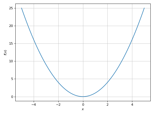
Multiple functions over the same range with custom rendering options:
>>> plot(x, log(x), exp(x), (x, -3, 3), aspect="equal", ylim=(-3, 3),
...    rendering_kw=[{}, {"linestyle": "--"}, {"linestyle": ":"}])
Plot object containing:
[0]: cartesian line: x for x over (-3, 3)
[1]: cartesian line: log(x) for x over (-3, 3)
[2]: cartesian line: exp(x) for x over (-3, 3)
(
Source code,png)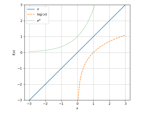
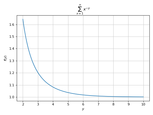
Plotting a summation in which the free symbol of the expression is not used in the lower/upper bounds:
>>> from sympy import Sum, oo, latex
>>> expr = Sum(1 / x ** y, (x, 1, oo))
>>> plot(expr, (y, 2, 10), sum_bound=1e03, title="$%s$" % latex(expr))
Plot object containing:
[0]: cartesian line: Sum(x**(-y), (x, 1, oo)) for y over (2, 10)
(
Source code,png)
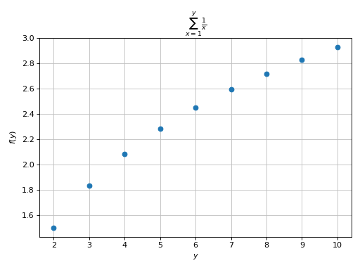
Plotting a summation in which the free symbol of the expression is used in the lower/upper bounds. Here, the discretization variable must assume integer values:
>>> expr = Sum(1 / x, (x, 1, y))
>>> plot(expr, (y, 2, 10),
...     is_scatter=True, is_filled=True, title="$%s$" % latex(expr))
Plot object containing:
[0]: cartesian line: Sum(1/x, (x, 1, y)) for y over (2, 10)
(
Source code,png)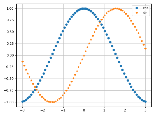
Detect essential singularities and visualize them with vertical lines. Also, apply a tick formatter on the x-axis is order to show ticks at multiples of pi/2:
>>> import numpy as np
>>> from spb import multiples_of_pi_over_2
>>> plot(tan(x), (x, -1.5*pi, 1.5*pi),
...      detect_poles="symbolic", ylim=(-7, 7),
...      xlabel="x [deg]", grid=False,
...      x_ticks_formatter=multiples_of_pi_over_2())
Plot object containing:
[0]: cartesian line: tan(x) for x over (-1.5*pi, 1.5*pi)
(
Source code,png)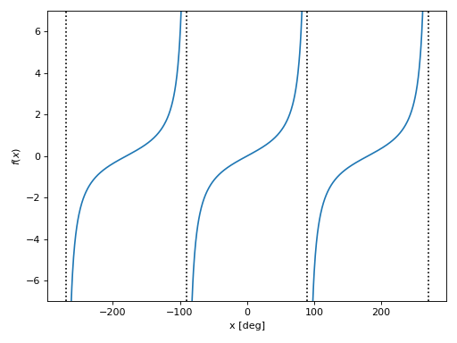
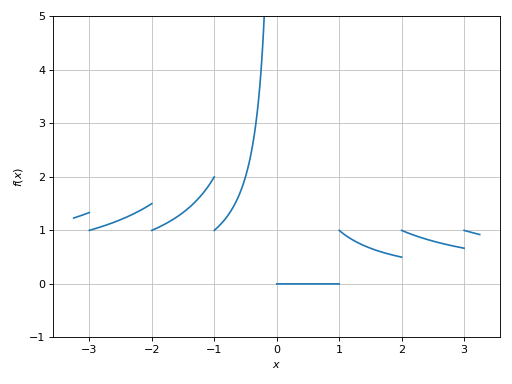
Introducing discontinuities by excluding specified points:
>>> plot(floor(x) / x, (x, -3.25, 3.25), ylim=(-1, 5),
...     exclude=list(range(-4, 5)))
Plot object containing:
[0]: cartesian line: floor(x)/x for x over (-3.25000000000000, 3.25000000000000)
(
Source code,png)
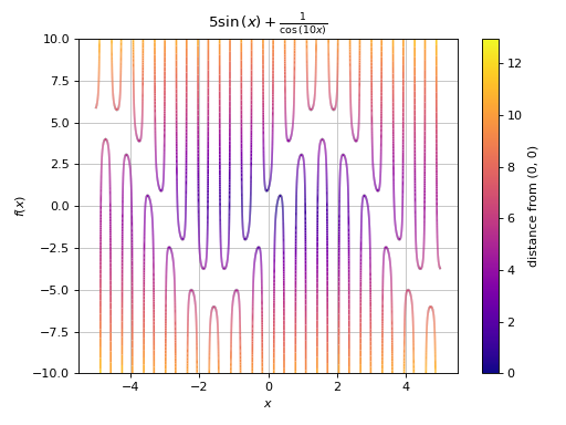
Advanced example showing:
detect singularities by setting increasing the number of discretization points (in order to have ‘vertical’ segments on the lines) and reducing the threshold for the singularity-detection algorithm.
application of color function.
>>> import numpy as np
>>> expr = 1 / cos(10 * x) + 5 * sin(x)
>>> def cf(x, y):
...     # map a colormap to the distance from the origin
...     d = np.sqrt(x**2 + y**2)
...     # visibility of the plot is limited: ylim=(-10, 10). However,
...     # some of the y-values computed by the function are much higher
...     # (or lower). Filter them out in order to have the entire
...     # colormap spectrum visible in the plot.
...     offset = 12 # 12 > 10 (safety margin)
...     d[(y > offset) | (y < -offset)] = 0
...     return d
>>> p1 = plot(expr, (x, -5, 5),
...         "distance from (0, 0)", {"cmap": "plasma"},
...         ylim=(-10, 10), detect_poles=True, n=3e04,
...         eps=1e-04, color_func=cf, title="$%s$" % latex(expr))
(
Source code,png)
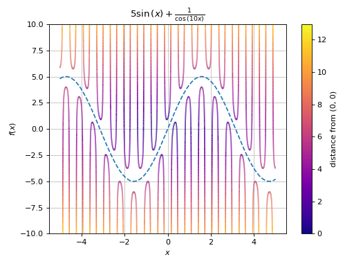
Combining multiple plots together:
>>> p2 = plot(5 * sin(x), (x, -5, 5), {"linestyle": "--"}, show=False)
>>> (p1 + p2).show()
(
Source code,png)
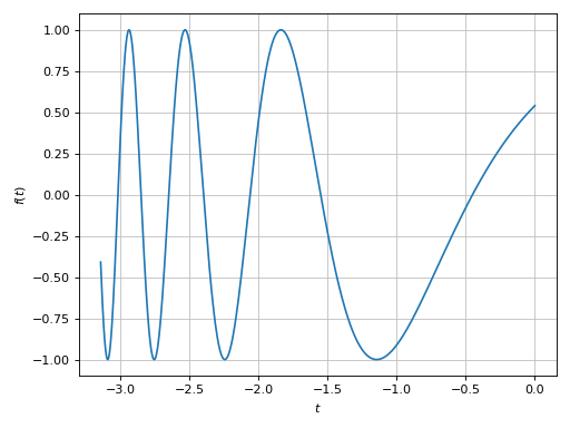
Plotting a numerical function instead of a symbolic expression:
>>> import numpy as np
>>> plot(lambda t: np.cos(np.exp(-t)), ("t", -pi, 0))
(
Source code,png)
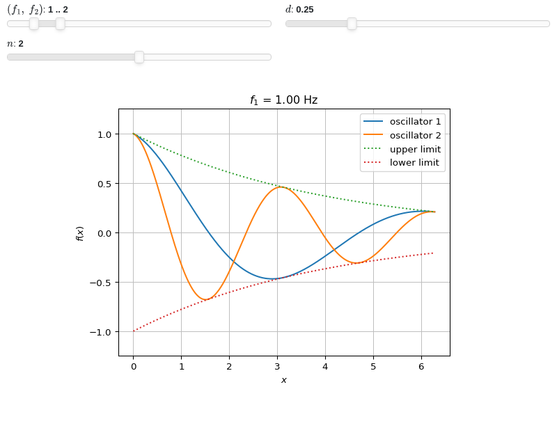
Interactive-widget plot of an oscillator. Refer to the interactive sub-module documentation to learn more about the
paramsdictionary. This plot illustrates:plotting multiple expressions, each one with its own label and rendering options.
the use of
prange(parametric plotting range).the use of the
paramsdictionary to specify sliders in their basic form: (default, min, max).the use of
panel.widgets.slider.RangeSlider, which is a 2-values widget. In this case it is used to enforce the condition f1 < f2.the use of a parametric title, specified with a tuple of the form:
(title_str, param_symbol1, ...), where:title_strmust be a formatted string, for example:"test = {:.2f}".param_symbol1, ...must be a symbol or a symbolic expression whose free symbols are contained in theparamsdictionary.
from sympy import *
from spb import *
import panel as pn
x, y, f1, f2, d, n = symbols("x, y, f_1, f_2, d, n")
plot(
    (cos(f1 * x) * exp(-d * x), "oscillator 1"),
    (cos(f2 * x) * exp(-d * x), "oscillator 2"),
    (exp(-d * x), "upper limit", {"linestyle": ":"}),
    (-exp(-d * x), "lower limit", {"linestyle": ":"}),
    prange(x, 0, n * pi),
    params={
        (f1, f2): pn.widgets.RangeSlider(value=(1, 2), start=0, end=10, step=0.1),     # frequency
        d: (0.25, 0, 1),   # damping
        n: (2, 0, 4)       # multiple of pi
    },
    ylim=(-1.25, 1.25),
    title=("$f_1$ = {:.2f} Hz", f1),
)
- spb.plot_functions.functions_2d.plot_implicit(*args, **kwargs)[source]
Plot implicit equations / inequalities.
plot_implicit, by default, generates a contour using a mesh grid of fixednumber of points. The greater the number of points, the better the results, but also the greater the memory used. By settingadaptive=True, interval arithmetic will be used to plot functions. If the expression cannot be plotted using interval arithmetic, it defaults to generating a contour using a mesh grid. With interval arithmetic, the line width can become very small; in those cases, it is better to use the mesh grid approach.Typical usage examples are in the following:
Plot a single expression:
plot_implicit(expr, range_x, range_y)
Plot multiple expressions over the same ranges:
plot_implicit(expr1, expr2, range_x, range_y)
Plot multiple expressions over different ranges:
plot_implicit(
   (expr1, range_x1, range_y1, label1 [opt]),
   (expr2, range_x2, range_y2, label2 [opt]))
- Parameters:
- fRelational, Boolean, Expr
The equation / inequality that is to be plotted.
- range_xtuple, Tuple
A 3-tuple (symb, min, max) denoting the range of the x variable. Default values: min=-10 and max=10.
- range_ytuple, Tuple
A 3-tuple (symb, min, max) denoting the range of the y variable. Default values: min=-10 and max=10.
- labelstr
Set the label associated to this series, which will be eventually shown on the legend or colorbar.
- adaptivebool
Select the evaluation strategy to be used. If
False, the internal algorithm uses a mesh grid approach. In such case, Boolean combinations of expressions cannot be plotted. IfTrue, the internal algorithm uses interval arithmetic. If the expression cannot be plotted with interval arithmetic, it switches to the meshgrid approach. Default value: False.- aspectstr, tuple, list, dict
Set the aspect ratio.
Possible values for Matplotlib (only works for a 2D plot):
"auto": Matplotlib will fit the plot in the vibile area."equal": sets equal spacing.tuple containing 2 float numbers, from which the aspect ratio is computed. This only works for 2D plots.
Possible values for Plotly:
"equal": sets equal spacing on the axis of a 2D plot.For 3D plots:
"cube": fix the ratio to be a cube"data": draw axes in proportion of their ranges"auto": automatically produce something that is well proportioned using ‘data’ as the default.manually set the aspect ratio by providing a dictionary. For example:
dict(x=1, y=1, z=2)forces the z-axis to appear twice as big as the other two.
Possible values for Bokeh:
"equal": sets equal spacing.
- ax
An existing Matplotlib’s Axes over which the symbolic expressions will be plotted.
- axisbool
Show the axis in the figure. Default value: True.
- axis_centerstr, tuple
Set the location of the intersection between the horizontal and vertical axis in a 2D plot. It only works with Matplotlib and it can receive the following values:
None: traditional layout, with the horizontal axis fixed on the bottom and the vertical axis fixed on the left. This is the default value.a tuple
(x, y)specifying the exact intersection point.'center': center of the current plot area.'auto': the intersection point is automatically computed.
- camera
Set the camera position for 3D plots.
For Matplotlib, it can be a dictionary of keyword arguments that will be passed to the
Axes3D.view_initmethod. Refer to the following link for more information: https://matplotlib.org/stable/api/_as_gen/mpl_toolkits.mplot3d.axes3d.Axes3D.html#mpl_toolkits.mplot3d.axes3d.Axes3D.view_initFor Plotly, it can be a dictionary of keyword arguments that will be passed to the layout’s
scene_camera. Refer to the following link for more information: https://plotly.com/python/3d-camera-controls/For K3D-Jupyter, it is list of 9 numbers, namely:
x_cam, y_cam, z_cam: the position of the camera in the scenex_tar, y_tar, z_tar: the position of the target of the camerax_up, y_up, z_up: components of the up vector
- colorbarbool
Toggle the visibility of the colorbar associated to the current data series. Note that a colorbar is only visible if
use_cm=Trueandcolor_funcis not None. Default value: True.- colorlooplist, tuple
List of colors to be used in line plots or solid color surfaces.
- colormapslist, tuple
List of color maps to render surfaces.
- cyclic_colormapslist, tuple
List of cyclic color maps to render complex series (the phase/argument ranges over [-pi, pi]).
- depthint
The depth of recursion for adaptive grid. Think of the resulting plot as a picture composed by pixels. Increasing
depthwill increase the number of pixels, thus obtaining a more accurate plot, at the cost of evaluation speed and possibly readability (if the figure has small size). It must be: 0 ≤ depth ≤ 4. Default value: 0.- fig
Get or set the figure where to plot into.
- force_real_evalbool
By default, numerical evaluation is performed over complex numbers, which is slower but produces correct results. However, when the symbolic expression is converted to a numerical function with lambdify, the resulting function may not like to be evaluated over complex numbers. In such cases, forcing the evaluation to be performed over real numbers might be a good choice. The plotting module should be able to detect such occurences and automatically activate this option. If that is not the case, or evaluation performance is of paramount importance, set this parameter to True, but be aware that it might produce wrong results. Default value: False.
- gridbool, dict
Toggle the visibility of major grid lines. A dictionary of keyword arguments can be passed to customized the appearance of the grid lines:
- hookslist
List of functions expecting one argument, the current plot object, which allows users to further customize the appearance of the plot before it is shown on the screen. The hooks are executed:
after the figure has been initialized and populated with numerical data.
after the existing renderers update the visualization because the user interacted with some widget.
Note: let
pbe the plot object. Then, the user can access the figure withp.fig. In case ofspb.backends.matplotlib.MatplotlibBackend, the user can also retrieve the axes in which data was added withp.ax.- legendbool
Toggle the visibility of the legend. If None, the backend will automatically determine if it is appropriate to show it. Default value: None.
- minor_gridbool, dict
Toggle the visibility of minor grid lines. A dictionary of keyword arguments can be passed to customized the appearance of the grid lines:
- modules
Specify the evaluation modules to be used by lambdify. If not specified, the evaluation will be done with NumPy/SciPy.
- n1int
Number of discretization points along the x-axis to be used in the evaluation, when
adaptive=False. Related parameters:adaptive, xscale. It must be: 2 ≤ n1 < ∞. Default value: 100.- n2int
Number of discretization points along the y-axis to be used in the evaluation, when
adaptive=False. Related parameters:adaptive, yscale. It must be: 2 ≤ n2 < ∞. Default value: 100.- only_integersbool
Discretize the domain using only integer numbers. When this parameter is True, the number of discretization points is choosen by the algorithm. Default value: False.
- paramsdict, optional
A dictionary mapping symbols to parameters. If provided, this dictionary enables the interactive-widgets plot.
When calling a plotting function, the parameter can be specified with:
a widget from the
ipywidgetsmodule.a widget from the
panelmodule.- a tuple of the form:
(default, min, max, N, tick_format, label, spacing), which will instantiate a
ipywidgets.widgets.widget_float.FloatSlideror aipywidgets.widgets.widget_float.FloatLogSlider, depending on the spacing strategy. In particular:- default, min, maxfloat
Default value, minimum value and maximum value of the slider, respectively. Must be finite numbers. The order of these 3 numbers is not important: the module will figure it out which is what.
- Nint, optional
Number of steps of the slider.
- tick_formatstr or None, optional
Provide a formatter for the tick value of the slider. Default to
".2f".
- label: str, optional
Custom text associated to the slider.
- spacingstr, optional
Specify the discretization spacing. Default to
"linear", can be changed to"log".
Notes:
parameters cannot be linked together (ie, one parameter cannot depend on another one).
If a widget returns multiple numerical values (like
panel.widgets.slider.RangeSlideroripywidgets.widgets.widget_float.FloatRangeSlider), then a corresponding number of symbols must be provided.
Here follows a couple of examples. If
imodule="panel":import panel as pn params = { a: (1, 0, 5), # slider from 0 to 5, with default value of 1 b: pn.widgets.FloatSlider(value=1, start=0, end=5), # same slider as above (c, d): pn.widgets.RangeSlider(value=(-1, 1), start=-3, end=3, step=0.1) }
Or with
imodule="ipywidgets":import ipywidgets as w params = { a: (1, 0, 5), # slider from 0 to 5, with default value of 1 b: w.FloatSlider(value=1, min=0, max=5), # same slider as above (c, d): w.FloatRangeSlider(value=(-1, 1), min=-3, max=3, step=0.1) }
When instantiating a data series directly,
paramsmust be a dictionary mapping symbols to numerical values.Let
seriesbe any data series. Thenseries.paramsreturns a dictionary mapping symbols to numerical values.- polar_axisbool
If True, the backend will attempt to use polar axis, otherwise it uses cartesian axis. This is only supported for 2D plots. Default value: False.
- rendering_kwdict
A dictionary of keyword arguments to be passed to the renderers in order to further customize the appearance of the contour. Here are some useful links for the supported plotting libraries:
- show_in_legendbool
Toggle the visibility of the data series on the legend. Default value: True.
- size
Set the size of the plot, (width, height). For Matplotlib, the size is measured in inches. For Bokeh, Plotly and K3D-Jupyter, the size is in pixel.
- sum_boundint
When plotting sums, the expression will be pre-processed in order to replace lower/upper bounds set to +/- infinity with this +/- numerical value. Note: the higher this number, the slower the evaluation, but the more accurate the plot. It must be: 0 ≤ sum_bound < ∞. Default value: 1000.
- themestr
Theme to be used to style the figure. Depending on the backend being used, several themes may be available.
- title
Title of the plot. It can be:
a string.
a callable receiving a single argument, use_latex, which must return a string.
a tuple of the form (format_str, symbol 1, symbol 2, etc.), which creates an output string when parameters symbol 1, symbol 2, etc. receive numerical values from the widgets. This operation mode only works when creating interactive data series (ie, specifying the
paramsdictionary).
- update_eventbool
If True and the backend supports such functionality, events like drag and zoom will trigger a recompute of the data series within the new axis limits. Default value: False.
- use_cmbool
Toggle the use of a colormap. By default, some series might use a colormap to display the necessary data. Setting this attribute to False will inform the associated renderer to use solid color. Related parameters:
color_func. Default value: False.- use_latexbool
Turn on/off the rendering of latex labels. If the backend doesn’t support latex, it will render the string representations instead. Default value: True.
- x_ticks_formattertick_formatter_multiples_of
An object of type
tick_formatter_multiples_ofwhich will be used to place tick values at each multiple of a specified quantity, along the x-axis.- xlabel
Label of the x-axis. It can be:
a string.
a callable receiving a single argument, use_latex, which must return a string.
a tuple of the form (format_str, symbol 1, symbol 2, etc.), which creates an output string when parameters symbol 1, symbol 2, etc. receive numerical values from the widgets. This operation mode only works when creating interactive data series (ie, specifying the
paramsdictionary).
- xlim
Limit the figure’s x-axis to the specified range. The tuple must be in the form (min_val, max_val).
- xscaleNoneType, str
If the backend supports it, the x-direction will use the specified scale. Note that none of the backends support logarithmic scale for 3D plots. Possible options: [‘linear’, ‘log’, None] Default value: ‘linear’.
- y_ticks_formattertick_formatter_multiples_of
An object of type
tick_formatter_multiples_ofwhich will be used to place tick values at each multiple of a specified quantity, along the y-axis.- ylabel
Label of the y-axis. It can be:
a string.
a callable receiving a single argument, use_latex, which must return a string.
a tuple of the form (format_str, symbol 1, symbol 2, etc.), which creates an output string when parameters symbol 1, symbol 2, etc. receive numerical values from the widgets. This operation mode only works when creating interactive data series (ie, specifying the
paramsdictionary).
- ylim
Limit the figure’s y-axis to the specified range. The tuple must be in the form (min_val, max_val).
- yscaleNoneType, str
If the backend supports it, the y-direction will use the specified scale. Note that none of the backends support logarithmic scale for 3D plots. Possible options: [‘linear’, ‘log’, None] Default value: ‘linear’.
- zlabel
Label of the z-axis. It can be:
a string.
a callable receiving a single argument, use_latex, which must return a string.
a tuple of the form (format_str, symbol 1, symbol 2, etc.), which creates an output string when parameters symbol 1, symbol 2, etc. receive numerical values from the widgets. This operation mode only works when creating interactive data series (ie, specifying the
paramsdictionary).
- zlim
Limit the figure’s z-axis to the specified range. The tuple must be in the form (min_val, max_val).
- zscaleNoneType, str
If the backend supports it, the z-direction will use the specified scale. Note that none of the backends support logarithmic scale for 3D plots. Possible options: [‘linear’, ‘log’, None] Default value: ‘linear’.
See also
Examples
Plot expressions:
>>> from sympy import symbols, Ne, Eq, And, sin, cos, pi, log, latex
>>> from spb import plot_implicit
>>> x, y = symbols('x y')
Providing only the symbol for the horizontal axis:
>>> p = plot_implicit(x - 1, x)
(
Source code,png)
Specify both ranges, set the number of discretization points and plot a region:
>>> plot_implicit(y > x**2, (x, -5, 5), (y, -10, 10), n=150, grid=False)
Plot object containing:
[0]: Implicit expression: y > x**2 for x over (-5, 5) and y over (-10, 10)
(
Source code,png)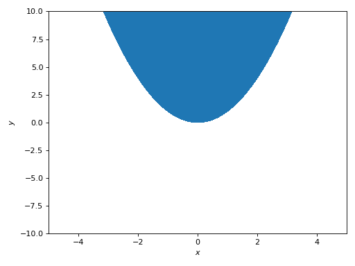
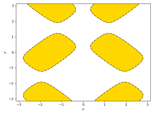
Plot a region using a custom color, highlights the limiting border and customize its appearance. In this particular case, the content of
rendering_kwwill be sent to matplotlib’scontourofcontourfcommands.>>> expr = 4 * (cos(x) - sin(y) / 5)**2 + 4 * (-cos(x) / 5 + sin(y))**2 >>> plot_implicit(expr <= pi, (x, -pi, pi), (y, -pi, pi), ... grid=False, color="gold", border_color="k", ... rendering_kw={"linestyles": "-.", "linewidths": 1}) Plot object containing: [0]: Implicit expression: 4*(-sin(y)/5 + cos(x))**2 + 4*(sin(y) - cos(x)/5)**2 <= pi for x over (-pi, pi) and y over (-pi, pi) [1]: Implicit expression: Eq(-4*(-sin(y)/5 + cos(x))**2 - 4*(sin(y) - cos(x)/5)**2 + pi, 0) for x over (-pi, pi) and y over (-pi, pi)
(
Source code,png)
Boolean expressions will be plotted with the adaptive algorithm. Note the thin width of lines:
>>> plot_implicit(
...     Eq(y, sin(x)) & (y > 0),
...     Eq(y, sin(x)) & (y < 0),
...     (x, -2 * pi, 2 * pi), (y, -4, 4))
Plot object containing:
[0]: Implicit expression: (y > 0) & Eq(y, sin(x)) for x over (-2*pi, 2*pi) and y over (-4, 4)
[1]: Implicit expression: (y < 0) & Eq(y, sin(x)) for x over (-2*pi, 2*pi) and y over (-4, 4)
(
Source code,png)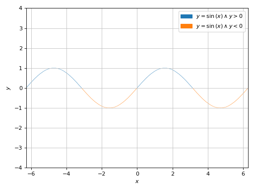
Plotting multiple implicit expressions and setting labels:
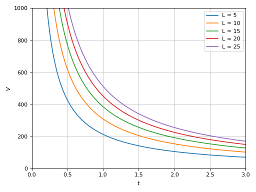
>>> V, t, b, L = symbols("V, t, b, L")
>>> L_array = [5, 10, 15, 20, 25]
>>> b_val = 0.0032
>>> expr = b * V * 0.277 * t - b * L - log(1 + b * V * 0.277 * t)
>>> expr_list = [expr.subs({b: b_val, L: L_val}) for L_val in L_array]
>>> labels = ["L = %s" % L_val for L_val in L_array]
>>> plot_implicit(*expr_list, (t, 0, 3), (V, 0, 1000), label=labels)
Plot object containing:
[0]: Implicit expression: Eq(0.0008864*V*t - log(0.0008864*V*t + 1) - 0.016, 0) for t over (0, 3) and V over (0, 1000)
[1]: Implicit expression: Eq(0.0008864*V*t - log(0.0008864*V*t + 1) - 0.032, 0) for t over (0, 3) and V over (0, 1000)
[2]: Implicit expression: Eq(0.0008864*V*t - log(0.0008864*V*t + 1) - 0.048, 0) for t over (0, 3) and V over (0, 1000)
[3]: Implicit expression: Eq(0.0008864*V*t - log(0.0008864*V*t + 1) - 0.064, 0) for t over (0, 3) and V over (0, 1000)
[4]: Implicit expression: Eq(0.0008864*V*t - log(0.0008864*V*t + 1) - 0.08, 0) for t over (0, 3) and V over (0, 1000)
(
Source code,png)
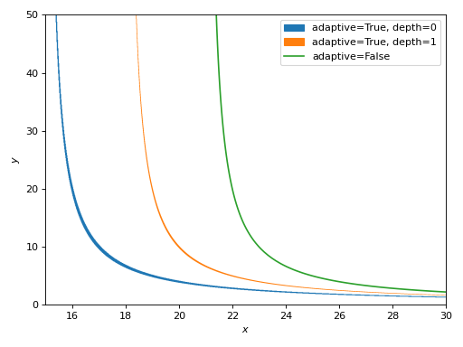
Comparison of similar expressions plotted with different algorithms. Note:
Adaptive algorithm (
adaptive=True) can be used with any expression, but it usually creates lines with variable thickness. Thedepthkeyword argument can be used to improve the accuracy, but reduces line thickness even further.Mesh grid algorithm (
adaptive=False) creates lines with constant thickness.
>>> expr1 = Eq(x * y - 20, 15 * y)
>>> expr2 = Eq((x - 3) * y - 20, 15 * y)
>>> expr3 = Eq((x - 6) * y - 20, 15 * y)
>>> ranges = (x, 15, 30), (y, 0, 50)
>>> p1 = plot_implicit(expr1, *ranges, adaptive=True, depth=0,
...     label="adaptive=True, depth=0", grid=False, show=False)
>>> p2 = plot_implicit(expr2, *ranges, adaptive=True, depth=1,
...     label="adaptive=True, depth=1", grid=False, show=False)
>>> p3 = plot_implicit(expr3, *ranges, adaptive=False,
...     label="adaptive=False", grid=False, show=False)
>>> (p1 + p2 + p3).show()
(
Source code,png)
If the expression is plotted with the adaptive algorithm and it produces “low-quality” results, maybe it’s possible to rewrite it in order to use the mesh grid approach (contours). For example:
>>> from spb import plotgrid
>>> expr = Ne(x*y, 1)
>>> p1 = plot_implicit(
...     expr, (x, -10, 10), (y, -10, 10),
...     grid=False, aspect="equal", show=False,
...     title="$%s$ : First approach" % latex(expr))
>>> # plot the entire visible region
>>> p2 = plot_implicit(
...     x < 20, (x, -10, 10), (y, -10, 10),
...     show=False, grid=False, aspect="equal",
...     title="$%s$ : Second approach" % latex(expr))
>>> # plot the excluded contour
>>> p3 = plot_implicit(
...     Eq(*expr.args), (x, -10, 10), (y, -10, 10),
...     color="w", show_in_legend=False, show=False)
>>> plotgrid(p1, (p2 + p3), nc=2)
(
Source code,png)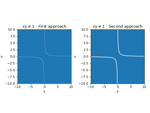
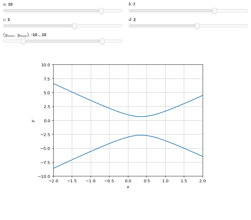
Interactive-widget implicit plot. Refer to the interactive sub-module documentation to learn more about the
paramsdictionary. This plot illustrates:the use of
prange(parametric plotting range).the use of the
paramsdictionary to specify sliders in their basic form: (default, min, max).the use of
panel.widgets.slider.RangeSlider, which is a 2-values widget.
from sympy import *
from spb import *
import panel as pn
x, y, a, b, c, d = symbols("x, y, a, b, c, d")
y_min, y_max = symbols("y_min, y_max")
expr = Eq(a * x**2 - b * x + c, d * y + y**2)
plot_implicit(expr, (x, -2, 2), prange(y, y_min, y_max),
    params={
        a: (10, -15, 15),
        b: (7, -15, 15),
        c: (3, -15, 15),
        d: (2, -15, 15),
        (y_min, y_max): pn.widgets.RangeSlider(
            value=(-10, 10), start=-15, end=15, step=0.1)
    }, n=150, ylim=(-10, 10))
- spb.plot_functions.functions_2d.plot_parametric(*args, **kwargs)[source]
Plots a 2D parametric curve.
Typical usage examples are in the followings:
Plotting a single parametric curve with a range:
plot_parametric(expr_x, expr_y, range)
Plotting multiple parametric curves with the same range:
plot_parametric(
   (expr_x1, expr_y1), (expr_x2, expr_y2), ..., range)
Plotting multiple curves with different ranges, custom labels and rendering options:
plot_parametric(
   (expr_x1, expr_y1, range1, label1 [opt], rendering_kw1 [opt]),
   (expr_x2, expr_y2, range2, label2 [opt], rendering_kw2 [opt]), ...)
- Parameters:
- expr_x
The expression representing the component along the x-axis of the parametric function. It can either be a symbolic expression representing the function of one variable to be plotted, or a numerical function of one variable, supporting vectorization. In the latter case the following keyword arguments are not supported:
params,sum_bound.- expr_y
The expression representing the component along the y-axis of the parametric function. It can either be a symbolic expression representing the function of one variable to be plotted, or a numerical function of one variable, supporting vectorization. In the latter case the following keyword arguments are not supported:
params,sum_bound.- range_ptuple, Tuple
A 3-tuple (symb, min, max) denoting the range of the parameter. Default values: min=-10 and max=10.
- labelstr
Set the label associated to this series, which will be eventually shown on the legend or colorbar.
- aspectstr, tuple, list, dict
Set the aspect ratio.
Possible values for Matplotlib (only works for a 2D plot):
"auto": Matplotlib will fit the plot in the vibile area."equal": sets equal spacing.tuple containing 2 float numbers, from which the aspect ratio is computed. This only works for 2D plots.
Possible values for Plotly:
"equal": sets equal spacing on the axis of a 2D plot.For 3D plots:
"cube": fix the ratio to be a cube"data": draw axes in proportion of their ranges"auto": automatically produce something that is well proportioned using ‘data’ as the default.manually set the aspect ratio by providing a dictionary. For example:
dict(x=1, y=1, z=2)forces the z-axis to appear twice as big as the other two.
Possible values for Bokeh:
"equal": sets equal spacing.
- ax
An existing Matplotlib’s Axes over which the symbolic expressions will be plotted.
- axisbool
Show the axis in the figure. Default value: True.
- axis_centerstr, tuple
Set the location of the intersection between the horizontal and vertical axis in a 2D plot. It only works with Matplotlib and it can receive the following values:
None: traditional layout, with the horizontal axis fixed on the bottom and the vertical axis fixed on the left. This is the default value.a tuple
(x, y)specifying the exact intersection point.'center': center of the current plot area.'auto': the intersection point is automatically computed.
- camera
Set the camera position for 3D plots.
For Matplotlib, it can be a dictionary of keyword arguments that will be passed to the
Axes3D.view_initmethod. Refer to the following link for more information: https://matplotlib.org/stable/api/_as_gen/mpl_toolkits.mplot3d.axes3d.Axes3D.html#mpl_toolkits.mplot3d.axes3d.Axes3D.view_initFor Plotly, it can be a dictionary of keyword arguments that will be passed to the layout’s
scene_camera. Refer to the following link for more information: https://plotly.com/python/3d-camera-controls/For K3D-Jupyter, it is list of 9 numbers, namely:
x_cam, y_cam, z_cam: the position of the camera in the scenex_tar, y_tar, z_tar: the position of the target of the camerax_up, y_up, z_up: components of the up vector
- color_func
Define a custom color mapping when
use_cm=True. It can either be:A numerical function supporting vectorization. The arity can be:
1 argument:
f(t), wheretis the parameter.2 arguments:
f(x, y)wherex, yare the coordinates of the points.3 arguments:
f(x, y, t).
A symbolic expression having at most as many free symbols as
expr_xorexpr_y.None: the default value (color mapping according to the parameter).
Alias of this parameters:
tp.- colorbarbool
Toggle the visibility of the colorbar associated to the current data series. Note that a colorbar is only visible if
use_cm=Trueandcolor_funcis not None. Default value: True.- colorbar_ticks_formattertick_formatter_multiples_of
An object of type
tick_formatter_multiples_ofwhich will be used to place tick values on the colorbar at each multiple of a specified quantity. This only works when use_cm=True.- colorlooplist, tuple
List of colors to be used in line plots or solid color surfaces.
- colormapslist, tuple
List of color maps to render surfaces.
- cyclic_colormapslist, tuple
List of cyclic color maps to render complex series (the phase/argument ranges over [-pi, pi]).
- detect_polesbool, str
Chose whether to detect and correctly plot the roots of the denominator. There are two algorithms at work:
based on the gradient of the numerical data, it introduces NaN values at locations where the steepness is greater than some threshold. This splits the line into multiple segments. To improve detection, increase the number of discretization points
nand/or change the value ofeps. This algorithm can be used to visualize jump discontinuities as well as essential discontinuities.a symbolic approach based on the
continuous_domainfunction from thesympy.calculus.utilmodule, which computes the locations of essential discontinuities. If any are found, vertical lines will be shown.
Possible options:
False: No poles detection
True: Poles detection with the numerical algorithm
‘symbolic’: Poles detection with numerical and symbolic algorithms
Default value: False.
- epsfloat
An arbitrary small value used by the
detect_polesnumerical algorithm. Before changing this value, it is recommended to increase the number of discretization points. Related parameters:detect_poles. It must be: 0 ≤ eps < ∞. Default value: 0.01.- excludelist
A list of numerical values along the parameter which are going to be excluded from the evaluation. In practice, it introduces discontinuities in the resulting line.
- fig
Get or set the figure where to plot into.
- force_real_evalbool
By default, numerical evaluation is performed over complex numbers, which is slower but produces correct results. However, when the symbolic expression is converted to a numerical function with lambdify, the resulting function may not like to be evaluated over complex numbers. In such cases, forcing the evaluation to be performed over real numbers might be a good choice. The plotting module should be able to detect such occurences and automatically activate this option. If that is not the case, or evaluation performance is of paramount importance, set this parameter to True, but be aware that it might produce wrong results. Default value: False.
- gridbool, dict
Toggle the visibility of major grid lines. A dictionary of keyword arguments can be passed to customized the appearance of the grid lines:
- hookslist
List of functions expecting one argument, the current plot object, which allows users to further customize the appearance of the plot before it is shown on the screen. The hooks are executed:
after the figure has been initialized and populated with numerical data.
after the existing renderers update the visualization because the user interacted with some widget.
Note: let
pbe the plot object. Then, the user can access the figure withp.fig. In case ofspb.backends.matplotlib.MatplotlibBackend, the user can also retrieve the axes in which data was added withp.ax.- is_filledbool
Whether scatter’s markers are filled or void. Default value: True.
- is_scatterbool
If True it represent a scatter plot, otherwise a continuous line. Default value: False.
- legendbool
Toggle the visibility of the legend. If None, the backend will automatically determine if it is appropriate to show it. Default value: None.
- line_color
For back-compatibility with old sympy.plotting. Use
rendering_kwin order to fully customize the appearance of the line/scatter.- minor_gridbool, dict
Toggle the visibility of minor grid lines. A dictionary of keyword arguments can be passed to customized the appearance of the grid lines:
- modules
Specify the evaluation modules to be used by lambdify. If not specified, the evaluation will be done with NumPy/SciPy.
- n1int
Number of discretization points along the parameter to be used in the evaluation. An alias of this parameter is
n. Related parameters:xscale. It must be: 2 ≤ n1 < ∞. Default value: 1000.- only_integersbool
Discretize the domain using only integer numbers. When this parameter is True, the number of discretization points is choosen by the algorithm. Default value: False.
- paramsdict, optional
A dictionary mapping symbols to parameters. If provided, this dictionary enables the interactive-widgets plot.
When calling a plotting function, the parameter can be specified with:
a widget from the
ipywidgetsmodule.a widget from the
panelmodule.- a tuple of the form:
(default, min, max, N, tick_format, label, spacing), which will instantiate a
ipywidgets.widgets.widget_float.FloatSlideror aipywidgets.widgets.widget_float.FloatLogSlider, depending on the spacing strategy. In particular:- default, min, maxfloat
Default value, minimum value and maximum value of the slider, respectively. Must be finite numbers. The order of these 3 numbers is not important: the module will figure it out which is what.
- Nint, optional
Number of steps of the slider.
- tick_formatstr or None, optional
Provide a formatter for the tick value of the slider. Default to
".2f".
- label: str, optional
Custom text associated to the slider.
- spacingstr, optional
Specify the discretization spacing. Default to
"linear", can be changed to"log".
Notes:
parameters cannot be linked together (ie, one parameter cannot depend on another one).
If a widget returns multiple numerical values (like
panel.widgets.slider.RangeSlideroripywidgets.widgets.widget_float.FloatRangeSlider), then a corresponding number of symbols must be provided.
Here follows a couple of examples. If
imodule="panel":import panel as pn params = { a: (1, 0, 5), # slider from 0 to 5, with default value of 1 b: pn.widgets.FloatSlider(value=1, start=0, end=5), # same slider as above (c, d): pn.widgets.RangeSlider(value=(-1, 1), start=-3, end=3, step=0.1) }
Or with
imodule="ipywidgets":import ipywidgets as w params = { a: (1, 0, 5), # slider from 0 to 5, with default value of 1 b: w.FloatSlider(value=1, min=0, max=5), # same slider as above (c, d): w.FloatRangeSlider(value=(-1, 1), min=-3, max=3, step=0.1) }
When instantiating a data series directly,
paramsmust be a dictionary mapping symbols to numerical values.Let
seriesbe any data series. Thenseries.paramsreturns a dictionary mapping symbols to numerical values.- polar_axisbool
If True, the backend will attempt to use polar axis, otherwise it uses cartesian axis. This is only supported for 2D plots. Default value: False.
- rendering_kwdict
A dictionary of keyword arguments to be passed to the renderers in order to further customize the appearance of the line. Here are some useful links for the supported plotting libraries:
Matplotlib:
for solid lines: https://matplotlib.org/stable/api/_as_gen/matplotlib.pyplot.plot.html
for colormap-based lines: https://matplotlib.org/stable/api/collections_api.html#matplotlib.collections.LineCollection
for scatters: https://matplotlib.org/stable/api/_as_gen/matplotlib.pyplot.scatter.html
Bokeh:
- show_in_legendbool
Toggle the visibility of the data series on the legend. Default value: True.
- size
Set the size of the plot, (width, height). For Matplotlib, the size is measured in inches. For Bokeh, Plotly and K3D-Jupyter, the size is in pixel.
- sum_boundint
When plotting sums, the expression will be pre-processed in order to replace lower/upper bounds set to +/- infinity with this +/- numerical value. Note: the higher this number, the slower the evaluation, but the more accurate the plot. It must be: 0 ≤ sum_bound < ∞. Default value: 1000.
- themestr
Theme to be used to style the figure. Depending on the backend being used, several themes may be available.
- title
Title of the plot. It can be:
a string.
a callable receiving a single argument, use_latex, which must return a string.
a tuple of the form (format_str, symbol 1, symbol 2, etc.), which creates an output string when parameters symbol 1, symbol 2, etc. receive numerical values from the widgets. This operation mode only works when creating interactive data series (ie, specifying the
paramsdictionary).
- txcallable
Numerical transformation function to be applied to the data on the x-axis.
- tycallable
Numerical transformation function to be applied to the data on the y-axis.
- update_eventbool
If True and the backend supports such functionality, events like drag and zoom will trigger a recompute of the data series within the new axis limits. Default value: False.
- use_cmbool
Toggle the use of a colormap. By default, some series might use a colormap to display the necessary data. Setting this attribute to False will inform the associated renderer to use solid color. Related parameters:
color_func. Default value: False.- use_latexbool
Turn on/off the rendering of latex labels. If the backend doesn’t support latex, it will render the string representations instead. Default value: True.
- x_ticks_formattertick_formatter_multiples_of
An object of type
tick_formatter_multiples_ofwhich will be used to place tick values at each multiple of a specified quantity, along the x-axis.- xlabel
Label of the x-axis. It can be:
a string.
a callable receiving a single argument, use_latex, which must return a string.
a tuple of the form (format_str, symbol 1, symbol 2, etc.), which creates an output string when parameters symbol 1, symbol 2, etc. receive numerical values from the widgets. This operation mode only works when creating interactive data series (ie, specifying the
paramsdictionary).
- xlim
Limit the figure’s x-axis to the specified range. The tuple must be in the form (min_val, max_val).
- xscaleNoneType, str
If the backend supports it, the x-direction will use the specified scale. Note that none of the backends support logarithmic scale for 3D plots. Possible options: [‘linear’, ‘log’, None] Default value: ‘linear’.
- y_ticks_formattertick_formatter_multiples_of
An object of type
tick_formatter_multiples_ofwhich will be used to place tick values at each multiple of a specified quantity, along the y-axis.- ylabel
Label of the y-axis. It can be:
a string.
a callable receiving a single argument, use_latex, which must return a string.
a tuple of the form (format_str, symbol 1, symbol 2, etc.), which creates an output string when parameters symbol 1, symbol 2, etc. receive numerical values from the widgets. This operation mode only works when creating interactive data series (ie, specifying the
paramsdictionary).
- ylim
Limit the figure’s y-axis to the specified range. The tuple must be in the form (min_val, max_val).
- yscaleNoneType, str
If the backend supports it, the y-direction will use the specified scale. Note that none of the backends support logarithmic scale for 3D plots. Possible options: [‘linear’, ‘log’, None] Default value: ‘linear’.
- zlabel
Label of the z-axis. It can be:
a string.
a callable receiving a single argument, use_latex, which must return a string.
a tuple of the form (format_str, symbol 1, symbol 2, etc.), which creates an output string when parameters symbol 1, symbol 2, etc. receive numerical values from the widgets. This operation mode only works when creating interactive data series (ie, specifying the
paramsdictionary).
- zlim
Limit the figure’s z-axis to the specified range. The tuple must be in the form (min_val, max_val).
- zscaleNoneType, str
If the backend supports it, the z-direction will use the specified scale. Note that none of the backends support logarithmic scale for 3D plots. Possible options: [‘linear’, ‘log’, None] Default value: ‘linear’.
See also
Examples
>>> from sympy import symbols, cos, sin, pi, floor, log
>>> from spb import plot_parametric, multiples_of_pi
>>> t, u, v = symbols('t, u, v')
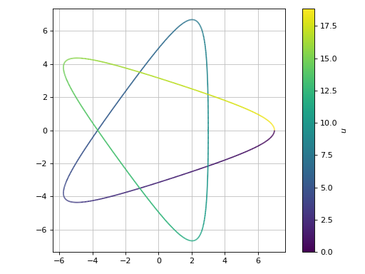
A parametric plot of a single expression (a Hypotrochoid using an equal aspect ratio), showing colorbar’s ticks at multiple of pi:
>>> plot_parametric(
...      2 * cos(u) + 5 * cos(2 * u / 3),
...      2 * sin(u) - 5 * sin(2 * u / 3),
...      (u, 0, 6 * pi), aspect="equal",
...      colorbar_ticks_formatter=multiples_of_pi())
Plot object containing:
[0]: parametric cartesian line: (5*cos(2*u/3) + 2*cos(u), -5*sin(2*u/3) + 2*sin(u)) for u over (0, 6*pi)
(
Source code,png)
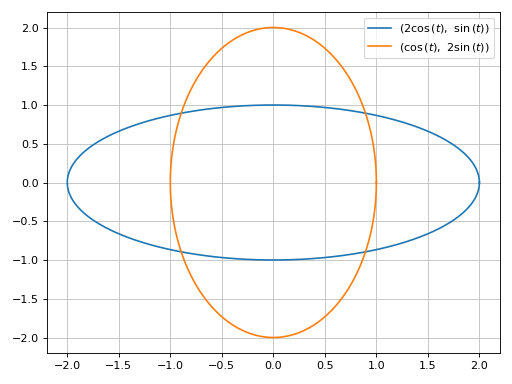
A parametric plot with multiple expressions with the same range with solid line colors:
>>> plot_parametric((2 * cos(t), sin(t)), (cos(t), 2 * sin(t)),
...    (t, 0, 2*pi), use_cm=False)
Plot object containing:
[0]: parametric cartesian line: (2*cos(t), sin(t)) for t over (0, 2*pi)
[1]: parametric cartesian line: (cos(t), 2*sin(t)) for t over (0, 2*pi)
(
Source code,png)
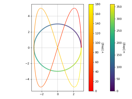
A parametric plot with multiple expressions with different ranges, custom labels, custom rendering options and a transformation function applied to the discretized parameter to convert radians to degrees:
>>> import numpy as np
>>> plot_parametric(
...      (3 * cos(u), 3 * sin(u), (u, 0, 2 * pi), "u [deg]", {"lw": 3}),
...      (3 * cos(2 * v), 5 * sin(4 * v), (v, 0, pi), "v [deg]"),
...      aspect="equal", tp=np.rad2deg)
Plot object containing:
[0]: parametric cartesian line: (3*cos(u), 3*sin(u)) for u over (0, 2*pi)
[1]: parametric cartesian line: (3*cos(2*v), 5*sin(4*v)) for v over (0, pi)
(
Source code,png)
Introducing discontinuities by excluding specified points:
>>> e1 = log(floor(t))*cos(t)
>>> e2 = log(floor(t))*sin(t)
>>> plot_parametric(e1, e2, (t, 1, 4*pi),
...     exclude=list(range(1, 13)), grid=False)
Plot object containing:
[0]: parametric cartesian line: (log(floor(t))*cos(t), log(floor(t))*sin(t)) for t over (1, 4*pi)
(
Source code,png)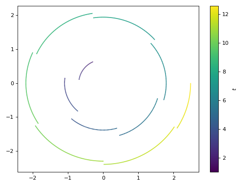
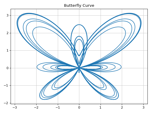
Plotting a numerical function instead of a symbolic expression:
>>> import numpy as np
>>> fx = lambda t: np.sin(t) * (np.exp(np.cos(t)) - 2 * np.cos(4 * t) - np.sin(t / 12)**5)
>>> fy = lambda t: np.cos(t) * (np.exp(np.cos(t)) - 2 * np.cos(4 * t) - np.sin(t / 12)**5)
>>> p = plot_parametric(fx, fy, ("t", 0, 12 * pi),
...     title="Butterfly Curve", use_cm=False, n=2000)
(
Source code,png)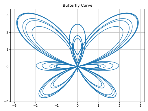
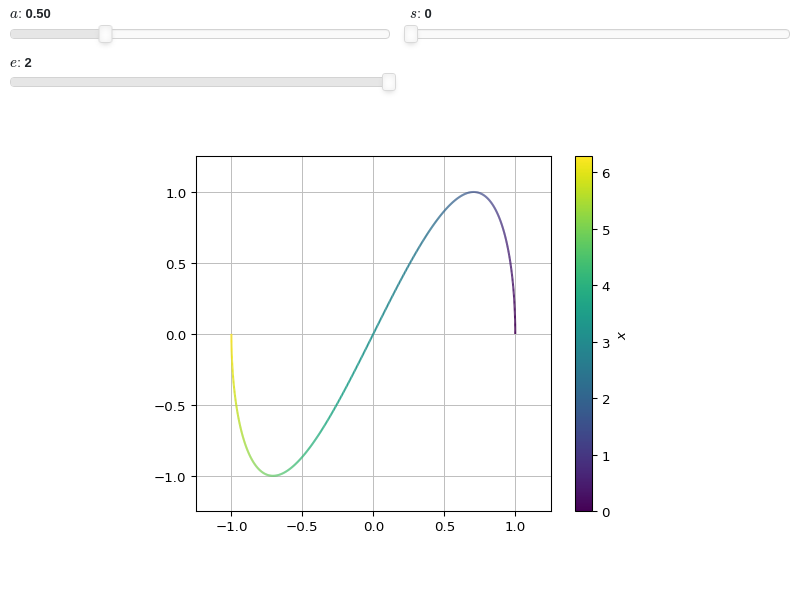
Interactive-widget plot. Refer to the interactive sub-module documentation to learn more about the
paramsdictionary. This plot illustrates:the use of
prange(parametric plotting range).the use of the
paramsdictionary to specify sliders in their basic form: (default, min, max).
from sympy import *
from spb import *
x, a, s, e = symbols("x a s, e")
plot_parametric(
    cos(a * x), sin(x), prange(x, s*pi, e*pi),
    params={
        a: (0.5, 0, 2),
        s: (0, 0, 2),
        e: (2, 0, 2),
    },
    aspect="equal",
    xlim=(-1.25, 1.25), ylim=(-1.25, 1.25)
)

- spb.plot_functions.functions_2d.plot_parametric_region(*args, **kwargs)[source]
Plots a 2D parametric region.
NOTE: this is an experimental plotting function as it only draws lines without fills. The resulting visualization might change when new features will be implemented.
Typical usage examples are in the followings:
Plotting a single parametric curve with a range:
plot_parametric(expr_x, expr_y, range_u, range_v)
Plotting multiple parametric curves with the same range:
plot_parametric((expr_x, expr_y), ..., range_u, range_v)
Plotting multiple parametric curves with different ranges:
plot_parametric((expr_x, expr_y, range_u, range_v), ...)
- Parameters:
- expr_x
The expression representing the component along the x-axis of the parametric function. It can either be a symbolic expression representing the function of one variable to be plotted, or a numerical function of one variable, supporting vectorization. In the latter case the following keyword arguments are not supported:
params,sum_bound.- expr_y
The expression representing the component along the y-axis of the parametric function. It can either be a symbolic expression representing the function of one variable to be plotted, or a numerical function of one variable, supporting vectorization. In the latter case the following keyword arguments are not supported:
params,sum_bound.- range_ptuple, Tuple
A 3-tuple (symb, min, max) denoting the range of the parameter. Default values: min=-10 and max=10.
- labelstr
Set the label associated to this series, which will be eventually shown on the legend or colorbar.
- args
- expr_x, expr_yExpr
The expression representing x and y component, respectively, of the parametric function. It can be a:
Symbolic expression representing the function of one variable to be plotted.
Numerical function of one variable, supporting vectorization. In this case the following keyword arguments are not supported:
params.
- range_u, range_v(symbol, min, max)
A 3-tuple denoting the parameter symbols, start and stop. For example, (u, 0, 5), (v, 0, 5). If the ranges are not specified, then they default to (-10, 10).
However, if the arguments are specified as (expr_x, expr_y, range_u, range_v), …, you must specify the ranges for each expressions manually.
- rendering_kwdict, optional
A dictionary of keywords/values which is passed to the backend’s function to customize the appearance of lines. Refer to the plotting library (backend) manual for more informations.
- aspect(float, float) or str, optional
Set the aspect ratio of the plot. The value depends on the backend being used. Read that backend’s documentation to find out the possible values.
- aspectstr, tuple, list, dict
Set the aspect ratio.
Possible values for Matplotlib (only works for a 2D plot):
"auto": Matplotlib will fit the plot in the vibile area."equal": sets equal spacing.tuple containing 2 float numbers, from which the aspect ratio is computed. This only works for 2D plots.
Possible values for Plotly:
"equal": sets equal spacing on the axis of a 2D plot.For 3D plots:
"cube": fix the ratio to be a cube"data": draw axes in proportion of their ranges"auto": automatically produce something that is well proportioned using ‘data’ as the default.manually set the aspect ratio by providing a dictionary. For example:
dict(x=1, y=1, z=2)forces the z-axis to appear twice as big as the other two.
Possible values for Bokeh:
"equal": sets equal spacing.
- ax
An existing Matplotlib’s Axes over which the symbolic expressions will be plotted.
- axisbool
Show the axis in the figure. Default value: True.
- axis_centerstr, tuple
Set the location of the intersection between the horizontal and vertical axis in a 2D plot. It only works with Matplotlib and it can receive the following values:
None: traditional layout, with the horizontal axis fixed on the bottom and the vertical axis fixed on the left. This is the default value.a tuple
(x, y)specifying the exact intersection point.'center': center of the current plot area.'auto': the intersection point is automatically computed.
- backendPlot, optional
A subclass of
Plot, which will perform the rendering. Default toMatplotlibBackend.- camera
Set the camera position for 3D plots.
For Matplotlib, it can be a dictionary of keyword arguments that will be passed to the
Axes3D.view_initmethod. Refer to the following link for more information: https://matplotlib.org/stable/api/_as_gen/mpl_toolkits.mplot3d.axes3d.Axes3D.html#mpl_toolkits.mplot3d.axes3d.Axes3D.view_initFor Plotly, it can be a dictionary of keyword arguments that will be passed to the layout’s
scene_camera. Refer to the following link for more information: https://plotly.com/python/3d-camera-controls/For K3D-Jupyter, it is list of 9 numbers, namely:
x_cam, y_cam, z_cam: the position of the camera in the scenex_tar, y_tar, z_tar: the position of the target of the camerax_up, y_up, z_up: components of the up vector
- color_func
Define a custom color mapping when
use_cm=True. It can either be:A numerical function supporting vectorization. The arity can be:
1 argument:
f(t), wheretis the parameter.2 arguments:
f(x, y)wherex, yare the coordinates of the points.3 arguments:
f(x, y, t).
A symbolic expression having at most as many free symbols as
expr_xorexpr_y.None: the default value (color mapping according to the parameter).
Alias of this parameters:
tp.- colorbarbool
Toggle the visibility of the colorbar associated to the current data series. Note that a colorbar is only visible if
use_cm=Trueandcolor_funcis not None. Default value: True.- colorbar_ticks_formattertick_formatter_multiples_of
An object of type
tick_formatter_multiples_ofwhich will be used to place tick values on the colorbar at each multiple of a specified quantity. This only works when use_cm=True.- colorlooplist, tuple
List of colors to be used in line plots or solid color surfaces.
- colormapslist, tuple
List of color maps to render surfaces.
- cyclic_colormapslist, tuple
List of cyclic color maps to render complex series (the phase/argument ranges over [-pi, pi]).
- detect_polesbool, str
Chose whether to detect and correctly plot the roots of the denominator. There are two algorithms at work:
based on the gradient of the numerical data, it introduces NaN values at locations where the steepness is greater than some threshold. This splits the line into multiple segments. To improve detection, increase the number of discretization points
nand/or change the value ofeps. This algorithm can be used to visualize jump discontinuities as well as essential discontinuities.a symbolic approach based on the
continuous_domainfunction from thesympy.calculus.utilmodule, which computes the locations of essential discontinuities. If any are found, vertical lines will be shown.
Possible options:
False: No poles detection
True: Poles detection with the numerical algorithm
‘symbolic’: Poles detection with numerical and symbolic algorithms
Default value: False.
- epsfloat
An arbitrary small value used by the
detect_polesnumerical algorithm. Before changing this value, it is recommended to increase the number of discretization points. Related parameters:detect_poles. It must be: 0 ≤ eps < ∞. Default value: 0.01.- excludelist
A list of numerical values along the parameter which are going to be excluded from the evaluation. In practice, it introduces discontinuities in the resulting line.
- fig
Get or set the figure where to plot into.
- force_real_evalbool
By default, numerical evaluation is performed over complex numbers, which is slower but produces correct results. However, when the symbolic expression is converted to a numerical function with lambdify, the resulting function may not like to be evaluated over complex numbers. In such cases, forcing the evaluation to be performed over real numbers might be a good choice. The plotting module should be able to detect such occurences and automatically activate this option. If that is not the case, or evaluation performance is of paramount importance, set this parameter to True, but be aware that it might produce wrong results. Default value: False.
- gridbool, dict
Toggle the visibility of major grid lines. A dictionary of keyword arguments can be passed to customized the appearance of the grid lines:
- hookslist
List of functions expecting one argument, the current plot object, which allows users to further customize the appearance of the plot before it is shown on the screen. The hooks are executed:
after the figure has been initialized and populated with numerical data.
after the existing renderers update the visualization because the user interacted with some widget.
Note: let
pbe the plot object. Then, the user can access the figure withp.fig. In case ofspb.backends.matplotlib.MatplotlibBackend, the user can also retrieve the axes in which data was added withp.ax.- is_filledbool
Whether scatter’s markers are filled or void. Default value: True.
- is_scatterbool
If True it represent a scatter plot, otherwise a continuous line. Default value: False.
- legendbool
Toggle the visibility of the legend. If None, the backend will automatically determine if it is appropriate to show it. Default value: None.
- line_color
For back-compatibility with old sympy.plotting. Use
rendering_kwin order to fully customize the appearance of the line/scatter.- minor_gridbool, dict
Toggle the visibility of minor grid lines. A dictionary of keyword arguments can be passed to customized the appearance of the grid lines:
- modules
Specify the evaluation modules to be used by lambdify. If not specified, the evaluation will be done with NumPy/SciPy.
- nint, optional
The functions are uniformly sampled at
nnumber of points. Default value to 1000.- n1int
Number of discretization points along the parameter to be used in the evaluation. An alias of this parameter is
n. Related parameters:xscale. It must be: 2 ≤ n1 < ∞. Default value: 1000.- n1, n2int, optional
Number of lines to create along each direction. Default to 10. Note: the higher the number, the slower the rendering.
- only_integersbool
Discretize the domain using only integer numbers. When this parameter is True, the number of discretization points is choosen by the algorithm. Default value: False.
- paramsdict, optional
A dictionary mapping symbols to parameters. If provided, this dictionary enables the interactive-widgets plot.
When calling a plotting function, the parameter can be specified with:
a widget from the
ipywidgetsmodule.a widget from the
panelmodule.- a tuple of the form:
(default, min, max, N, tick_format, label, spacing), which will instantiate a
ipywidgets.widgets.widget_float.FloatSlideror aipywidgets.widgets.widget_float.FloatLogSlider, depending on the spacing strategy. In particular:- default, min, maxfloat
Default value, minimum value and maximum value of the slider, respectively. Must be finite numbers. The order of these 3 numbers is not important: the module will figure it out which is what.
- Nint, optional
Number of steps of the slider.
- tick_formatstr or None, optional
Provide a formatter for the tick value of the slider. Default to
".2f".
- label: str, optional
Custom text associated to the slider.
- spacingstr, optional
Specify the discretization spacing. Default to
"linear", can be changed to"log".
Notes:
parameters cannot be linked together (ie, one parameter cannot depend on another one).
If a widget returns multiple numerical values (like
panel.widgets.slider.RangeSlideroripywidgets.widgets.widget_float.FloatRangeSlider), then a corresponding number of symbols must be provided.
Here follows a couple of examples. If
imodule="panel":import panel as pn params = { a: (1, 0, 5), # slider from 0 to 5, with default value of 1 b: pn.widgets.FloatSlider(value=1, start=0, end=5), # same slider as above (c, d): pn.widgets.RangeSlider(value=(-1, 1), start=-3, end=3, step=0.1) }
Or with
imodule="ipywidgets":import ipywidgets as w params = { a: (1, 0, 5), # slider from 0 to 5, with default value of 1 b: w.FloatSlider(value=1, min=0, max=5), # same slider as above (c, d): w.FloatRangeSlider(value=(-1, 1), min=-3, max=3, step=0.1) }
When instantiating a data series directly,
paramsmust be a dictionary mapping symbols to numerical values.Let
seriesbe any data series. Thenseries.paramsreturns a dictionary mapping symbols to numerical values.- polar_axisbool
If True, the backend will attempt to use polar axis, otherwise it uses cartesian axis. This is only supported for 2D plots. Default value: False.
- rendering_kwdict
A dictionary of keyword arguments to be passed to the renderers in order to further customize the appearance of the line. Here are some useful links for the supported plotting libraries:
Matplotlib:
for solid lines: https://matplotlib.org/stable/api/_as_gen/matplotlib.pyplot.plot.html
for colormap-based lines: https://matplotlib.org/stable/api/collections_api.html#matplotlib.collections.LineCollection
for scatters: https://matplotlib.org/stable/api/_as_gen/matplotlib.pyplot.scatter.html
Bokeh:
- rkw_u, rkw_vdict
A dictionary of keywords/values which is passed to the backend’s function to customize the appearance of lines along the u and v directions, respectively. These overrides
rendering_kwif provided. Refer to the plotting library (backend) manual for more informations.- showbool, optional
The default value is set to
True. Set show toFalseand the function will not display the plot. The returned instance of thePlotclass can then be used to save or display the plot by calling thesave()andshow()methods respectively.- size(float, float), optional
A tuple in the form (width, height) to specify the size of the overall figure. The default value is set to
None, meaning the size will be set by the backend.
- show_in_legendbool
Toggle the visibility of the data series on the legend. Default value: True.
- size
Set the size of the plot, (width, height). For Matplotlib, the size is measured in inches. For Bokeh, Plotly and K3D-Jupyter, the size is in pixel.
- sum_boundint
When plotting sums, the expression will be pre-processed in order to replace lower/upper bounds set to +/- infinity with this +/- numerical value. Note: the higher this number, the slower the evaluation, but the more accurate the plot. It must be: 0 ≤ sum_bound < ∞. Default value: 1000.
- themestr
Theme to be used to style the figure. Depending on the backend being used, several themes may be available.
- titlestr, optional
Title of the plot. It is set to the latex representation of the expression, if the plot has only one expression.
- txcallable
Numerical transformation function to be applied to the data on the x-axis.
- tycallable
Numerical transformation function to be applied to the data on the y-axis.
- update_eventbool
If True and the backend supports such functionality, events like drag and zoom will trigger a recompute of the data series within the new axis limits. Default value: False.
- use_cmbool
Toggle the use of a colormap. By default, some series might use a colormap to display the necessary data. Setting this attribute to False will inform the associated renderer to use solid color. Related parameters:
color_func. Default value: False.- use_latexboolean, optional
Turn on/off the rendering of latex labels. If the backend doesn’t support latex, it will render the string representations instead.
- x_ticks_formattertick_formatter_multiples_of
An object of type
tick_formatter_multiples_ofwhich will be used to place tick values at each multiple of a specified quantity, along the x-axis.- xlabel
Label of the x-axis. It can be:
a string.
a callable receiving a single argument, use_latex, which must return a string.
a tuple of the form (format_str, symbol 1, symbol 2, etc.), which creates an output string when parameters symbol 1, symbol 2, etc. receive numerical values from the widgets. This operation mode only works when creating interactive data series (ie, specifying the
paramsdictionary).
- xlabel, ylabelstr, optional
Label for the x-axis or y-axis, respectively.
- xscale, yscale‘linear’ or ‘log’, optional
Sets the scaling of the x-axis or y-axis, respectively. Default to
'linear'.- xlim, ylim(float, float), optional
Denotes the x-axis or y-axis limits,
(min, max), visible in the chart.
- xlim
Limit the figure’s x-axis to the specified range. The tuple must be in the form (min_val, max_val).
- xscaleNoneType, str
If the backend supports it, the x-direction will use the specified scale. Note that none of the backends support logarithmic scale for 3D plots. Possible options: [‘linear’, ‘log’, None] Default value: ‘linear’.
- y_ticks_formattertick_formatter_multiples_of
An object of type
tick_formatter_multiples_ofwhich will be used to place tick values at each multiple of a specified quantity, along the y-axis.- ylabel
Label of the y-axis. It can be:
a string.
a callable receiving a single argument, use_latex, which must return a string.
a tuple of the form (format_str, symbol 1, symbol 2, etc.), which creates an output string when parameters symbol 1, symbol 2, etc. receive numerical values from the widgets. This operation mode only works when creating interactive data series (ie, specifying the
paramsdictionary).
- ylim
Limit the figure’s y-axis to the specified range. The tuple must be in the form (min_val, max_val).
- yscaleNoneType, str
If the backend supports it, the y-direction will use the specified scale. Note that none of the backends support logarithmic scale for 3D plots. Possible options: [‘linear’, ‘log’, None] Default value: ‘linear’.
- zlabel
Label of the z-axis. It can be:
a string.
a callable receiving a single argument, use_latex, which must return a string.
a tuple of the form (format_str, symbol 1, symbol 2, etc.), which creates an output string when parameters symbol 1, symbol 2, etc. receive numerical values from the widgets. This operation mode only works when creating interactive data series (ie, specifying the
paramsdictionary).
- zlim
Limit the figure’s z-axis to the specified range. The tuple must be in the form (min_val, max_val).
- zscaleNoneType, str
If the backend supports it, the z-direction will use the specified scale. Note that none of the backends support logarithmic scale for 3D plots. Possible options: [‘linear’, ‘log’, None] Default value: ‘linear’.
Examples
>>> from sympy import symbols, cos, sin, pi, I, re, im, latex
>>> from spb import plot_parametric_region
Plot a slice of a ring, applying the same style to all lines:
>>> r, theta = symbols("r theta")
>>> p = plot_parametric_region(r * cos(theta), r * sin(theta),
...     (r, 1, 2), (theta, 0, 2*pi/3),
...     {"color": "k", "linewidth": 0.75},
...     n1=5, n2=15, aspect="equal")
(
Source code,png)
Complex mapping, applying to different line styles:
>>> x, y, z = symbols("x y z")
>>> f = 1 / z**2
>>> f_cart = f.subs(z, x + I * y)
>>> r, i = re(f_cart), im(f_cart)
>>> n1, n2 = 30, 30
>>> p = plot_parametric_region(r, i, (x, -2, 2), (y, -2, 2),
...     rkw_u={"color": "r", "linewidth": 0.75},
...     rkw_v={"color": "b", "linewidth": 0.75},
...     n1=20, n2=20, aspect="equal", xlim=(-2, 2), ylim=(-2, 2),
...     xlabel="Re", ylabel="Im", title="$f(z)=%s$" % latex(f))
(
Source code,png)
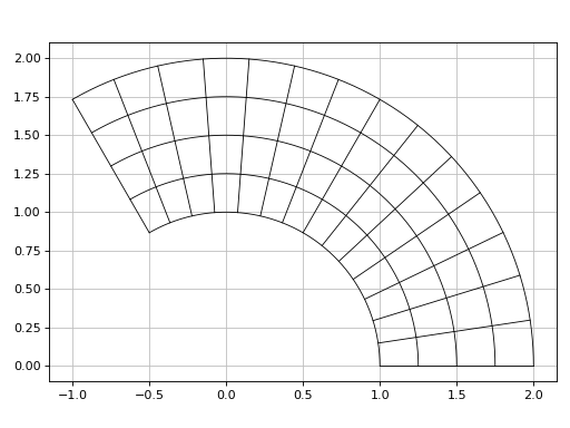
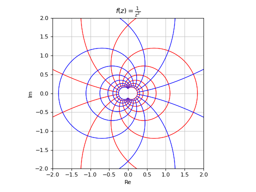
- spb.plot_functions.functions_2d.plot_contour(*args, **kwargs)[source]
Draws contour plot of a function of two variables.
This function signature is almost identical to
plot3d(): refer to its documentation for a full list of available argument and keyword arguments.Refer to
contour()for a full list of keyword arguments to customize the appearances of contours.Refer to
graphics()for a full list of keyword arguments to customize the appearances of the figure (title, axis labels, …).- Parameters:
- expr
The expression representing the function of two variables to be plotted. It can be a:
Symbolic expression.
Numerical function of two variable, supporting vectorization. In this case the following keyword arguments are not supported:
params.
- range_xtuple, Tuple
A 3-tuple (symb, min, max) denoting the range of the x variable. Default values: min=-10 and max=10.
- range_ytuple, Tuple
A 3-tuple (symb, min, max) denoting the range of the y variable. Default values: min=-10 and max=10.
- labelstr
Set the label associated to this series, which will be eventually shown on the legend or colorbar.
- aspectstr, tuple, list, dict
Set the aspect ratio.
Possible values for Matplotlib (only works for a 2D plot):
"auto": Matplotlib will fit the plot in the vibile area."equal": sets equal spacing.tuple containing 2 float numbers, from which the aspect ratio is computed. This only works for 2D plots.
Possible values for Plotly:
"equal": sets equal spacing on the axis of a 2D plot.For 3D plots:
"cube": fix the ratio to be a cube"data": draw axes in proportion of their ranges"auto": automatically produce something that is well proportioned using ‘data’ as the default.manually set the aspect ratio by providing a dictionary. For example:
dict(x=1, y=1, z=2)forces the z-axis to appear twice as big as the other two.
Possible values for Bokeh:
"equal": sets equal spacing.
- ax
An existing Matplotlib’s Axes over which the symbolic expressions will be plotted.
- axisbool
Show the axis in the figure. Default value: True.
- axis_centerstr, tuple
Set the location of the intersection between the horizontal and vertical axis in a 2D plot. It only works with Matplotlib and it can receive the following values:
None: traditional layout, with the horizontal axis fixed on the bottom and the vertical axis fixed on the left. This is the default value.a tuple
(x, y)specifying the exact intersection point.'center': center of the current plot area.'auto': the intersection point is automatically computed.
- camera
Set the camera position for 3D plots.
For Matplotlib, it can be a dictionary of keyword arguments that will be passed to the
Axes3D.view_initmethod. Refer to the following link for more information: https://matplotlib.org/stable/api/_as_gen/mpl_toolkits.mplot3d.axes3d.Axes3D.html#mpl_toolkits.mplot3d.axes3d.Axes3D.view_initFor Plotly, it can be a dictionary of keyword arguments that will be passed to the layout’s
scene_camera. Refer to the following link for more information: https://plotly.com/python/3d-camera-controls/For K3D-Jupyter, it is list of 9 numbers, namely:
x_cam, y_cam, z_cam: the position of the camera in the scenex_tar, y_tar, z_tar: the position of the target of the camerax_up, y_up, z_up: components of the up vector
- color_func
Define a custom color mapping. It can either be:
A numerical function supporting vectorization. The arity can be:
2 arguments:
f(x, y)wherex, yare the coordinates of the points.3 arguments:
f(x, y, z)wherex, y, zare the coordinates of the points.
A symbolic expression having at most as many free symbols as
expr.None: the default value (color mapping according to the z coordinate).
- colorbarbool
Toggle the visibility of the colorbar associated to the current data series. Note that a colorbar is only visible if
use_cm=Trueandcolor_funcis not None. Default value: True.- colorbar_ticks_formattertick_formatter_multiples_of
An object of type
tick_formatter_multiples_ofwhich will be used to place tick values on the colorbar at each multiple of a specified quantity. This only works when use_cm=True.- colorlooplist, tuple
List of colors to be used in line plots or solid color surfaces.
- colormapslist, tuple
List of color maps to render surfaces.
- cyclic_colormapslist, tuple
List of cyclic color maps to render complex series (the phase/argument ranges over [-pi, pi]).
- fig
Get or set the figure where to plot into.
- force_real_evalbool
By default, numerical evaluation is performed over complex numbers, which is slower but produces correct results. However, when the symbolic expression is converted to a numerical function with lambdify, the resulting function may not like to be evaluated over complex numbers. In such cases, forcing the evaluation to be performed over real numbers might be a good choice. The plotting module should be able to detect such occurences and automatically activate this option. If that is not the case, or evaluation performance is of paramount importance, set this parameter to True, but be aware that it might produce wrong results. Default value: False.
- gridbool, dict
Toggle the visibility of major grid lines. A dictionary of keyword arguments can be passed to customized the appearance of the grid lines:
- hookslist
List of functions expecting one argument, the current plot object, which allows users to further customize the appearance of the plot before it is shown on the screen. The hooks are executed:
after the figure has been initialized and populated with numerical data.
after the existing renderers update the visualization because the user interacted with some widget.
Note: let
pbe the plot object. Then, the user can access the figure withp.fig. In case ofspb.backends.matplotlib.MatplotlibBackend, the user can also retrieve the axes in which data was added withp.ax.- is_filledbool
If True, use filled contours. Otherwise, use line contours. Relatated parameters:
show_clabels. Default value: True.- is_polarbool
If True, requests a polar discretization. In this case,
range_xrepresents the radius, whilerange_yrepresents the angle. Default value: False.- legendbool
Toggle the visibility of the legend. If None, the backend will automatically determine if it is appropriate to show it. Default value: None.
- minor_gridbool, dict
Toggle the visibility of minor grid lines. A dictionary of keyword arguments can be passed to customized the appearance of the grid lines:
- modules
Specify the evaluation modules to be used by lambdify. If not specified, the evaluation will be done with NumPy/SciPy.
- n1int
Number of discretization points along the x-axis to be used in the evaluation. Related parameters:
xscale. It must be: 2 ≤ n1 < ∞. Default value: 100.- n2int
Number of discretization points along the y-axis to be used in the evaluation. Related parameters:
yscale. It must be: 2 ≤ n2 < ∞. Default value: 100.- only_integersbool
Discretize the domain using only integer numbers. When this parameter is True, the number of discretization points is choosen by the algorithm. Default value: False.
- paramsdict, optional
A dictionary mapping symbols to parameters. If provided, this dictionary enables the interactive-widgets plot.
When calling a plotting function, the parameter can be specified with:
a widget from the
ipywidgetsmodule.a widget from the
panelmodule.- a tuple of the form:
(default, min, max, N, tick_format, label, spacing), which will instantiate a
ipywidgets.widgets.widget_float.FloatSlideror aipywidgets.widgets.widget_float.FloatLogSlider, depending on the spacing strategy. In particular:- default, min, maxfloat
Default value, minimum value and maximum value of the slider, respectively. Must be finite numbers. The order of these 3 numbers is not important: the module will figure it out which is what.
- Nint, optional
Number of steps of the slider.
- tick_formatstr or None, optional
Provide a formatter for the tick value of the slider. Default to
".2f".
- label: str, optional
Custom text associated to the slider.
- spacingstr, optional
Specify the discretization spacing. Default to
"linear", can be changed to"log".
Notes:
parameters cannot be linked together (ie, one parameter cannot depend on another one).
If a widget returns multiple numerical values (like
panel.widgets.slider.RangeSlideroripywidgets.widgets.widget_float.FloatRangeSlider), then a corresponding number of symbols must be provided.
Here follows a couple of examples. If
imodule="panel":import panel as pn params = { a: (1, 0, 5), # slider from 0 to 5, with default value of 1 b: pn.widgets.FloatSlider(value=1, start=0, end=5), # same slider as above (c, d): pn.widgets.RangeSlider(value=(-1, 1), start=-3, end=3, step=0.1) }
Or with
imodule="ipywidgets":import ipywidgets as w params = { a: (1, 0, 5), # slider from 0 to 5, with default value of 1 b: w.FloatSlider(value=1, min=0, max=5), # same slider as above (c, d): w.FloatRangeSlider(value=(-1, 1), min=-3, max=3, step=0.1) }
When instantiating a data series directly,
paramsmust be a dictionary mapping symbols to numerical values.Let
seriesbe any data series. Thenseries.paramsreturns a dictionary mapping symbols to numerical values.- polar_axisbool
If True, the backend will attempt to use polar axis, otherwise it uses cartesian axis. This is only supported for 2D plots. Default value: False.
- rendering_kwdict
A dictionary of keyword arguments to be passed to the renderers in order to further customize the appearance of the contour. Here are some useful links for the supported plotting libraries:
- show_clabelsbool
Toggle the label’s visibility of contour lines. It only works when
is_filled=False. Note that some backend might not implement this feature. Relatated parameters:is_filled. Default value: True.- show_in_legendbool
Toggle the visibility of the data series on the legend. Default value: True.
- size
Set the size of the plot, (width, height). For Matplotlib, the size is measured in inches. For Bokeh, Plotly and K3D-Jupyter, the size is in pixel.
- sum_boundint
When plotting sums, the expression will be pre-processed in order to replace lower/upper bounds set to +/- infinity with this +/- numerical value. Note: the higher this number, the slower the evaluation, but the more accurate the plot. It must be: 0 ≤ sum_bound < ∞. Default value: 1000.
- surface_color
For back-compatibility with old sympy.plotting. Use
rendering_kwin order to fully customize the appearance of the surface.- themestr
Theme to be used to style the figure. Depending on the backend being used, several themes may be available.
- title
Title of the plot. It can be:
a string.
a callable receiving a single argument, use_latex, which must return a string.
a tuple of the form (format_str, symbol 1, symbol 2, etc.), which creates an output string when parameters symbol 1, symbol 2, etc. receive numerical values from the widgets. This operation mode only works when creating interactive data series (ie, specifying the
paramsdictionary).
- txcallable
Numerical transformation function to be applied to the data on the x-axis.
- tycallable
Numerical transformation function to be applied to the data on the y-axis.
- tzcallable
Numerical transformation function to be applied to the data on the z-axis.
- update_eventbool
If True and the backend supports such functionality, events like drag and zoom will trigger a recompute of the data series within the new axis limits. Default value: False.
- use_cmbool
Toggle the use of a colormap. By default, some series might use a colormap to display the necessary data. Setting this attribute to False will inform the associated renderer to use solid color. Related parameters:
color_func. Default value: False.- use_latexbool
Turn on/off the rendering of latex labels. If the backend doesn’t support latex, it will render the string representations instead. Default value: True.
- x_ticks_formattertick_formatter_multiples_of
An object of type
tick_formatter_multiples_ofwhich will be used to place tick values at each multiple of a specified quantity, along the x-axis.- xlabel
Label of the x-axis. It can be:
a string.
a callable receiving a single argument, use_latex, which must return a string.
a tuple of the form (format_str, symbol 1, symbol 2, etc.), which creates an output string when parameters symbol 1, symbol 2, etc. receive numerical values from the widgets. This operation mode only works when creating interactive data series (ie, specifying the
paramsdictionary).
- xlim
Limit the figure’s x-axis to the specified range. The tuple must be in the form (min_val, max_val).
- xscaleNoneType, str
If the backend supports it, the x-direction will use the specified scale. Note that none of the backends support logarithmic scale for 3D plots. Possible options: [‘linear’, ‘log’, None] Default value: ‘linear’.
- y_ticks_formattertick_formatter_multiples_of
An object of type
tick_formatter_multiples_ofwhich will be used to place tick values at each multiple of a specified quantity, along the y-axis.- ylabel
Label of the y-axis. It can be:
a string.
a callable receiving a single argument, use_latex, which must return a string.
a tuple of the form (format_str, symbol 1, symbol 2, etc.), which creates an output string when parameters symbol 1, symbol 2, etc. receive numerical values from the widgets. This operation mode only works when creating interactive data series (ie, specifying the
paramsdictionary).
- ylim
Limit the figure’s y-axis to the specified range. The tuple must be in the form (min_val, max_val).
- yscaleNoneType, str
If the backend supports it, the y-direction will use the specified scale. Note that none of the backends support logarithmic scale for 3D plots. Possible options: [‘linear’, ‘log’, None] Default value: ‘linear’.
- zlabel
Label of the z-axis. It can be:
a string.
a callable receiving a single argument, use_latex, which must return a string.
a tuple of the form (format_str, symbol 1, symbol 2, etc.), which creates an output string when parameters symbol 1, symbol 2, etc. receive numerical values from the widgets. This operation mode only works when creating interactive data series (ie, specifying the
paramsdictionary).
- zlim
Limit the figure’s z-axis to the specified range. The tuple must be in the form (min_val, max_val).
- zscaleNoneType, str
If the backend supports it, the z-direction will use the specified scale. Note that none of the backends support logarithmic scale for 3D plots. Possible options: [‘linear’, ‘log’, None] Default value: ‘linear’.
See also
Examples
>>> from sympy import symbols, cos, exp, sin, pi, Eq, Add
>>> from spb import plot_contour
>>> x, y = symbols('x, y')
Filled contours of a function of two variables.
>>> plot_contour(cos((x**2 + y**2)) * exp(-(x**2 + y**2) / 10),
...      (x, -5, 5), (y, -5, 5))
Plot object containing:
[0]: contour: exp(-x**2/10 - y**2/10)*cos(x**2 + y**2) for x over (-5, 5) and y over (-5, 5)
(
Source code,png)
Line contours of a function of two variables, with ticks formatted as multiples of pi/n.
>>> from spb import multiples_of_pi_over_2, multiples_of_pi_over_3
>>> expr = 5 * (cos(x) - 0.2 * sin(y))**2 + 5 * (-0.2 * cos(x) + sin(y))**2
>>> plot_contour(
...     expr, (x, 0, 2 * pi), (y, 0, 2 * pi),
...     x_ticks_formatter=multiples_of_pi_over_2(),
...     y_ticks_formatter=multiples_of_pi_over_3(),
...     is_filled=False
... )
Plot object containing:
[0]: contour: 5*(-0.2*sin(y) + cos(x))**2 + 5*(sin(y) - 0.2*cos(x))**2 for x over (0, 2*pi) and y over (0, 2*pi)
(
Source code,png)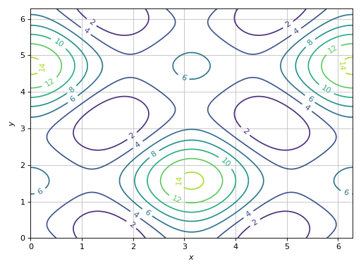
Combining together filled and line contours. Use a custom label on the colorbar of the filled contour.
>>> expr = 5 * (cos(x) - 0.2 * sin(y))**2 + 5 * (-0.2 * cos(x) + sin(y))**2
>>> p1 = plot_contour(expr, (x, 0, 2 * pi), (y, 0, 2 * pi), "z",
...      {"cmap": "coolwarm"}, show=False, grid=False)
>>> p2 = plot_contour(expr, (x, 0, 2 * pi), (y, 0, 2 * pi),
...      {"colors": "k", "cmap": None, "linewidths": 0.75},
...      show=False, is_filled=False)
>>> (p1 + p2).show()
(
Source code,png)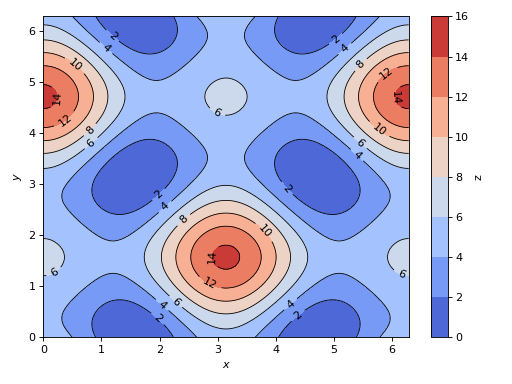
Visually inspect the solutions of a system of 2 non-linear equations. The intersections between the contour lines represent the solutions.
>>> eq1 = Eq((cos(x) - sin(y) / 2)**2 + 3 * (-sin(x) + cos(y) / 2)**2, 2)
>>> eq2 = Eq((cos(x) - 2 * sin(y))**2 - (sin(x) + 2 * cos(y))**2, 3)
>>> plot_contour(eq1.lhs - eq1.rhs, eq2.lhs - eq2.rhs, {"levels": [0]},
...      (x, 0, 2 * pi), (y, 0, 2 * pi), is_filled=False, clabels=False)
Plot object containing:
[0]: contour: 3*(-sin(x) + cos(y)/2)**2 + (-sin(y)/2 + cos(x))**2 - 2 for x over (0, 2*pi) and y over (0, 2*pi)
[1]: contour: -(sin(x) + 2*cos(y))**2 + (-2*sin(y) + cos(x))**2 - 3 for x over (0, 2*pi) and y over (0, 2*pi)
(
Source code,png)
Contour plot with polar axis:
>>> r, theta = symbols("r, theta")
>>> plot_contour(sin(2 * r) * cos(theta), (theta, 0, 2*pi), (r, 0, 7),
...     {"levels": 100}, polar_axis=True, aspect="equal")
Plot object containing:
[0]: contour: sin(2*r)*cos(theta) for theta over (0, 2*pi) and r over (0, 7)
(
Source code,png)
Interactive-widget plot. Refer to the interactive sub-module documentation to learn more about the
paramsdictionary. This plot illustrates:the use of
prange(parametric plotting range).the use of the
paramsdictionary to specify sliders in their basic form: (default, min, max).the use of
panel.widgets.slider.RangeSlider, which is a 2-values widget.
from sympy import *
from spb import *
import panel as pn
x, y, a, b = symbols("x y a b")
x_min, x_max, y_min, y_max = symbols("x_min x_max y_min y_max")
expr = (cos(x) + a * sin(x) * sin(y) - b * sin(x) * cos(y))**2
plot_contour(
    expr, prange(x, x_min*pi, x_max*pi), prange(y, y_min*pi, y_max*pi),
    params={
        a: (1, 0, 2),
        b: (1, 0, 2),
        (x_min, x_max): pn.widgets.RangeSlider(
            value=(-1, 1), start=-3, end=3, step=0.1),
        (y_min, y_max): pn.widgets.RangeSlider(
            value=(-1, 1), start=-3, end=3, step=0.1),
    },
    grid=False)

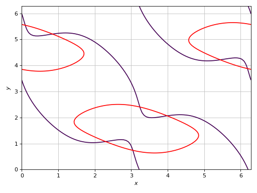
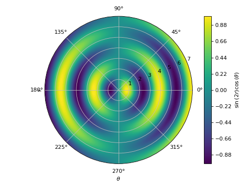
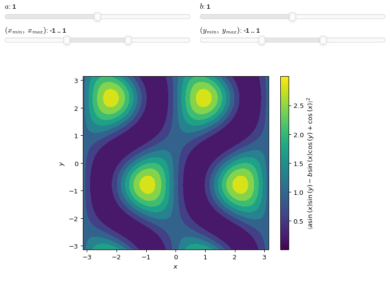
- spb.plot_functions.functions_2d.plot_polar(*args, **kwargs)[source]
The following function creates a 2D polar plot.
By default, it uses an equal aspect ratio and doesn’t apply a colormap.
Typical usage examples are in the followings:
Plotting a single polar curve with a range:
plot_polar(expr, range)
Plotting multiple polar curves with the same range:
plot_polar(expr1, expr2, ..., range)
Plotting multiple curves with different ranges, custom labels and rendering options:
plot_polar(
   (expr1, range1, label1 [opt], rendering_kw1 [opt]),
   (expr2, range2, label2 [opt], rendering_kw2 [opt]), ..., **kwargs)
- Parameters:
- expr_x
The expression representing the component along the x-axis of the parametric function. It can either be a symbolic expression representing the function of one variable to be plotted, or a numerical function of one variable, supporting vectorization. In the latter case the following keyword arguments are not supported:
params,sum_bound.- expr_y
The expression representing the component along the y-axis of the parametric function. It can either be a symbolic expression representing the function of one variable to be plotted, or a numerical function of one variable, supporting vectorization. In the latter case the following keyword arguments are not supported:
params,sum_bound.- range_ptuple, Tuple
A 3-tuple (symb, min, max) denoting the range of the parameter. Default values: min=-10 and max=10.
- labelstr
Set the label associated to this series, which will be eventually shown on the legend or colorbar.
- aspectstr, tuple, list, dict
Set the aspect ratio.
Possible values for Matplotlib (only works for a 2D plot):
"auto": Matplotlib will fit the plot in the vibile area."equal": sets equal spacing.tuple containing 2 float numbers, from which the aspect ratio is computed. This only works for 2D plots.
Possible values for Plotly:
"equal": sets equal spacing on the axis of a 2D plot.For 3D plots:
"cube": fix the ratio to be a cube"data": draw axes in proportion of their ranges"auto": automatically produce something that is well proportioned using ‘data’ as the default.manually set the aspect ratio by providing a dictionary. For example:
dict(x=1, y=1, z=2)forces the z-axis to appear twice as big as the other two.
Possible values for Bokeh:
"equal": sets equal spacing.
- ax
An existing Matplotlib’s Axes over which the symbolic expressions will be plotted.
- axisbool
Show the axis in the figure. Default value: True.
- axis_centerstr, tuple
Set the location of the intersection between the horizontal and vertical axis in a 2D plot. It only works with Matplotlib and it can receive the following values:
None: traditional layout, with the horizontal axis fixed on the bottom and the vertical axis fixed on the left. This is the default value.a tuple
(x, y)specifying the exact intersection point.'center': center of the current plot area.'auto': the intersection point is automatically computed.
- camera
Set the camera position for 3D plots.
For Matplotlib, it can be a dictionary of keyword arguments that will be passed to the
Axes3D.view_initmethod. Refer to the following link for more information: https://matplotlib.org/stable/api/_as_gen/mpl_toolkits.mplot3d.axes3d.Axes3D.html#mpl_toolkits.mplot3d.axes3d.Axes3D.view_initFor Plotly, it can be a dictionary of keyword arguments that will be passed to the layout’s
scene_camera. Refer to the following link for more information: https://plotly.com/python/3d-camera-controls/For K3D-Jupyter, it is list of 9 numbers, namely:
x_cam, y_cam, z_cam: the position of the camera in the scenex_tar, y_tar, z_tar: the position of the target of the camerax_up, y_up, z_up: components of the up vector
- color_func
Define a custom color mapping when
use_cm=True. It can either be:A numerical function supporting vectorization. The arity can be:
1 argument:
f(t), wheretis the parameter.2 arguments:
f(x, y)wherex, yare the coordinates of the points.3 arguments:
f(x, y, t).
A symbolic expression having at most as many free symbols as
expr_xorexpr_y.None: the default value (color mapping according to the parameter).
Alias of this parameters:
tp.- colorbarbool
Toggle the visibility of the colorbar associated to the current data series. Note that a colorbar is only visible if
use_cm=Trueandcolor_funcis not None. Default value: True.- colorbar_ticks_formattertick_formatter_multiples_of
An object of type
tick_formatter_multiples_ofwhich will be used to place tick values on the colorbar at each multiple of a specified quantity. This only works when use_cm=True.- colorlooplist, tuple
List of colors to be used in line plots or solid color surfaces.
- colormapslist, tuple
List of color maps to render surfaces.
- cyclic_colormapslist, tuple
List of cyclic color maps to render complex series (the phase/argument ranges over [-pi, pi]).
- detect_polesbool, str
Chose whether to detect and correctly plot the roots of the denominator. There are two algorithms at work:
based on the gradient of the numerical data, it introduces NaN values at locations where the steepness is greater than some threshold. This splits the line into multiple segments. To improve detection, increase the number of discretization points
nand/or change the value ofeps. This algorithm can be used to visualize jump discontinuities as well as essential discontinuities.a symbolic approach based on the
continuous_domainfunction from thesympy.calculus.utilmodule, which computes the locations of essential discontinuities. If any are found, vertical lines will be shown.
Possible options:
False: No poles detection
True: Poles detection with the numerical algorithm
‘symbolic’: Poles detection with numerical and symbolic algorithms
Default value: False.
- epsfloat
An arbitrary small value used by the
detect_polesnumerical algorithm. Before changing this value, it is recommended to increase the number of discretization points. Related parameters:detect_poles. It must be: 0 ≤ eps < ∞. Default value: 0.01.- excludelist
A list of numerical values along the parameter which are going to be excluded from the evaluation. In practice, it introduces discontinuities in the resulting line.
- fig
Get or set the figure where to plot into.
- force_real_evalbool
By default, numerical evaluation is performed over complex numbers, which is slower but produces correct results. However, when the symbolic expression is converted to a numerical function with lambdify, the resulting function may not like to be evaluated over complex numbers. In such cases, forcing the evaluation to be performed over real numbers might be a good choice. The plotting module should be able to detect such occurences and automatically activate this option. If that is not the case, or evaluation performance is of paramount importance, set this parameter to True, but be aware that it might produce wrong results. Default value: False.
- gridbool, dict
Toggle the visibility of major grid lines. A dictionary of keyword arguments can be passed to customized the appearance of the grid lines:
- hookslist
List of functions expecting one argument, the current plot object, which allows users to further customize the appearance of the plot before it is shown on the screen. The hooks are executed:
after the figure has been initialized and populated with numerical data.
after the existing renderers update the visualization because the user interacted with some widget.
Note: let
pbe the plot object. Then, the user can access the figure withp.fig. In case ofspb.backends.matplotlib.MatplotlibBackend, the user can also retrieve the axes in which data was added withp.ax.- is_filledbool
Whether scatter’s markers are filled or void. Default value: True.
- is_scatterbool
If True it represent a scatter plot, otherwise a continuous line. Default value: False.
- legendbool
Toggle the visibility of the legend. If None, the backend will automatically determine if it is appropriate to show it. Default value: None.
- line_color
For back-compatibility with old sympy.plotting. Use
rendering_kwin order to fully customize the appearance of the line/scatter.- minor_gridbool, dict
Toggle the visibility of minor grid lines. A dictionary of keyword arguments can be passed to customized the appearance of the grid lines:
- modules
Specify the evaluation modules to be used by lambdify. If not specified, the evaluation will be done with NumPy/SciPy.
- n1int
Number of discretization points along the parameter to be used in the evaluation. An alias of this parameter is
n. Related parameters:xscale. It must be: 2 ≤ n1 < ∞. Default value: 1000.- only_integersbool
Discretize the domain using only integer numbers. When this parameter is True, the number of discretization points is choosen by the algorithm. Default value: False.
- paramsdict, optional
A dictionary mapping symbols to parameters. If provided, this dictionary enables the interactive-widgets plot.
When calling a plotting function, the parameter can be specified with:
a widget from the
ipywidgetsmodule.a widget from the
panelmodule.- a tuple of the form:
(default, min, max, N, tick_format, label, spacing), which will instantiate a
ipywidgets.widgets.widget_float.FloatSlideror aipywidgets.widgets.widget_float.FloatLogSlider, depending on the spacing strategy. In particular:- default, min, maxfloat
Default value, minimum value and maximum value of the slider, respectively. Must be finite numbers. The order of these 3 numbers is not important: the module will figure it out which is what.
- Nint, optional
Number of steps of the slider.
- tick_formatstr or None, optional
Provide a formatter for the tick value of the slider. Default to
".2f".
- label: str, optional
Custom text associated to the slider.
- spacingstr, optional
Specify the discretization spacing. Default to
"linear", can be changed to"log".
Notes:
parameters cannot be linked together (ie, one parameter cannot depend on another one).
If a widget returns multiple numerical values (like
panel.widgets.slider.RangeSlideroripywidgets.widgets.widget_float.FloatRangeSlider), then a corresponding number of symbols must be provided.
Here follows a couple of examples. If
imodule="panel":import panel as pn params = { a: (1, 0, 5), # slider from 0 to 5, with default value of 1 b: pn.widgets.FloatSlider(value=1, start=0, end=5), # same slider as above (c, d): pn.widgets.RangeSlider(value=(-1, 1), start=-3, end=3, step=0.1) }
Or with
imodule="ipywidgets":import ipywidgets as w params = { a: (1, 0, 5), # slider from 0 to 5, with default value of 1 b: w.FloatSlider(value=1, min=0, max=5), # same slider as above (c, d): w.FloatRangeSlider(value=(-1, 1), min=-3, max=3, step=0.1) }
When instantiating a data series directly,
paramsmust be a dictionary mapping symbols to numerical values.Let
seriesbe any data series. Thenseries.paramsreturns a dictionary mapping symbols to numerical values.- polar_axisbool
If True, the backend will attempt to use polar axis, otherwise it uses cartesian axis. This is only supported for 2D plots. Default value: False.
- rendering_kwdict
A dictionary of keyword arguments to be passed to the renderers in order to further customize the appearance of the line. Here are some useful links for the supported plotting libraries:
Matplotlib:
for solid lines: https://matplotlib.org/stable/api/_as_gen/matplotlib.pyplot.plot.html
for colormap-based lines: https://matplotlib.org/stable/api/collections_api.html#matplotlib.collections.LineCollection
for scatters: https://matplotlib.org/stable/api/_as_gen/matplotlib.pyplot.scatter.html
Bokeh:
- show_in_legendbool
Toggle the visibility of the data series on the legend. Default value: True.
- size
Set the size of the plot, (width, height). For Matplotlib, the size is measured in inches. For Bokeh, Plotly and K3D-Jupyter, the size is in pixel.
- sum_boundint
When plotting sums, the expression will be pre-processed in order to replace lower/upper bounds set to +/- infinity with this +/- numerical value. Note: the higher this number, the slower the evaluation, but the more accurate the plot. It must be: 0 ≤ sum_bound < ∞. Default value: 1000.
- themestr
Theme to be used to style the figure. Depending on the backend being used, several themes may be available.
- title
Title of the plot. It can be:
a string.
a callable receiving a single argument, use_latex, which must return a string.
a tuple of the form (format_str, symbol 1, symbol 2, etc.), which creates an output string when parameters symbol 1, symbol 2, etc. receive numerical values from the widgets. This operation mode only works when creating interactive data series (ie, specifying the
paramsdictionary).
- txcallable
Numerical transformation function to be applied to the data on the x-axis.
- tycallable
Numerical transformation function to be applied to the data on the y-axis.
- update_eventbool
If True and the backend supports such functionality, events like drag and zoom will trigger a recompute of the data series within the new axis limits. Default value: False.
- use_cmbool
Toggle the use of a colormap. By default, some series might use a colormap to display the necessary data. Setting this attribute to False will inform the associated renderer to use solid color. Related parameters:
color_func. Default value: False.- use_latexbool
Turn on/off the rendering of latex labels. If the backend doesn’t support latex, it will render the string representations instead. Default value: True.
- x_ticks_formattertick_formatter_multiples_of
An object of type
tick_formatter_multiples_ofwhich will be used to place tick values at each multiple of a specified quantity, along the x-axis.- xlabel
Label of the x-axis. It can be:
a string.
a callable receiving a single argument, use_latex, which must return a string.
a tuple of the form (format_str, symbol 1, symbol 2, etc.), which creates an output string when parameters symbol 1, symbol 2, etc. receive numerical values from the widgets. This operation mode only works when creating interactive data series (ie, specifying the
paramsdictionary).
- xlim
Limit the figure’s x-axis to the specified range. The tuple must be in the form (min_val, max_val).
- xscaleNoneType, str
If the backend supports it, the x-direction will use the specified scale. Note that none of the backends support logarithmic scale for 3D plots. Possible options: [‘linear’, ‘log’, None] Default value: ‘linear’.
- y_ticks_formattertick_formatter_multiples_of
An object of type
tick_formatter_multiples_ofwhich will be used to place tick values at each multiple of a specified quantity, along the y-axis.- ylabel
Label of the y-axis. It can be:
a string.
a callable receiving a single argument, use_latex, which must return a string.
a tuple of the form (format_str, symbol 1, symbol 2, etc.), which creates an output string when parameters symbol 1, symbol 2, etc. receive numerical values from the widgets. This operation mode only works when creating interactive data series (ie, specifying the
paramsdictionary).
- ylim
Limit the figure’s y-axis to the specified range. The tuple must be in the form (min_val, max_val).
- yscaleNoneType, str
If the backend supports it, the y-direction will use the specified scale. Note that none of the backends support logarithmic scale for 3D plots. Possible options: [‘linear’, ‘log’, None] Default value: ‘linear’.
- zlabel
Label of the z-axis. It can be:
a string.
a callable receiving a single argument, use_latex, which must return a string.
a tuple of the form (format_str, symbol 1, symbol 2, etc.), which creates an output string when parameters symbol 1, symbol 2, etc. receive numerical values from the widgets. This operation mode only works when creating interactive data series (ie, specifying the
paramsdictionary).
- zlim
Limit the figure’s z-axis to the specified range. The tuple must be in the form (min_val, max_val).
- zscaleNoneType, str
If the backend supports it, the z-direction will use the specified scale. Note that none of the backends support logarithmic scale for 3D plots. Possible options: [‘linear’, ‘log’, None] Default value: ‘linear’.
See also
Examples
>>> from sympy import symbols, sin, cos, exp, pi
>>> from spb import plot_polar
>>> theta = symbols('theta')
Plot with cartesian axis:
>>> plot_polar(3 * sin(2 * theta), (theta, 0, 2*pi))
Plot object containing:
[0]: parametric cartesian line: (3*sin(2*theta)*cos(theta), 3*sin(theta)*sin(2*theta)) for theta over (0, 2*pi)
(
Source code,png)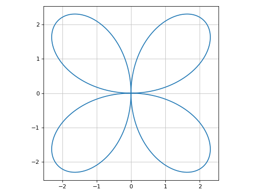
Plot with polar axis:
>>> plot_polar(
...     exp(sin(theta)) - 2 * cos(4 * theta), (theta, 0, 2 * pi),
...     polar_axis=True)
Plot object containing:
[0]: parametric cartesian line: ((exp(sin(theta)) - 2*cos(4*theta))*cos(theta), (exp(sin(theta)) - 2*cos(4*theta))*sin(theta)) for theta over (0, 2*pi)
(
Source code,png)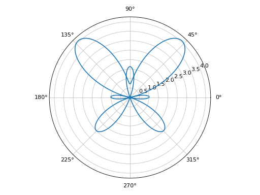
Interactive-widget plot of Guilloché Pattern. Refer to the interactive sub-module documentation to learn more about the
paramsdictionary. This plot illustrates:the use of
prange(parametric plotting range).the use of the
paramsdictionary to specify the widgets to be created by Holoviz’s Panel.
from sympy import *
from spb import *
import panel as pn
a, b, c, d, e, f, theta, tp = symbols("a:f theta tp")
def func(n):
    t1 = (c + sin(a * theta + d))
    t2 = ((b + sin(b * theta + e)) - (c + sin(a * theta + d)))
    t3 = (f + sin(a * theta + n / pi))
    return t1 + t2 * t3 / 2
exprs = [func(n) for n in range(20)]
plot_polar(
    *exprs, prange(theta, 0, tp*pi),
    {"line_color": "black", "line_width": 0.5},
    params={
        a: pn.widgets.IntInput(value=6, name="a"),
        b: pn.widgets.IntInput(value=12, name="b"),
        c: pn.widgets.IntInput(value=18, name="c"),
        d: (4.7, 0, 2*pi),
        e: (1.8, 0, 2*pi),
        f: (3, 0, 5),
        tp: (2, 0, 2)
    },
    layout = "sbl",
    ncols = 1,
    title="Guilloché Pattern Explorer",
    backend=BB,
    legend=False,
    servable=True,
    imodule="panel"
)

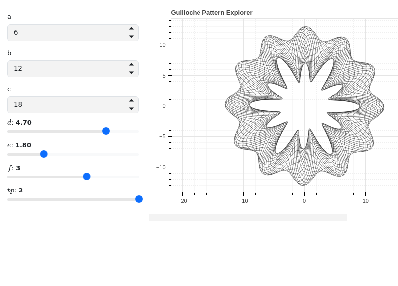
- spb.plot_functions.functions_2d.plot_geometry(*args, **kwargs)[source]
Plot entities from the sympy.geometry module.
Typical usage examples are in the following:
Plotting a single geometric entity:
plot_geometry(geom, label [opt], rendering_kw [opt])
Plotting multiple geometric entities:
plot_geometry(geom1, geom2, ...)
Plotting multiple geometric entities, setting custom labels and rendering options:
plot_geometry(
   (geom1, label1 [opt], rendering_kw1 [opt]),
   (geom2, label2 [opt], rendering_kw2 [opt]),
   **kwargs)
- Parameters:
- geomGeometryEntity
Represent the geometric entity to be plotted.
- range_xtuple
A 2-tuple (min, max) denoting the range of the x variable to be used when plotting objects of type Line2D. If not provided, a segment will be plotted between the 2 specified points of the line.
- labelstr
Set the label associated to this series, which will be eventually shown on the legend or colorbar.
- aspectstr, tuple, list, dict
Set the aspect ratio.
Possible values for Matplotlib (only works for a 2D plot):
"auto": Matplotlib will fit the plot in the vibile area."equal": sets equal spacing.tuple containing 2 float numbers, from which the aspect ratio is computed. This only works for 2D plots.
Possible values for Plotly:
"equal": sets equal spacing on the axis of a 2D plot.For 3D plots:
"cube": fix the ratio to be a cube"data": draw axes in proportion of their ranges"auto": automatically produce something that is well proportioned using ‘data’ as the default.manually set the aspect ratio by providing a dictionary. For example:
dict(x=1, y=1, z=2)forces the z-axis to appear twice as big as the other two.
Possible values for Bokeh:
"equal": sets equal spacing.
- ax
An existing Matplotlib’s Axes over which the symbolic expressions will be plotted.
- axisbool
Show the axis in the figure. Default value: True.
- axis_centerstr, tuple
Set the location of the intersection between the horizontal and vertical axis in a 2D plot. It only works with Matplotlib and it can receive the following values:
None: traditional layout, with the horizontal axis fixed on the bottom and the vertical axis fixed on the left. This is the default value.a tuple
(x, y)specifying the exact intersection point.'center': center of the current plot area.'auto': the intersection point is automatically computed.
- camera
Set the camera position for 3D plots.
For Matplotlib, it can be a dictionary of keyword arguments that will be passed to the
Axes3D.view_initmethod. Refer to the following link for more information: https://matplotlib.org/stable/api/_as_gen/mpl_toolkits.mplot3d.axes3d.Axes3D.html#mpl_toolkits.mplot3d.axes3d.Axes3D.view_initFor Plotly, it can be a dictionary of keyword arguments that will be passed to the layout’s
scene_camera. Refer to the following link for more information: https://plotly.com/python/3d-camera-controls/For K3D-Jupyter, it is list of 9 numbers, namely:
x_cam, y_cam, z_cam: the position of the camera in the scenex_tar, y_tar, z_tar: the position of the target of the camerax_up, y_up, z_up: components of the up vector
- colorbar_ticks_formattertick_formatter_multiples_of
An object of type
tick_formatter_multiples_ofwhich will be used to place tick values on the colorbar at each multiple of a specified quantity. This only works when use_cm=True.- colorlooplist, tuple
List of colors to be used in line plots or solid color surfaces.
- colormapslist, tuple
List of color maps to render surfaces.
- cyclic_colormapslist, tuple
List of cyclic color maps to render complex series (the phase/argument ranges over [-pi, pi]).
- fig
Get or set the figure where to plot into.
- gridbool, dict
Toggle the visibility of major grid lines. A dictionary of keyword arguments can be passed to customized the appearance of the grid lines:
- hookslist
List of functions expecting one argument, the current plot object, which allows users to further customize the appearance of the plot before it is shown on the screen. The hooks are executed:
after the figure has been initialized and populated with numerical data.
after the existing renderers update the visualization because the user interacted with some widget.
Note: let
pbe the plot object. Then, the user can access the figure withp.fig. In case ofspb.backends.matplotlib.MatplotlibBackend, the user can also retrieve the axes in which data was added withp.ax.- is_filledbool
If True, the geometry will be filled, otherwise only the perimeter will be rendered. Default value: True.
- is_scatterbool
If True it represent a scatter plot, otherwise a continuous line. Default value: False.
- legendbool
Toggle the visibility of the legend. If None, the backend will automatically determine if it is appropriate to show it. Default value: None.
- line_color
For back-compatibility with old sympy.plotting. Use
rendering_kwin order to fully customize the appearance of the line/scatter.- minor_gridbool, dict
Toggle the visibility of minor grid lines. A dictionary of keyword arguments can be passed to customized the appearance of the grid lines:
- n1int
Number of discretization points used to resolve the polar angle theta ∈ [0, 2*pi] in order to plot ellipses. It must be: 2 ≤ n1 < ∞. Default value: 1000.
- paramsdict, optional
A dictionary mapping symbols to parameters. If provided, this dictionary enables the interactive-widgets plot.
When calling a plotting function, the parameter can be specified with:
a widget from the
ipywidgetsmodule.a widget from the
panelmodule.- a tuple of the form:
(default, min, max, N, tick_format, label, spacing), which will instantiate a
ipywidgets.widgets.widget_float.FloatSlideror aipywidgets.widgets.widget_float.FloatLogSlider, depending on the spacing strategy. In particular:- default, min, maxfloat
Default value, minimum value and maximum value of the slider, respectively. Must be finite numbers. The order of these 3 numbers is not important: the module will figure it out which is what.
- Nint, optional
Number of steps of the slider.
- tick_formatstr or None, optional
Provide a formatter for the tick value of the slider. Default to
".2f".
- label: str, optional
Custom text associated to the slider.
- spacingstr, optional
Specify the discretization spacing. Default to
"linear", can be changed to"log".
Notes:
parameters cannot be linked together (ie, one parameter cannot depend on another one).
If a widget returns multiple numerical values (like
panel.widgets.slider.RangeSlideroripywidgets.widgets.widget_float.FloatRangeSlider), then a corresponding number of symbols must be provided.
Here follows a couple of examples. If
imodule="panel":import panel as pn params = { a: (1, 0, 5), # slider from 0 to 5, with default value of 1 b: pn.widgets.FloatSlider(value=1, start=0, end=5), # same slider as above (c, d): pn.widgets.RangeSlider(value=(-1, 1), start=-3, end=3, step=0.1) }
Or with
imodule="ipywidgets":import ipywidgets as w params = { a: (1, 0, 5), # slider from 0 to 5, with default value of 1 b: w.FloatSlider(value=1, min=0, max=5), # same slider as above (c, d): w.FloatRangeSlider(value=(-1, 1), min=-3, max=3, step=0.1) }
When instantiating a data series directly,
paramsmust be a dictionary mapping symbols to numerical values.Let
seriesbe any data series. Thenseries.paramsreturns a dictionary mapping symbols to numerical values.- polar_axisbool
If True, the backend will attempt to use polar axis, otherwise it uses cartesian axis. This is only supported for 2D plots. Default value: False.
- rendering_kwdict
A dictionary of keyword arguments to be passed to the renderers in order to further customize the appearance of the line. Here are some useful links for the supported plotting libraries:
Matplotlib:
for solid lines: https://matplotlib.org/stable/api/_as_gen/matplotlib.pyplot.plot.html
for colormap-based lines: https://matplotlib.org/stable/api/collections_api.html#matplotlib.collections.LineCollection
for scatters: https://matplotlib.org/stable/api/_as_gen/matplotlib.pyplot.scatter.html
Bokeh:
- show_in_legendbool
Toggle the visibility of the data series on the legend. Default value: True.
- size
Set the size of the plot, (width, height). For Matplotlib, the size is measured in inches. For Bokeh, Plotly and K3D-Jupyter, the size is in pixel.
- themestr
Theme to be used to style the figure. Depending on the backend being used, several themes may be available.
- title
Title of the plot. It can be:
a string.
a callable receiving a single argument, use_latex, which must return a string.
a tuple of the form (format_str, symbol 1, symbol 2, etc.), which creates an output string when parameters symbol 1, symbol 2, etc. receive numerical values from the widgets. This operation mode only works when creating interactive data series (ie, specifying the
paramsdictionary).
- txcallable
Numerical transformation function to be applied to the data on the x-axis.
- tycallable
Numerical transformation function to be applied to the data on the y-axis.
- update_eventbool
If True and the backend supports such functionality, events like drag and zoom will trigger a recompute of the data series within the new axis limits. Default value: False.
- use_latexbool
Turn on/off the rendering of latex labels. If the backend doesn’t support latex, it will render the string representations instead. Default value: True.
- x_ticks_formattertick_formatter_multiples_of
An object of type
tick_formatter_multiples_ofwhich will be used to place tick values at each multiple of a specified quantity, along the x-axis.- xlabel
Label of the x-axis. It can be:
a string.
a callable receiving a single argument, use_latex, which must return a string.
a tuple of the form (format_str, symbol 1, symbol 2, etc.), which creates an output string when parameters symbol 1, symbol 2, etc. receive numerical values from the widgets. This operation mode only works when creating interactive data series (ie, specifying the
paramsdictionary).
- xlim
Limit the figure’s x-axis to the specified range. The tuple must be in the form (min_val, max_val).
- xscaleNoneType, str
If the backend supports it, the x-direction will use the specified scale. Note that none of the backends support logarithmic scale for 3D plots. Possible options: [‘linear’, ‘log’, None] Default value: ‘linear’.
- y_ticks_formattertick_formatter_multiples_of
An object of type
tick_formatter_multiples_ofwhich will be used to place tick values at each multiple of a specified quantity, along the y-axis.- ylabel
Label of the y-axis. It can be:
a string.
a callable receiving a single argument, use_latex, which must return a string.
a tuple of the form (format_str, symbol 1, symbol 2, etc.), which creates an output string when parameters symbol 1, symbol 2, etc. receive numerical values from the widgets. This operation mode only works when creating interactive data series (ie, specifying the
paramsdictionary).
- ylim
Limit the figure’s y-axis to the specified range. The tuple must be in the form (min_val, max_val).
- yscaleNoneType, str
If the backend supports it, the y-direction will use the specified scale. Note that none of the backends support logarithmic scale for 3D plots. Possible options: [‘linear’, ‘log’, None] Default value: ‘linear’.
- zlabel
Label of the z-axis. It can be:
a string.
a callable receiving a single argument, use_latex, which must return a string.
a tuple of the form (format_str, symbol 1, symbol 2, etc.), which creates an output string when parameters symbol 1, symbol 2, etc. receive numerical values from the widgets. This operation mode only works when creating interactive data series (ie, specifying the
paramsdictionary).
- zlim
Limit the figure’s z-axis to the specified range. The tuple must be in the form (min_val, max_val).
- zscaleNoneType, str
If the backend supports it, the z-direction will use the specified scale. Note that none of the backends support logarithmic scale for 3D plots. Possible options: [‘linear’, ‘log’, None] Default value: ‘linear’.
See also
Examples
>>> from sympy import (symbols, Circle, Ellipse, Polygon,
...      Curve, Segment, Point2D, Point3D, Line3D, Plane,
...      Rational, pi, Point, cos, sin)
>>> from spb import plot_geometry
>>> x, y, z = symbols('x, y, z')
Plot a single geometry, customizing its color:
>>> plot_geometry(
...     Ellipse(Point(-3, 2), hradius=3, eccentricity=Rational(4, 5)),
...     {"color": "tab:orange"}, grid=False)
Plot object containing:
[0]: 2D geometry entity: Ellipse(Point2D(-3, 2), 3, 9/5)
(
Source code,png)
Plot several numeric geometric entitiesy. By default, circles, ellipses and polygons are going to be filled. Plotting Curve objects is the same as plot_parametric.
>>> plot_geometry(
...      Circle(Point(0, 0), 5),
...      Ellipse(Point(-3, 2), hradius=3, eccentricity=Rational(4, 5)),
...      Polygon((4, 0), 4, n=5),
...      Curve((cos(x), sin(x)), (x, 0, 2 * pi)),
...      Segment((-4, -6), (6, 6)),
...      Point2D(0, 0))
Plot object containing:
[0]: 2D geometry entity: Circle(Point2D(0, 0), 5)
[1]: 2D geometry entity: Ellipse(Point2D(-3, 2), 3, 9/5)
[2]: 2D geometry entity: RegularPolygon(Point2D(4, 0), 4, 5, 0)
[3]: parametric cartesian line: (cos(x), sin(x)) for x over (0, 2*pi)
[4]: 2D geometry entity: Segment2D(Point2D(-4, -6), Point2D(6, 6))
[5]: 2D geometry entity: Point2D(0, 0)
(
Source code,png)
Plot several numeric geometric entities defined by numbers only, turn off fill. Every entity is represented as a line.
>>> plot_geometry(
...      Circle(Point(0, 0), 5),
...      Ellipse(Point(-3, 2), hradius=3, eccentricity=Rational(4, 5)),
...      Polygon((4, 0), 4, n=5),
...      Curve((cos(x), sin(x)), (x, 0, 2 * pi)),
...      Segment((-4, -6), (6, 6)),
...      Point2D(0, 0), is_filled=False)
Plot object containing:
[0]: 2D geometry entity: Circle(Point2D(0, 0), 5)
[1]: 2D geometry entity: Ellipse(Point2D(-3, 2), 3, 9/5)
[2]: 2D geometry entity: RegularPolygon(Point2D(4, 0), 4, 5, 0)
[3]: parametric cartesian line: (cos(x), sin(x)) for x over (0, 2*pi)
[4]: 2D geometry entity: Segment2D(Point2D(-4, -6), Point2D(6, 6))
[5]: 2D geometry entity: Point2D(0, 0)
(
Source code,png)
Plot several symbolic geometric entities. We need to pass in the params dictionary, which will be used to substitute symbols before numerical evaluation. Note: here we also set custom labels:
>>> a, b, c, d = symbols("a, b, c, d")
>>> plot_geometry(
...      (Polygon((a, b), c, n=d), "triangle"),
...      (Polygon((a + 2, b + 3), c, n=d + 1), "square"),
...      params = {a: 0, b: 1, c: 2, d: 3})
Plot object containing:
[0]: 2D geometry entity: RegularPolygon(Point2D(0, 1), 2, 3, 0)
[1]: 2D geometry entity: RegularPolygon(Point2D(2, 4), 2, 4, 0)
(
Source code,png)
Plot 3D geometric entities. Note: when plotting a Plane, we must always provide the x/y/z ranges:
>>> plot_geometry(
...      (Point3D(5, 5, 5), "center"),
...      (Line3D(Point3D(-2, -3, -4), Point3D(2, 3, 4)), "line"),
...      (Plane((0, 0, 0), (1, 1, 1)),
...          (x, -5, 5), (y, -4, 4), (z, -10, 10)))
Plot object containing:
[0]: 3D geometry entity: Point3D(5, 5, 5)
[1]: 3D geometry entity: Line3D(Point3D(-2, -3, -4), Point3D(2, 3, 4))
[2]: plane series: Plane(Point3D(0, 0, 0), (1, 1, 1)) over (x, -5, 5), (y, -4, 4), (z, -10, 10)
(
Source code,png)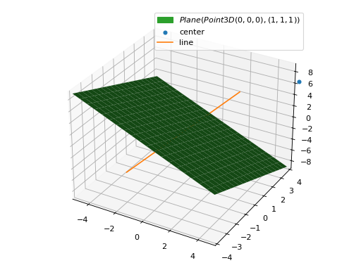
Interactive-widget plot. Refer to the interactive sub-module documentation to learn more about the
paramsdictionary.from sympy import * from spb import * import panel as pn a, b, c, d = symbols("a, b, c, d") plot_geometry( (Polygon((a, b), c, n=d), "a"), (Polygon((a + 2, b + 3), c, n=d + 1), "b"), params = { a: (0, -1, 1), b: (1, -1, 1), c: (2, 1, 2), d: pn.widgets.IntInput(value=3, start=3, end=8, name="n") }, aspect="equal", is_filled=False, xlim=(-2.5, 5.5), ylim=(-3, 6.5), imodule="panel")

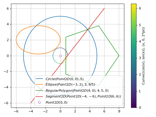
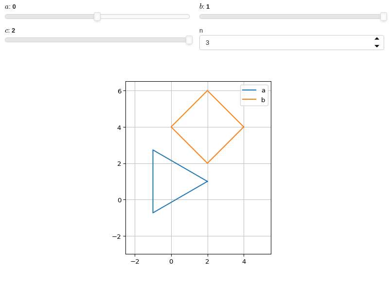
- spb.plot_functions.functions_2d.plot_list(*args, **kwargs)[source]
Plots lists of coordinates (ie, lists of numbers).
Typical usage examples are in the followings:
Plotting coordinates of a single function:
plot_list(x, y, **kwargs)
Plotting coordinates of multiple functions, adding custom labels and rendering options:
plot_list(
   (x1, y1, label1 [opt], rendering_kw1 [opt]),
   (x2, y2, label2 [opt], rendering_kw2 [opt]),
   ..., **kwargs)
- Parameters:
- list_x
Coordinates for the x-axis. It can be a list or a numper array.
- list_y
Coordinates for the y-axis. It can be a list or a numper array.
- labelstr
Set the label associated to this series, which will be eventually shown on the legend or colorbar.
- aspectstr, tuple, list, dict
Set the aspect ratio.
Possible values for Matplotlib (only works for a 2D plot):
"auto": Matplotlib will fit the plot in the vibile area."equal": sets equal spacing.tuple containing 2 float numbers, from which the aspect ratio is computed. This only works for 2D plots.
Possible values for Plotly:
"equal": sets equal spacing on the axis of a 2D plot.For 3D plots:
"cube": fix the ratio to be a cube"data": draw axes in proportion of their ranges"auto": automatically produce something that is well proportioned using ‘data’ as the default.manually set the aspect ratio by providing a dictionary. For example:
dict(x=1, y=1, z=2)forces the z-axis to appear twice as big as the other two.
Possible values for Bokeh:
"equal": sets equal spacing.
- ax
An existing Matplotlib’s Axes over which the symbolic expressions will be plotted.
- axisbool
Show the axis in the figure. Default value: True.
- axis_centerstr, tuple
Set the location of the intersection between the horizontal and vertical axis in a 2D plot. It only works with Matplotlib and it can receive the following values:
None: traditional layout, with the horizontal axis fixed on the bottom and the vertical axis fixed on the left. This is the default value.a tuple
(x, y)specifying the exact intersection point.'center': center of the current plot area.'auto': the intersection point is automatically computed.
- camera
Set the camera position for 3D plots.
For Matplotlib, it can be a dictionary of keyword arguments that will be passed to the
Axes3D.view_initmethod. Refer to the following link for more information: https://matplotlib.org/stable/api/_as_gen/mpl_toolkits.mplot3d.axes3d.Axes3D.html#mpl_toolkits.mplot3d.axes3d.Axes3D.view_initFor Plotly, it can be a dictionary of keyword arguments that will be passed to the layout’s
scene_camera. Refer to the following link for more information: https://plotly.com/python/3d-camera-controls/For K3D-Jupyter, it is list of 9 numbers, namely:
x_cam, y_cam, z_cam: the position of the camera in the scenex_tar, y_tar, z_tar: the position of the target of the camerax_up, y_up, z_up: components of the up vector
- color_funccallable
A color function to be applied to the numerical data. It can be:
None: no color function.
callable: a function accepting:
no arguments: this can be used to return an array of precomputed values.
two arguments, the x, y coordinates.
- colorbarbool
Toggle the visibility of the colorbar associated to the current data series. Note that a colorbar is only visible if
use_cm=Trueandcolor_funcis not None. Default value: True.- colorbar_ticks_formattertick_formatter_multiples_of
An object of type
tick_formatter_multiples_ofwhich will be used to place tick values on the colorbar at each multiple of a specified quantity. This only works when use_cm=True.- colorlooplist, tuple
List of colors to be used in line plots or solid color surfaces.
- colormapslist, tuple
List of color maps to render surfaces.
- cyclic_colormapslist, tuple
List of cyclic color maps to render complex series (the phase/argument ranges over [-pi, pi]).
- fig
Get or set the figure where to plot into.
- gridbool, dict
Toggle the visibility of major grid lines. A dictionary of keyword arguments can be passed to customized the appearance of the grid lines:
- hookslist
List of functions expecting one argument, the current plot object, which allows users to further customize the appearance of the plot before it is shown on the screen. The hooks are executed:
after the figure has been initialized and populated with numerical data.
after the existing renderers update the visualization because the user interacted with some widget.
Note: let
pbe the plot object. Then, the user can access the figure withp.fig. In case ofspb.backends.matplotlib.MatplotlibBackend, the user can also retrieve the axes in which data was added withp.ax.- is_filledbool
Whether scatter’s markers are filled or void. Default value: True.
- is_scatterbool
If True it represent a scatter plot, otherwise a continuous line. Default value: False.
- legendbool
Toggle the visibility of the legend. If None, the backend will automatically determine if it is appropriate to show it. Default value: None.
- line_color
For back-compatibility with old sympy.plotting. Use
rendering_kwin order to fully customize the appearance of the line/scatter.- minor_gridbool, dict
Toggle the visibility of minor grid lines. A dictionary of keyword arguments can be passed to customized the appearance of the grid lines:
- paramsdict, optional
A dictionary mapping symbols to parameters. If provided, this dictionary enables the interactive-widgets plot.
When calling a plotting function, the parameter can be specified with:
a widget from the
ipywidgetsmodule.a widget from the
panelmodule.- a tuple of the form:
(default, min, max, N, tick_format, label, spacing), which will instantiate a
ipywidgets.widgets.widget_float.FloatSlideror aipywidgets.widgets.widget_float.FloatLogSlider, depending on the spacing strategy. In particular:- default, min, maxfloat
Default value, minimum value and maximum value of the slider, respectively. Must be finite numbers. The order of these 3 numbers is not important: the module will figure it out which is what.
- Nint, optional
Number of steps of the slider.
- tick_formatstr or None, optional
Provide a formatter for the tick value of the slider. Default to
".2f".
- label: str, optional
Custom text associated to the slider.
- spacingstr, optional
Specify the discretization spacing. Default to
"linear", can be changed to"log".
Notes:
parameters cannot be linked together (ie, one parameter cannot depend on another one).
If a widget returns multiple numerical values (like
panel.widgets.slider.RangeSlideroripywidgets.widgets.widget_float.FloatRangeSlider), then a corresponding number of symbols must be provided.
Here follows a couple of examples. If
imodule="panel":import panel as pn params = { a: (1, 0, 5), # slider from 0 to 5, with default value of 1 b: pn.widgets.FloatSlider(value=1, start=0, end=5), # same slider as above (c, d): pn.widgets.RangeSlider(value=(-1, 1), start=-3, end=3, step=0.1) }
Or with
imodule="ipywidgets":import ipywidgets as w params = { a: (1, 0, 5), # slider from 0 to 5, with default value of 1 b: w.FloatSlider(value=1, min=0, max=5), # same slider as above (c, d): w.FloatRangeSlider(value=(-1, 1), min=-3, max=3, step=0.1) }
When instantiating a data series directly,
paramsmust be a dictionary mapping symbols to numerical values.Let
seriesbe any data series. Thenseries.paramsreturns a dictionary mapping symbols to numerical values.- polar_axisbool
If True, the backend will attempt to use polar axis, otherwise it uses cartesian axis. This is only supported for 2D plots. Default value: False.
- rendering_kwdict
A dictionary of keyword arguments to be passed to the renderers in order to further customize the appearance of the line. Here are some useful links for the supported plotting libraries:
Matplotlib:
for solid lines: https://matplotlib.org/stable/api/_as_gen/matplotlib.pyplot.plot.html
for colormap-based lines: https://matplotlib.org/stable/api/collections_api.html#matplotlib.collections.LineCollection
for scatters: https://matplotlib.org/stable/api/_as_gen/matplotlib.pyplot.scatter.html
Bokeh:
- show_in_legendbool
Toggle the visibility of the data series on the legend. Default value: True.
- size
Set the size of the plot, (width, height). For Matplotlib, the size is measured in inches. For Bokeh, Plotly and K3D-Jupyter, the size is in pixel.
- stepsNoneType, bool, str
If set, it connects consecutive points with steps rather than straight segments. Possible options: [‘pre’, ‘post’, ‘mid’, True, False, None] Default value: False.
- themestr
Theme to be used to style the figure. Depending on the backend being used, several themes may be available.
- title
Title of the plot. It can be:
a string.
a callable receiving a single argument, use_latex, which must return a string.
a tuple of the form (format_str, symbol 1, symbol 2, etc.), which creates an output string when parameters symbol 1, symbol 2, etc. receive numerical values from the widgets. This operation mode only works when creating interactive data series (ie, specifying the
paramsdictionary).
- txcallable
Numerical transformation function to be applied to the data on the x-axis.
- tycallable
Numerical transformation function to be applied to the data on the y-axis.
- unwrapbool, dict
Whether to use numpy.unwrap() on the computed coordinates in order to get rid of discontinuities. It can be:
False: do not use
np.unwrap().True: use
np.unwrap()with default keyword arguments.dictionary of keyword arguments passed to
np.unwrap().
- update_eventbool
If True and the backend supports such functionality, events like drag and zoom will trigger a recompute of the data series within the new axis limits. Default value: False.
- use_cmbool
Toggle the use of a colormap. By default, some series might use a colormap to display the necessary data. Setting this attribute to False will inform the associated renderer to use solid color. Related parameters:
color_func. Default value: False.- use_latexbool
Turn on/off the rendering of latex labels. If the backend doesn’t support latex, it will render the string representations instead. Default value: True.
- x_ticks_formattertick_formatter_multiples_of
An object of type
tick_formatter_multiples_ofwhich will be used to place tick values at each multiple of a specified quantity, along the x-axis.- xlabel
Label of the x-axis. It can be:
a string.
a callable receiving a single argument, use_latex, which must return a string.
a tuple of the form (format_str, symbol 1, symbol 2, etc.), which creates an output string when parameters symbol 1, symbol 2, etc. receive numerical values from the widgets. This operation mode only works when creating interactive data series (ie, specifying the
paramsdictionary).
- xlim
Limit the figure’s x-axis to the specified range. The tuple must be in the form (min_val, max_val).
- xscaleNoneType, str
If the backend supports it, the x-direction will use the specified scale. Note that none of the backends support logarithmic scale for 3D plots. Possible options: [‘linear’, ‘log’, None] Default value: ‘linear’.
- y_ticks_formattertick_formatter_multiples_of
An object of type
tick_formatter_multiples_ofwhich will be used to place tick values at each multiple of a specified quantity, along the y-axis.- ylabel
Label of the y-axis. It can be:
a string.
a callable receiving a single argument, use_latex, which must return a string.
a tuple of the form (format_str, symbol 1, symbol 2, etc.), which creates an output string when parameters symbol 1, symbol 2, etc. receive numerical values from the widgets. This operation mode only works when creating interactive data series (ie, specifying the
paramsdictionary).
- ylim
Limit the figure’s y-axis to the specified range. The tuple must be in the form (min_val, max_val).
- yscaleNoneType, str
If the backend supports it, the y-direction will use the specified scale. Note that none of the backends support logarithmic scale for 3D plots. Possible options: [‘linear’, ‘log’, None] Default value: ‘linear’.
- zlabel
Label of the z-axis. It can be:
a string.
a callable receiving a single argument, use_latex, which must return a string.
a tuple of the form (format_str, symbol 1, symbol 2, etc.), which creates an output string when parameters symbol 1, symbol 2, etc. receive numerical values from the widgets. This operation mode only works when creating interactive data series (ie, specifying the
paramsdictionary).
- zlim
Limit the figure’s z-axis to the specified range. The tuple must be in the form (min_val, max_val).
- zscaleNoneType, str
If the backend supports it, the z-direction will use the specified scale. Note that none of the backends support logarithmic scale for 3D plots. Possible options: [‘linear’, ‘log’, None] Default value: ‘linear’.
See also
plot,plot_implicit,plot_polar,plot_parametric,plot_contourplot_geometry,plot_piecewise,plot3d_list
Examples
>>> from sympy import symbols, sin, cos
>>> from spb import plot_list
>>> x = symbols('x')
Plot the coordinates of a single function:
>>> xx = [t / 100 * 6 - 3 for t in list(range(101))]
>>> yy = [cos(x).evalf(subs={x: t}) for t in xx]
>>> plot_list(xx, yy)
Plot object containing:
[0]: 2D list plot
(
Source code,png)
Plot individual points with custom labels:
>>> plot_list(
...     ([0], [0], "A"), ([1], [1], "B"), ([2], [0], "C"),
...     is_scatter=True, is_filled=True)
Plot object containing:
[0]: 2D list plot
[1]: 2D list plot
[2]: 2D list plot
(
Source code,png)
Scatter plot of the coordinates of multiple functions, with custom rendering keywords:
>>> xx = [t / 70 * 6 - 3 for t in list(range(71))]
>>> yy1 = [cos(x).evalf(subs={x: t}) for t in xx]
>>> yy2 = [sin(x).evalf(subs={x: t}) for t in xx]
>>> plot_list(
...     (xx, yy1, "cos"),
...     (xx, yy2, "sin", {"marker": "*", "markerfacecolor": None}),
...     is_scatter=True)
Plot object containing:
[0]: 2D list plot
[1]: 2D list plot
(
Source code,png)
Interactive-widget plot. Refer to the interactive sub-module documentation to learn more about the
paramsdictionary.from sympy import * from spb import * x, t = symbols("x, t") params = {t: (0, 0, 2*pi)} # plot trajectories p1 = plot_parametric( (cos(x), sin(x), (x, 0, 2*pi), {"linestyle": ":"}), (cos(2 * x) / 2, sin(2 * x) / 2, (x, 0, pi), {"linestyle": ":"}), use_cm=False, aspect="equal", show=False, params=params, imodule="panel") # plot points p2 = plot_list( ([cos(t)], [sin(t)], "A"), ([cos(2 * t) / 2], [sin(2 * t) / 2], "B"), rendering_kw={"marker": "s", "markerfacecolor": None}, params=params, is_scatter=True, show=False) (p1 + p2).show()
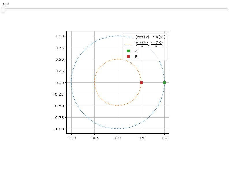
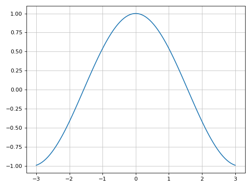
- spb.plot_functions.functions_2d.plot_piecewise(*args, **kwargs)[source]
Plots univariate piecewise functions.
Typical usage examples are in the followings:
Plotting a single expression with the default range (-10, 10):
plot_piecewise(expr, **kwargs)
Plotting multiple expressions with a single range:
plot_piecewise(expr1, expr2, ..., range, **kwargs)
Plotting multiple expressions with multiple ranges, custom labels and rendering options:
plot_piecewise(
   (expr1, range1, label1 [opt], rendering_kw1 [opt]),
   (expr2, range2, label2 [opt], rendering_kw2 [opt]),
   ..., **kwargs)`
- Parameters:
- expr
It can either be a symbolic expression representing the function of one variable to be plotted, or a numerical function of one variable, supporting vectorization. In the latter case the following keyword arguments are not supported:
params,sum_bound.- range_xtuple, Tuple
A 3-tuple (symb, min, max) denoting the range of the x variable. Default values: min=-10 and max=10.
- labelstr
Set the label associated to this series, which will be eventually shown on the legend or colorbar.
- aspectstr, tuple, list, dict
Set the aspect ratio.
Possible values for Matplotlib (only works for a 2D plot):
"auto": Matplotlib will fit the plot in the vibile area."equal": sets equal spacing.tuple containing 2 float numbers, from which the aspect ratio is computed. This only works for 2D plots.
Possible values for Plotly:
"equal": sets equal spacing on the axis of a 2D plot.For 3D plots:
"cube": fix the ratio to be a cube"data": draw axes in proportion of their ranges"auto": automatically produce something that is well proportioned using ‘data’ as the default.manually set the aspect ratio by providing a dictionary. For example:
dict(x=1, y=1, z=2)forces the z-axis to appear twice as big as the other two.
Possible values for Bokeh:
"equal": sets equal spacing.
- ax
An existing Matplotlib’s Axes over which the symbolic expressions will be plotted.
- axisbool
Show the axis in the figure. Default value: True.
- axis_centerstr, tuple
Set the location of the intersection between the horizontal and vertical axis in a 2D plot. It only works with Matplotlib and it can receive the following values:
None: traditional layout, with the horizontal axis fixed on the bottom and the vertical axis fixed on the left. This is the default value.a tuple
(x, y)specifying the exact intersection point.'center': center of the current plot area.'auto': the intersection point is automatically computed.
- camera
Set the camera position for 3D plots.
For Matplotlib, it can be a dictionary of keyword arguments that will be passed to the
Axes3D.view_initmethod. Refer to the following link for more information: https://matplotlib.org/stable/api/_as_gen/mpl_toolkits.mplot3d.axes3d.Axes3D.html#mpl_toolkits.mplot3d.axes3d.Axes3D.view_initFor Plotly, it can be a dictionary of keyword arguments that will be passed to the layout’s
scene_camera. Refer to the following link for more information: https://plotly.com/python/3d-camera-controls/For K3D-Jupyter, it is list of 9 numbers, namely:
x_cam, y_cam, z_cam: the position of the camera in the scenex_tar, y_tar, z_tar: the position of the target of the camerax_up, y_up, z_up: components of the up vector
- color_func
A color function to be applied to the numerical data. It can be:
A numerical function of 2 variables, x, y (the points computed by the internal algorithm) supporting vectorization.
A symbolic expression having at most as many free symbols as
expr.None: the default value (no color mapping).
- colorbarbool
Toggle the visibility of the colorbar associated to the current data series. Note that a colorbar is only visible if
use_cm=Trueandcolor_funcis not None. Default value: True.- colorbar_ticks_formattertick_formatter_multiples_of
An object of type
tick_formatter_multiples_ofwhich will be used to place tick values on the colorbar at each multiple of a specified quantity. This only works when use_cm=True.- colorlooplist, tuple
List of colors to be used in line plots or solid color surfaces.
- colormapslist, tuple
List of color maps to render surfaces.
- cyclic_colormapslist, tuple
List of cyclic color maps to render complex series (the phase/argument ranges over [-pi, pi]).
- detect_polesbool, str
Chose whether to detect and correctly plot the roots of the denominator. There are two algorithms at work:
based on the gradient of the numerical data, it introduces NaN values at locations where the steepness is greater than some threshold. This splits the line into multiple segments. To improve detection, increase the number of discretization points
nand/or change the value ofeps. This algorithm can be used to visualize jump discontinuities as well as essential discontinuities.a symbolic approach based on the
continuous_domainfunction from thesympy.calculus.utilmodule, which computes the locations of essential discontinuities. If any are found, vertical lines will be shown.
Possible options:
False: No poles detection
True: Poles detection with the numerical algorithm
‘symbolic’: Poles detection with numerical and symbolic algorithms
Default value: False.
- dotsboolean
Wheter to show circular markers at the endpoints. Default to True.
- epsfloat
An arbitrary small value used by the
detect_polesnumerical algorithm. Before changing this value, it is recommended to increase the number of discretization points. Related parameters:detect_poles. It must be: 0 ≤ eps < ∞. Default value: 0.01.- excludelist
List of x-coordinates to be excluded from evaluation. In practice, it introduces discontinuities in the resulting line.
- fig
Get or set the figure where to plot into.
- force_real_evalbool
By default, numerical evaluation is performed over complex numbers, which is slower but produces correct results. However, when the symbolic expression is converted to a numerical function with lambdify, the resulting function may not like to be evaluated over complex numbers. In such cases, forcing the evaluation to be performed over real numbers might be a good choice. The plotting module should be able to detect such occurences and automatically activate this option. If that is not the case, or evaluation performance is of paramount importance, set this parameter to True, but be aware that it might produce wrong results. Default value: False.
- gridbool, dict
Toggle the visibility of major grid lines. A dictionary of keyword arguments can be passed to customized the appearance of the grid lines:
- hookslist
List of functions expecting one argument, the current plot object, which allows users to further customize the appearance of the plot before it is shown on the screen. The hooks are executed:
after the figure has been initialized and populated with numerical data.
after the existing renderers update the visualization because the user interacted with some widget.
Note: let
pbe the plot object. Then, the user can access the figure withp.fig. In case ofspb.backends.matplotlib.MatplotlibBackend, the user can also retrieve the axes in which data was added withp.ax.- is_filledbool
Whether scatter’s markers are filled or void. Default value: True.
- is_scatterbool
If True it represent a scatter plot, otherwise a continuous line. Default value: False.
- legendbool
Toggle the visibility of the legend. If None, the backend will automatically determine if it is appropriate to show it. Default value: None.
- line_color
For back-compatibility with old sympy.plotting. Use
rendering_kwin order to fully customize the appearance of the line/scatter.- minor_gridbool, dict
Toggle the visibility of minor grid lines. A dictionary of keyword arguments can be passed to customized the appearance of the grid lines:
- modules
Specify the evaluation modules to be used by lambdify. If not specified, the evaluation will be done with NumPy/SciPy.
- n1int
Number of discretization points along the parameter to be used in the numerical evaluation. An alias of this parameter is
n. Related parameters:xscale. It must be: 2 ≤ n1 < ∞. Default value: 1000.- only_integersbool
Discretize the domain using only integer numbers. When this parameter is True, the number of discretization points is choosen by the algorithm. Default value: False.
- paramsdict, optional
A dictionary mapping symbols to parameters. If provided, this dictionary enables the interactive-widgets plot.
When calling a plotting function, the parameter can be specified with:
a widget from the
ipywidgetsmodule.a widget from the
panelmodule.- a tuple of the form:
(default, min, max, N, tick_format, label, spacing), which will instantiate a
ipywidgets.widgets.widget_float.FloatSlideror aipywidgets.widgets.widget_float.FloatLogSlider, depending on the spacing strategy. In particular:- default, min, maxfloat
Default value, minimum value and maximum value of the slider, respectively. Must be finite numbers. The order of these 3 numbers is not important: the module will figure it out which is what.
- Nint, optional
Number of steps of the slider.
- tick_formatstr or None, optional
Provide a formatter for the tick value of the slider. Default to
".2f".
- label: str, optional
Custom text associated to the slider.
- spacingstr, optional
Specify the discretization spacing. Default to
"linear", can be changed to"log".
Notes:
parameters cannot be linked together (ie, one parameter cannot depend on another one).
If a widget returns multiple numerical values (like
panel.widgets.slider.RangeSlideroripywidgets.widgets.widget_float.FloatRangeSlider), then a corresponding number of symbols must be provided.
Here follows a couple of examples. If
imodule="panel":import panel as pn params = { a: (1, 0, 5), # slider from 0 to 5, with default value of 1 b: pn.widgets.FloatSlider(value=1, start=0, end=5), # same slider as above (c, d): pn.widgets.RangeSlider(value=(-1, 1), start=-3, end=3, step=0.1) }
Or with
imodule="ipywidgets":import ipywidgets as w params = { a: (1, 0, 5), # slider from 0 to 5, with default value of 1 b: w.FloatSlider(value=1, min=0, max=5), # same slider as above (c, d): w.FloatRangeSlider(value=(-1, 1), min=-3, max=3, step=0.1) }
When instantiating a data series directly,
paramsmust be a dictionary mapping symbols to numerical values.Let
seriesbe any data series. Thenseries.paramsreturns a dictionary mapping symbols to numerical values.- polar_axisbool
If True, the backend will attempt to use polar axis, otherwise it uses cartesian axis. This is only supported for 2D plots. Default value: False.
- poles_locationslist
When
detect_poles="symbolic", stores the location of the computed poles (essential discontinuities) so that they can be appropriately rendered.- poles_rendering_kwdict
Rendering kw used to customize the appearance of vertical lines representing essential discontinuities. Related parameters:
poles_locations.- rendering_kwdict
A dictionary of keyword arguments to be passed to the renderers in order to further customize the appearance of the line. Here are some useful links for the supported plotting libraries:
Matplotlib:
for solid lines: https://matplotlib.org/stable/api/_as_gen/matplotlib.pyplot.plot.html
for colormap-based lines: https://matplotlib.org/stable/api/collections_api.html#matplotlib.collections.LineCollection
for scatters: https://matplotlib.org/stable/api/_as_gen/matplotlib.pyplot.scatter.html
Bokeh:
- show_in_legendbool
Toggle the visibility of the data series on the legend. Default value: True.
- size
Set the size of the plot, (width, height). For Matplotlib, the size is measured in inches. For Bokeh, Plotly and K3D-Jupyter, the size is in pixel.
- stepsNoneType, bool, str
If set, it connects consecutive points with steps rather than straight segments. Possible options: [‘pre’, ‘post’, ‘mid’, True, False, None] Default value: False.
- sum_boundint
When plotting sums, the expression will be pre-processed in order to replace lower/upper bounds set to +/- infinity with this +/- numerical value. Note: the higher this number, the slower the evaluation, but the more accurate the plot. It must be: 0 ≤ sum_bound < ∞. Default value: 1000.
- themestr
Theme to be used to style the figure. Depending on the backend being used, several themes may be available.
- title
Title of the plot. It can be:
a string.
a callable receiving a single argument, use_latex, which must return a string.
a tuple of the form (format_str, symbol 1, symbol 2, etc.), which creates an output string when parameters symbol 1, symbol 2, etc. receive numerical values from the widgets. This operation mode only works when creating interactive data series (ie, specifying the
paramsdictionary).
- txcallable
Numerical transformation function to be applied to the data on the x-axis.
- tycallable
Numerical transformation function to be applied to the data on the y-axis.
- unwrapbool, dict
Whether to use numpy.unwrap() on the computed coordinates in order to get rid of discontinuities. It can be:
False: do not use
np.unwrap().True: use
np.unwrap()with default keyword arguments.dictionary of keyword arguments passed to
np.unwrap().
- update_eventbool
If True and the backend supports such functionality, events like drag and zoom will trigger a recompute of the data series within the new axis limits. Default value: False.
- use_cmbool
Toggle the use of a colormap. By default, some series might use a colormap to display the necessary data. Setting this attribute to False will inform the associated renderer to use solid color. Related parameters:
color_func. Default value: False.- use_latexbool
Turn on/off the rendering of latex labels. If the backend doesn’t support latex, it will render the string representations instead. Default value: True.
- x_ticks_formattertick_formatter_multiples_of
An object of type
tick_formatter_multiples_ofwhich will be used to place tick values at each multiple of a specified quantity, along the x-axis.- xlabel
Label of the x-axis. It can be:
a string.
a callable receiving a single argument, use_latex, which must return a string.
a tuple of the form (format_str, symbol 1, symbol 2, etc.), which creates an output string when parameters symbol 1, symbol 2, etc. receive numerical values from the widgets. This operation mode only works when creating interactive data series (ie, specifying the
paramsdictionary).
- xlim
Limit the figure’s x-axis to the specified range. The tuple must be in the form (min_val, max_val).
- xscaleNoneType, str
If the backend supports it, the x-direction will use the specified scale. Note that none of the backends support logarithmic scale for 3D plots. Possible options: [‘linear’, ‘log’, None] Default value: ‘linear’.
- y_ticks_formattertick_formatter_multiples_of
An object of type
tick_formatter_multiples_ofwhich will be used to place tick values at each multiple of a specified quantity, along the y-axis.- ylabel
Label of the y-axis. It can be:
a string.
a callable receiving a single argument, use_latex, which must return a string.
a tuple of the form (format_str, symbol 1, symbol 2, etc.), which creates an output string when parameters symbol 1, symbol 2, etc. receive numerical values from the widgets. This operation mode only works when creating interactive data series (ie, specifying the
paramsdictionary).
- ylim
Limit the figure’s y-axis to the specified range. The tuple must be in the form (min_val, max_val).
- yscaleNoneType, str
If the backend supports it, the y-direction will use the specified scale. Note that none of the backends support logarithmic scale for 3D plots. Possible options: [‘linear’, ‘log’, None] Default value: ‘linear’.
- zlabel
Label of the z-axis. It can be:
a string.
a callable receiving a single argument, use_latex, which must return a string.
a tuple of the form (format_str, symbol 1, symbol 2, etc.), which creates an output string when parameters symbol 1, symbol 2, etc. receive numerical values from the widgets. This operation mode only works when creating interactive data series (ie, specifying the
paramsdictionary).
- zlim
Limit the figure’s z-axis to the specified range. The tuple must be in the form (min_val, max_val).
- zscaleNoneType, str
If the backend supports it, the z-direction will use the specified scale. Note that none of the backends support logarithmic scale for 3D plots. Possible options: [‘linear’, ‘log’, None] Default value: ‘linear’.
See also
Examples
>>> from sympy import symbols, sin, cos, pi, Heaviside, Piecewise, Eq
>>> from spb import plot_piecewise
>>> x = symbols('x')
Single Plot
>>> f = Piecewise((x**2, x < 2), (5, Eq(x, 2)), (10 - x, True))
>>> plot_piecewise(f, (x, -2, 5))
Plot object containing:
[0]: cartesian line: x**2 for x over (-2, 1.99999900000000)
[1]: 2D list plot
[2]: cartesian line: 10 - x for x over (2.00000100000000, 5)
[3]: 2D list plot
[4]: 2D list plot
(
Source code,png)
Single plot without dots (circular markers):
>>> plot_piecewise(Heaviside(x, 0).rewrite(Piecewise),
...     (x, -10, 10), dots=False)
Plot object containing:
[0]: cartesian line: 0 for x over (-10, 0)
[1]: cartesian line: 1 for x over (1.00000000000000e-6, 10)
(
Source code,png)
Plot multiple expressions in which the second piecewise expression has a dotted line style. Use the
labelkeyword argument to set the appropriate entries for the legend:>>> plot_piecewise( ... (Heaviside(x, 0).rewrite(Piecewise), (x, -10, 10)), ... (Piecewise( ... (sin(x), x < -5), ... (cos(x), x > 5), ... (1 / x, True)), (x, -8, 8), {"linestyle": ":"}), ... ylim=(-2, 2), detect_poles=True, legend=True, label=["A", "B"]) Plot object containing: [0]: cartesian line: 0 for x over (-10, 0) [1]: cartesian line: 1 for x over (1.00000000000000e-6, 10) [2]: 2D list plot [3]: 2D list plot [4]: cartesian line: sin(x) for x over (-8, -5.00000100000000) [5]: 2D list plot [6]: cartesian line: cos(x) for x over (5.00000100000000, 8) [7]: 2D list plot [8]: cartesian line: 1/x for x over (-5, 5) [9]: 2D list plot [10]: 2D list plot
(
Source code,png)